The tool works well enough to get the job done. I'm working on a Skyrim look-alike UI mod (which I'll publish if I finish it): there are two screenshots of it in the images section, and the fonts used in them were created entirely using this tool.
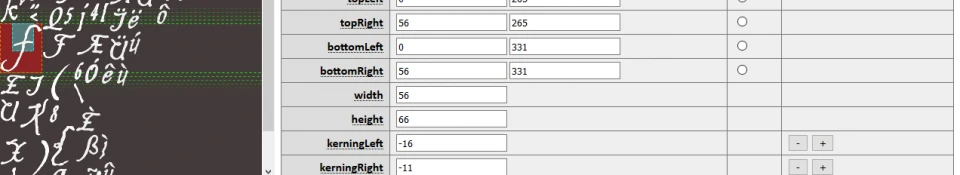
TODO: For shadowed fonts, balance the kerning on both sides even if we need non-integer kerning for that purpose. (Unless we do this already? It's been a while since I looked at it.) Focusing kerning on the left causes shadowed fonts to spill out of the left edge of their containing elements, and causes them to be off-center when centering is used.
TODO: Code analysis indicates that text inputs use a blinking cursor that alternates between two characters, "|" and charcode 0x7F. We should modify our code to generate 0x7F as a blank character with the same physical size as "|", and modify the UI to list it as "blinked cursor" or something. Testing establishes that we can leave 0x7F blank and everything will render just fine. The render code must have a special case for this.
TODO: Code analysis and testing indicate that one-line textboxes in Oblivion's menus (e.g. for editing the player's name or a potion name) don't handle the up and down arrow keys properly, due to missing cases in a switch-case statement. Instead of moving the cursor, these keys insert garbage characters (codes 03 and 04) into the text that the player is typing. In the vanilla fonts, these characters are zero-width; if I update the font generator, I need to force these to zero-width. In the meantime, font authors are advised to manually edit glyphs 03 and 04 and set their width and kerning values to zero.
Testing shows that we're also not generating tabs (09) correctly; they're way too small. Manually editing the width is possible, though.
Awesome work! I used to improve the darnified Kingthings Petrock 16 font to support german umlauts and the esszett glyph. Very easy to handle and in combination with gimp absolutely dummies proof. When times come, I will share the xcf to create a png and the modified font as mod. I love it!
Western versions of Oblivion don't use UTF-8. They use single-byte encodings (different ones for different languages and character sets), and the game's font format is explicitly designed around this. Font files for these versions of the game define exactly 256 glyphs. There's no system for skipping character codes or mapping data to character codes arbitrarily; there's just 256 "font character" data structures one after another in a flat list.
East Asian versions of the game would have to support multi-byte encodings, but this also means they'd need a completely different file format for their fonts. (I assume Bethesda didn't just make the font files define tons of unused data for tens of thousands of irrelevant symbols.) Unfortunately, I don't own such a version, so I can't reverse-engineer it to figure out how that format works. If the font format for those versions hasn't already been decoded and documented by someone else, then I don't have the knowledge to support those versions.
Thank you for your work on this tool! I have used it along with the DC Font Generator to fix some vanilla font mapping issues on my Vanilla UI Plus mod for Fallout 3 and New Vegas.
If you are interested on a wishlist / commentary, let me know.
I don't mind if you post feedback here in the comments. However, I am currently engaged with a non-TES project and may not be able to act on feedback in a timely manner. (Small changes are more likely for this than for my usual work, though, since this is implemented in HTML/JS and I can therefore edit and test very rapidly.)
1) I'd like to see more TTF to TEX conversion effects than a simple black outline. Smoothing, glow, blur, shadows, emboss, rust can provide interesting options for both Oblivion and FO3/NV. For example, it may be possible to create script characters with small semi-transparent smudges to emulate ink blots on parchment.
2) A debug tool to identify issues you've documented with control characters.
3) A debug tool to at least identify, and offer to fix issues with unbalanced left/right kerning that can lead to incorrect wrapping. This is a major problem in most 3rd party Fallout fonts.
4) Selection of multiple characters to apply edits on them.
5) Conversion to and from TEX/PNG for bitmap editing.
1. I'm not a graphic designer. I feel that this would be adequately covered by offering PNG import/export and batch glyph editing.
2. Not sure what you mean by a "debug tool." Just, like, a button you can click?
3. I need further clarification. A tool to identify [i]any[i] differences in kerning balance is going to have false-positives everywhere: font rendering is messy, so even with this tool it's common to have to adjust kerning (and sometimes even intentionally imbalance it). If the fonts in question have much more imbalanced kerning (e.g. 3px on one side, 0 on the other), that's something I can check for. Alternatively, if false-positives aren't a problem I can try to do a simple check if I find the time.
4. Implemented in the new update.
5. Implemented in the new update.
As for your request, I'm no longer reverse-engineering Oblivion (again -- other projects) but I don't recall centered text with line breaks ever working in that game: the game would only shift the first line of text leftward to center it, so lines after the first would be left-aligned with the horizontal center of the text element. (Of course, I don't remember whether I tested this in a text editor or programmatically; in the latter case I would only have tested \n and not \r\n. Your post directly after the OP mentions carriage returns being "missing" but I don't understand what you mean, given that Oblivion's FNT format, at least, contains all glyphs in order.) If centered text with line breaks works out of the box in New Vegas, then that game is likely doing something different from Oblivion.
1. PNG export is fine, but it cannot be used to apply effects because after importing the modified PNG the dimensions of the glyphs have changed, unless working with special fonts and all your effects are applied within the glyph outlines.
2 & 3. Yes, even a simple check for imbalances would suffice or other issues such as a zero height NULL character.
You can ignore my linked thread, it's probably an issue with the DC Font Generator or non-Oblivion related.
Thank you for the update. Combined with the DC Font Generator, I've now done everything I wanted to tweak on the vanilla bitmaps.
Published an update which should address more of this feedback.
There are now tools to report bad glyphs and glyphs with uneven kerning (more than a one-pixel difference); check the buttons in the "Macros" section of the ribbon. A zero-height null glyph is not reported as a problem: using the null glyph to influence line height was my idea and as far as I know, the vanilla fonts don't do that.
The glyph list also has a "select all" button. If you need to enlarge all glyphs by a certain number of pixels on each side (say, because you exported to PNG, added some effect, and imported back to the editor), then you can select all glyphs and then batch-edit each property.
thank you for this wonderful tool, it has helped me achieve a dream of mine i have had for years i couldn't of done it without this, thank you so so much
can you use this to make font smaller for existing font files? what i want to do is use this to edit certain darnified font files and make the text smaller is this possible with this and if so how? i'm really not sure how to use this thing
It's not popping a "save as" box for both files? They appear at the same time, so depending on your browser, one box may cover up the other.
...Or your browser may only allow one to appear, if it's especially silly. Lemme know; if it's a problem, I can split up the "save" button so you save both files separately.
I've got same problem. It looks like browser does not allow to pop up two boxes at the same time, ony the second one. I'm using firefox. Splitting save button could realy help :)


 Give Feedback


51 comments
TODO: For shadowed fonts, balance the kerning on both sides even if we need non-integer kerning for that purpose. (Unless we do this already? It's been a while since I looked at it.) Focusing kerning on the left causes shadowed fonts to spill out of the left edge of their containing elements, and causes them to be off-center when centering is used.
TODO: Code analysis indicates that text inputs use a blinking cursor that alternates between two characters, "|" and charcode 0x7F.
We should modify our code to generate 0x7F as a blank character with the same physical size as "|", and modify the UI to list it as "blinked cursor" or something.Testing establishes that we can leave 0x7F blank and everything will render just fine. The render code must have a special case for this.TODO: Code analysis and testing indicate that one-line textboxes in Oblivion's menus (e.g. for editing the player's name or a potion name) don't handle the up and down arrow keys properly, due to missing cases in a switch-case statement. Instead of moving the cursor, these keys insert garbage characters (codes 03 and 04) into the text that the player is typing. In the vanilla fonts, these characters are zero-width; if I update the font generator, I need to force these to zero-width. In the meantime, font authors are advised to manually edit glyphs 03 and 04 and set their width and kerning values to zero.
Testing shows that we're also not generating tabs (09) correctly; they're way too small. Manually editing the width is possible, though.
East Asian versions of the game would have to support multi-byte encodings, but this also means they'd need a completely different file format for their fonts. (I assume Bethesda didn't just make the font files define tons of unused data for tens of thousands of irrelevant symbols.) Unfortunately, I don't own such a version, so I can't reverse-engineer it to figure out how that format works. If the font format for those versions hasn't already been decoded and documented by someone else, then I don't have the knowledge to support those versions.
If you are interested on a wishlist / commentary, let me know.
1) I'd like to see more TTF to TEX conversion effects than a simple black outline. Smoothing, glow, blur, shadows, emboss, rust can provide interesting options for both Oblivion and FO3/NV. For example, it may be possible to create script characters with small semi-transparent smudges to emulate ink blots on parchment.
2) A debug tool to identify issues you've documented with control characters.
3) A debug tool to at least identify, and offer to fix issues with unbalanced left/right kerning that can lead to incorrect wrapping. This is a major problem in most 3rd party Fallout fonts.
4) Selection of multiple characters to apply edits on them.
5) Conversion to and from TEX/PNG for bitmap editing.
Finally, as you are performing code analysis, I'd request that you check out center alignment issues caused by the space character as seen at this discussion.
2. Not sure what you mean by a "debug tool." Just, like, a button you can click?
3. I need further clarification. A tool to identify [i]any[i] differences in kerning balance is going to have false-positives everywhere: font rendering is messy, so even with this tool it's common to have to adjust kerning (and sometimes even intentionally imbalance it). If the fonts in question have much more imbalanced kerning (e.g. 3px on one side, 0 on the other), that's something I can check for. Alternatively, if false-positives aren't a problem I can try to do a simple check if I find the time.
4. Implemented in the new update.
5. Implemented in the new update.
As for your request, I'm no longer reverse-engineering Oblivion (again -- other projects) but I don't recall centered text with line breaks ever working in that game: the game would only shift the first line of text leftward to center it, so lines after the first would be left-aligned with the horizontal center of the text element. (Of course, I don't remember whether I tested this in a text editor or programmatically; in the latter case I would only have tested \n and not \r\n. Your post directly after the OP mentions carriage returns being "missing" but I don't understand what you mean, given that Oblivion's FNT format, at least, contains all glyphs in order.) If centered text with line breaks works out of the box in New Vegas, then that game is likely doing something different from Oblivion.
2 & 3. Yes, even a simple check for imbalances would suffice or other issues such as a zero height NULL character.
You can ignore my linked thread, it's probably an issue with the DC Font Generator or non-Oblivion related.
Thank you for the update. Combined with the DC Font Generator, I've now done everything I wanted to tweak on the vanilla bitmaps.
There are now tools to report bad glyphs and glyphs with uneven kerning (more than a one-pixel difference); check the buttons in the "Macros" section of the ribbon. A zero-height null glyph is not reported as a problem: using the null glyph to influence line height was my idea and as far as I know, the vanilla fonts don't do that.
The glyph list also has a "select all" button. If you need to enlarge all glyphs by a certain number of pixels on each side (say, because you exported to PNG, added some effect, and imported back to the editor), then you can select all glyphs and then batch-edit each property.
i couldn't of done it without this, thank you so so much
what i want to do is use this to edit certain darnified font files and make the text smaller
is this possible with this and if so how?
i'm really not sure how to use this thing
how can i get fnt file?
...Or your browser may only allow one to appear, if it's especially silly. Lemme know; if it's a problem, I can split up the "save" button so you save both files separately.