


0 of 0


Documentation
Readme
View as plain text
- You can hand-edit a glyph's settings individually. You can also modify the
kerning and ascent values for all glyphs at once.
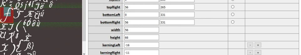
- Glyphs define two sets of coordinates: coordinates for each corner of the
glyph within the TEX file; and values for the width, height, ascent, and
kerning. These values are not redundant.
Oblivion renders text by constructing a 3D mesh for it at run-time, with
one quad per glyph. The corner-coordinates are UVs for each vertex in the
quad, while the width, height, and other values are used to control the
position of each vertex. As such, the UVs and the pixel-values don't
actually have to match up; you can make a high-resolution font that gets
downscaled for display (and we provide a "Scale Mult" option to control
this).
Of course, this isn't recommended, because the downscaling isn't very
high-quality. Downscaled fonts would only be useful in cases where the
user's screen resolution is taller than 960px, because the UI is rendered
to a height of 960px and then scaled to the user's screen height; on
taller screens, the UI (and fonts) would be scaled up.
- The bottom bar contains a rendered preview of your font. Type "\n" to add a
line break. The preview should live-update as you load/create fonts and make
changes to glyphs.
The preview code mimics how Oblivion positions glyphs (and I disassembled
the game to verify this), but has some inaccuracies due to how web browsers
handle graphics. Our preview is a 2D graphic rendered at 1:1 size, but
Oblivion renders text to a 3D canvas that is scaled based on your screen
size. The most notable differences are that glyphs won't appear at the same
size, and glyphs with sub-pixel values (e.g. kerning) will appear fairly
blurry in our preview but not in-game.
- Vertical alignment of text was made accurate in the v1.2 patch. The changes
were verified by disassembling Oblivion. Unfortunately, vertical alignment
is not strictly intuitive.
Every font has a value that, at run-time, is stored in a field at offset
0x2C; we refer to it as engineUnk2C in the editor. This field is set to the
maximum of these values, computed for every glyph:
Font Line Height + Glyph Height - Glyph Ascent
When it comes time to render a run of text, the text is offset by the
following value:
(Engine Unk2C - Font Line Height) * 2
This, of course, simplifies to the following value (again, the maximum out
of all glyphs):
(Glyph Height - Glyph Ascent) * 2
This means that to edit the alignment of text within a TEXT element in the
user interface, without also editing the height of each line of text, you
generally need to use a non-printable character as a "dummy" and change its
height and ascent. If ((height - ascent) * 2) is less than the font line
height, then text will be pulled upward; if ((height - ascent) * 2) is
greater than the font line height, then text will be pulled downward. If
((height - ascent) * 2) is exactly equal to the font line height, then the
text baseline (the bottom of the "ascent" portion) will be aligned with the
bottom edge of the element.
For fonts generated from scratch, we configure the null glyph (00 NULL) to
have a height and ascent as outlined above (i.e. ((height - ascent) * 2)
is equal to the font line height). To move the first line of text downward
by one pixel, you would increase the height of the null glyph by 0.5.
- When you've selected a glyph, underlays appear on the displayed data. These
underlays indicate:
- RED -- The glyph's bounds (visible) size. Everything in the red box is
part of the visible glyph.
- CYAN -- The glyph's "hitbox," accounting for ascent and kerning. The
bottoms of every glyph's "hitbox" will be aligned when text is
rendered.
- GREEN -- The glyph's vertical positioning within a line of text.
- YELLOW -- The boundaries of the text element itself, assuming a single
line of text. See explanation above.
- If you see text with a dotted underline, hover over it for a tooltip that
explains what it does/is.
- When generating fonts, the Outline thickness can be a bit quirky due to
idiosyncrasies in how browsers render outlined text to canvases (the 2D
render tech that this tool uses). An outline that's "three pixels thick"
will appear to be closer to one pixel thick. An outline that's "five pixels
thick" won't be nearly that thick in the rendered image.
Note also that fonts *without* an outline may have indistinct or low-quality
edges when rendered in-game. For a sans-serif font at 22px or so, I've had
the best results using a "three-pixel outline" (so, one pixel thick).
- Bear in mind that when generating fonts from scratch, the editor *estimates*
the dimensions of each glyph. It does this based on the alpha transparency
of each pixel in the font. You may want to go through each glyph by hand and
make sure that its width/height bounds aren't too large. This is preferable
to just using kerning to compensate for the difference, because kerning can
knock text off of alignment when it needs to be centered, justified, etc..
How you go about verifying that will vary depending on your font's character-
istics. I mentioned using a font with a one-pixel border earlier: what I can
do in that case is just move one of the corner UVs inward and see if the out-
line is cropped off. Of course, when you're changing the size of a glyph,
remember to change BOTH the UVs AND the width/height values, so that your
glyph isn't stretched.
- The editor now offers macros, which can be used to quickly make fonts that
force rendered text to all-uppercase or all-lowercase. Note that these
operations directly modify the loaded font data and cannot be undone. Make
sure you've saved a separate copy of your normal font before using these
macros.
These macros work by modifying the glyph data, copying one set of glyph
coordinates over another. This means that an all-uppercase font and an
all-lowercase font generated from the same base font can share a TEX with
that base font and with each other.
- The editor now offers PNG import/export. If you are importing an image
that is a different size from the loaded image, you will be asked how to
handle the size difference. Internally, glyphs store their coordinates as
UVs (i.e. percentages along the width and height of the image); in order
to keep the glyphs' pixel sizes the same, the UVs must be rescaled from
the old image to the new image. This is what the editor asks permission
to do.
- The editor now allows you to multi-select glyphs. When multiple glyphs
are selected, only glyph bounds (not line bounds) will be overlaid in
the TEX view on the left. The input fields for editing glyph properties
will be blank; you can use the increment and decrement buttons on each
field to change that field for all selected glyphs.