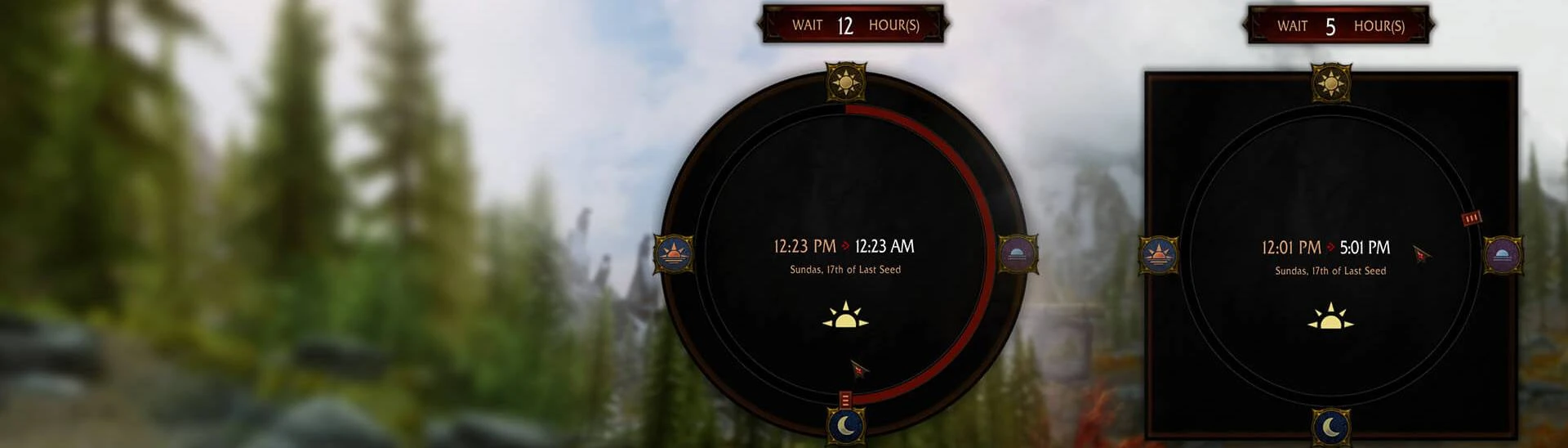
Hi, thank you for your work. As you can see in the screen, in french the text goes beyond. in addition bottom image is cut off. The PM of the hour in the middle as well.
As for the PM of the hour, it's an issue from the original when you use SkyrimSouls RE Unpaused Menu (IIRC). There's a discussion on the original Modern Wait Menu page.
Dang - I was hoping no one noticed until the next update lol. I'll get around to it. Just wanted to release this today as I will be a bit occupied in the next week.
i have feedback, maybe add drop shadow to these letters for better visibility, and maybe bigger numbers/letters in the center, also the sun icon in the middle has a little thin line on top, if you enlarge the image is noticeable
Good catch on the line! Feedback incorporated. Let me know what you think. I didn't change much the text size however, anticipating people's use of larger fonts.
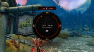
Sorry, the position in-game is the same, slightly to the left, but i took the screenshot using another software, besides the position, the mod works normally, i should have explained that lol
hopefully you don't take it the wrong way, but why did you changed the original design, with only one circle? i think the original design, with the weather circle and the time circle inside looks better
Good question. I just thought that there's no circular element in the original Dear Diary Dark Mode design. But I get what you're saying, it does look different when squared like that. I've updated the mod so there are two alternatives to choose from: the circle one and the square one.
Very fast and well made reskin. Tracking for now as I wait for the 24 hours support of the original mod before I download. You don't want to make other DDDM UI reskins, too, don't you? xD
Small feeback/request: Would you mind in desaturate the snow symbol or make it more white? Personal preference, but I don't like that it's so vibrant.
Oh is it? I think it should be a quick fix then since there's already a base...
I also plan to make a DDDM for Wheeler since I have yet to see one that retains DDDM design pattern at the moment. Also Simply Order Squad given I already make the vanilla icons one.
DDDM is quite fun to work with; great asset base and have plenty of good reusable elements. So let me know if you want to see anything else.


48 comments
For example, the M1, Tab buttons are very bad
As you can see in the screen, in french the text goes beyond. in addition bottom image is cut off.
The PM of the hour in the middle as well.
As for the PM of the hour, it's an issue from the original when you use SkyrimSouls RE Unpaused Menu (IIRC). There's a discussion on the original Modern Wait Menu page.
It looks like this in game, just a bit to the left.
You don't want to make other DDDM UI reskins, too, don't you? xD
Small feeback/request: Would you mind in desaturate the snow symbol or make it more white? Personal preference, but I don't like that it's so vibrant.
I also plan to make a DDDM for Wheeler since I have yet to see one that retains DDDM design pattern at the moment. Also Simply Order Squad given I already make the vanilla icons one.
DDDM is quite fun to work with; great asset base and have plenty of good reusable elements. So let me know if you want to see anything else.