Any progress on this? I'm also looking to get the black (solid) knight piece character; I need it for something. Actually all of the Unicode chess characters would be good to have, though really I need that one in particular.
It's a good font collection, would be even greater if the fix could be back ported from the SSE version. Edit: The updated SSE mod is actually compatible with LE. I just tested it on my install. Font Overhaul - Natural Typefaces for Skyrim -- FONTS
this looks made for me my current font is too big and it makes reading books really bad and annoying like trying to read a book with a magnifying glass
I'm working on a version for SE right now, and being that both use the same system, both will be updated. I'll keep this in mind and make sure to correct this issue!
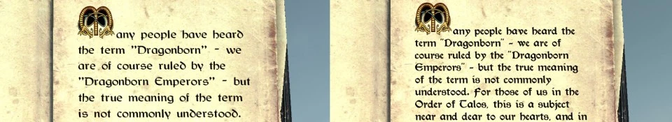
Hello, mfcfbro. It's good that someone noticed how bad the ingame books and letters are. But in order to increase realism further, the text has to be justified and seperating has to be implemented as well (like in normal books and writings). People don't write with a left allignment -- you can only see it at websites on the Internet. It's not used in books either. I don't know if it's possible to implement in Skyrim though, but it will be great.
That's an interesting idea. I know that it is possible, but editing the file responsible for this is a little finicky and it'll take some work. Worth a shot anyway.
So this is awesome and I love it in game... but it makes using the console a frustrating mess, and anyone that is modding their game heavily will probably use the consoles a lot.
I use my widescreen TV as my monitor, it's like 7 feet from me, with a wireless keyboard and long wire mouse. With this setup and 1080x720 I can read all text ingame just fine, but the console font doesn't work at all for me. I have too much issues telling the difference between a B and an 8, and seeing a I next to a D or the like, or often telling spaces between sets of numbers. I'm going to have to revert back to vanilla for now, if you could eihter fix this or release an optional file to make the console text vanilla (or at least easier to make sense out of) I would use this again in a heartbeat.


67 comments
Edit: The updated SSE mod is actually compatible with LE. I just tested it on my install.
Font Overhaul - Natural Typefaces for Skyrim -- FONTS
It's good that someone noticed how bad the ingame books and letters are. But in order to increase realism further, the text has to be justified and seperating has to be implemented as well (like in normal books and writings). People don't write with a left allignment -- you can only see it at websites on the Internet. It's not used in books either.
I don't know if it's possible to implement in Skyrim though, but it will be great.
I use my widescreen TV as my monitor, it's like 7 feet from me, with a wireless keyboard and long wire mouse. With this setup and 1080x720 I can read all text ingame just fine, but the console font doesn't work at all for me. I have too much issues telling the difference between a B and an 8, and seeing a I next to a D or the like, or often telling spaces between sets of numbers. I'm going to have to revert back to vanilla for now, if you could eihter fix this or release an optional file to make the console text vanilla (or at least easier to make sense out of) I would use this again in a heartbeat.
Endorsed regardless.