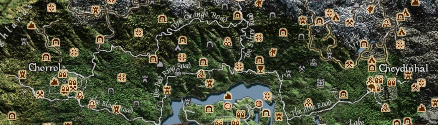
On a low-color map (vanilla or the classic colored map from ages ago), the difference between the gold and silver is perhaps a little too subtle, but I really like it. The greyed icons invoke a sense of mystery and make me want to find out what that unknown cave in the distance might be, far better than the vanilla icons. Thank you for your work!


4 comments