I love this mod. but i ran into something i've never seen before, last night i played and i'm used the ranked mod, the pip boy was black and had the red on it. i log in today and it's back to its default color? any way to fix this? i reinstalled the mod a few times and everything idk it just won't show the color but it still has the rank on the screen and everything
Hi i downloaded boht the ranked and the opitional brotherhood symbol but two things i noticed, The symbol is barely there ((i dunno if i did something wrong or if my amber colored pip bow lights are making it super dark somehow..)) and i cant see the industrial red stripes on the bottom like on the screenshots it shows all but the bottom stripes also i dont see the "owned by the brotherhood on the side...besides that alls good ((scratch most of that it just ...started working randomly)) but i still cant see the stripes on the bottom when in first person
Really cool. Can you do a Railroad and Children of Atom pipboy to round out the different factions/playthroughs please? The institute and minutemen already have one up
Love the mod! my only problem with it is that everyone in vault 81 is now running around with BoS pip boys lol! just goin to have to pretend they have regular ones! other then that excellent mod!
Any chance you could add an optional file to have 2 stripes on each side? Cause one stripe is for lower ranks AFAIK, would be much appreciated! Great looking retexture btw, ad victoriam! (loving the skin)
Thanks! Will definetily endorse! Would be cool if the rank symbols were shown somewhere but would have no idea where to put those, it might look too cluttered when knight, sentinel or paladin rank symbol would be on it too. Either way, awesome job on the skin!
Sorry my internet weirded out around the time you posted, but yeah! Having a white (like the way the brotherhood symbol looks) sentinel rank symbol as background would be quite awesome together with the double stripes! I would most likely make it so that the 2 lines are centered, if you know what I mean, would look best I think! (If I am not stating the obvious >.< )
http://steamcommunity.com/id/TheOriginalMe/screenshot/403432783362872033 the insignia on the left side of the chest where my pointer is in, the shield with the square in. That is the sentinel insignia that I mean!
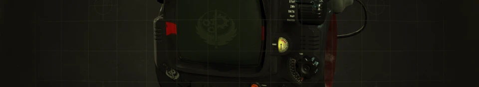
Haha, don't mention it. Now, I think maybe you'll want the logo at bit more dull as it stands out a bit much on the screen. But tell me what you think of the stripes. Too thick, too thin, too far apart etc. Fixing it ain't an issue. By the way. The rad meter on that screenshot is just an experimental one I'm working on. The one you'd have is the same as screenshots unless maybe you want the one in this picture. Or, I do have a clearer rad meter without the crack. But tell me what you think
Looks great! But I would either lower the insignia abit so that the lines are centered at it or put the lines a bit higher so that they are. The rad meter looks sweet as hell! But I would put it as optional file as you intended! Also, sorry that I took so long to respond, I went to bed before you responded back ;_;


 Give Feedback


46 comments
Edit: endorsed!
Edit: Unless I'm misunderstanding and you mean that you'd like to use the BOS Logo optional file that I already have on here with the two stripes?
Edit: Here's what I have for the screen: i.imgur.com/LXAinf3.png How's that? I had to basically make it from scratch
i.imgur.com/XjWiywG.png