Hey it is okay to dislike it, but this is the best I could make it personally :) I am using different programs for different kind of textures, like for buttons or more realistic kind of textures and edit them slightly manually. I am open to improve everything, so if you can provide something better, I will glady include that instead!
Keep in mind uspscaling generally is not something objectively better, so I cannot argue with "dont think this looks that good", as it might be just your opinion. You can always not use it.
The software might need to have the sharpening turned down. For instance, I use Topaz Gigapixel AI for my upscale textures. The "Standard" AI setting artificially sharpens the image by default, and in some cases, makes the image too sharpened leading to the introduction of sharpening-related artifacts like halos or edge enhancement. Whenever I upscale an image, I always eyeball it to see if "Standard" sets it too sharp. If it does, I switch it to the "Art & CG" preset which is softer by default.
It might just require some playing around with the settings in the software so that it properly upscales the image to improve quality without the artificial sharpening. See below for a couple of examples. It's hard to tell with this image size, but blown up to 100%, the Standard version is much sharper. The Art & CG version is softer and easier on the eyes (IMO), which I think is what the OP was originally complaining about.
Standard Preset (vanilla on let; upscaled on right)
Art & CG Preset (vanilla on left; upscaled on right)
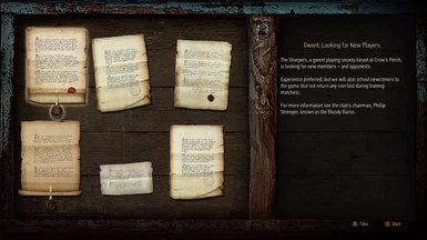
yes, I also tried Topaz, and expected a little bit better results, but i wasnt happy. For the background of the noticeboard, Art and CG poroduced the best result, but it introduced some weird artefacts to the darkest parts of the board itself. For the icons, that Tinnaib uploaded, all the results were kinda bad. But they are icons, so are simple, it's probably better idea to just redraw them in high res by hand by somebody that has the time.
And i thought you were finished, great job once again my man (When you are officially finished with your upscaled series making a compilation of all of them wouldn't be a bad idea i think) Cheers!!!


23 comments
Keep in mind uspscaling generally is not something objectively better, so I cannot argue with "dont think this looks that good", as it might be just your opinion. You can always not use it.
It might just require some playing around with the settings in the software so that it properly upscales the image to improve quality without the artificial sharpening. See below for a couple of examples. It's hard to tell with this image size, but blown up to 100%, the Standard version is much sharper. The Art & CG version is softer and easier on the eyes (IMO), which I think is what the OP was originally complaining about.
Standard Preset (vanilla on let; upscaled on right)
Art & CG Preset (vanilla on left; upscaled on right)
If you want to see them full size (which is much easier to see the difference):
Standard: https://i.imgur.com/qxGpb6l.jpg
Art & CG: https://i.imgur.com/XsJVjRy.jpg
Suggestion: maybe upscale time-dial screen, where you can pass time!. :)
(When you are officially finished with your upscaled series making a compilation of all of them wouldn't be a bad idea i think)
Cheers!!!