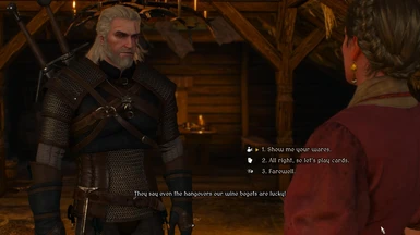
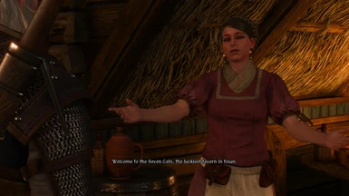
Unfortunately, they are a bit bigger than vanilla font. So, for french version at least (french language usually takes more words and space) the font are overlapping or going out of their space.
You can see the problem here: https://i.postimg.cc/brTTQKGZ/w3medievalfont-bug-report-FR1.jpg https://i.postimg.cc/nrc7tMzL/w3medievalfont-bug-report-FR2.jpg EDIT: ignore the ' Emile Régis Godefroy' one on the pictures. I just noticed it also goes out of the card while using the vanilla font xD
Is it possible to edit their size and also to reduce their vertical and horizontal spacings?
I think it looks great, will definitely try it out. Thank you very much for it. By the way, I don't know why, but the font reminds me somehow of Diablo and Diablo 2 :), that's really a cool thing :).


21 comments
But as for me this font looks terrible. Херово, короч :)
https://openload.co/f/nxxXeZLD1AM/16674.otf
Edit: Oh it's a font? I assume you wanted me to use this one for the russian version?
Yes, this is a font for the Russian version of the mod.
Unfortunately, they are a bit bigger than vanilla font. So, for french version at least (french language usually takes more words and space) the font are overlapping or going out of their space.
You can see the problem here:
https://i.postimg.cc/brTTQKGZ/w3medievalfont-bug-report-FR1.jpg
https://i.postimg.cc/nrc7tMzL/w3medievalfont-bug-report-FR2.jpg
EDIT: ignore the ' Emile Régis Godefroy' one on the pictures. I just noticed it also goes out of the card while using the vanilla font xD
Is it possible to edit their size and also to reduce their vertical and horizontal spacings?
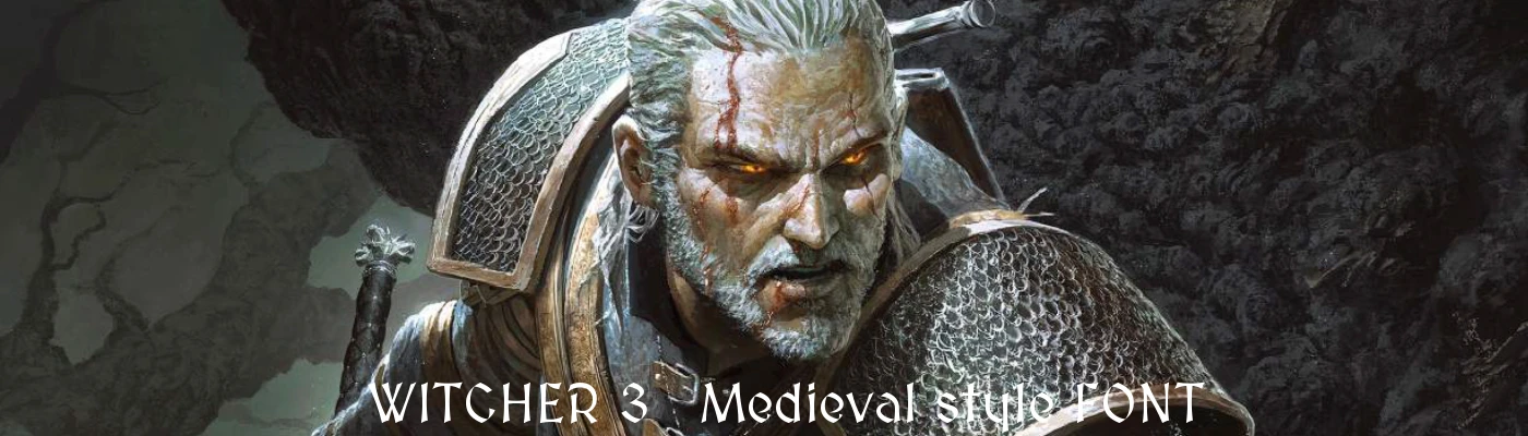
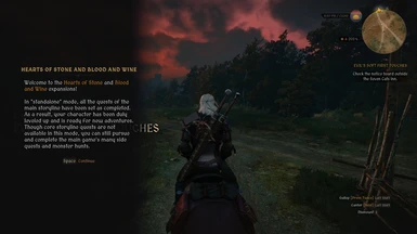
Very stylised yet readable.