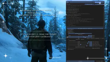
If your only intention is to say something mean, please don't, I've received enough already. Regarding saturation, please read the mod description. I've attached a tutorial on how to disable it or edit it, it's in the gallery.
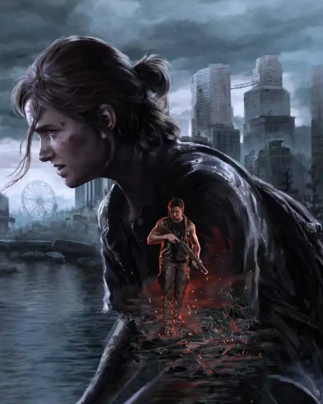
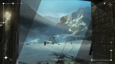
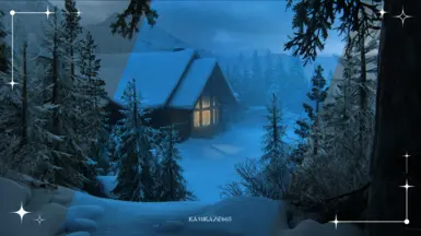
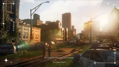
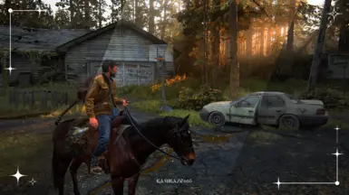
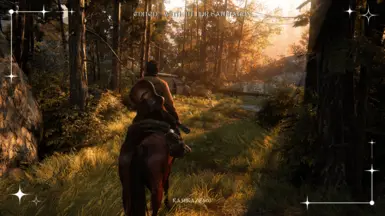
I've created this preset for me, because I like colorful games, it's INTENTIONAL, but I understand it's not everyone's taste. There are plenty of other presets that aim to be realistic, mine is not and wasn't created to be realistic.
gave some advice so he goes on to make something bigger and better. Idk how to make mods or I would. So now that I did something, what exactly did you do but be a little b&@*$ today?
rahul717 Thank you for standing up for me, I really appreciate it! I'm used to kind communities like Stardew and the Sims, so the negativity really stumped me. Second guessing if I should delete it, like damn, I'm just a girl, don't comment hateful things if you're not interested
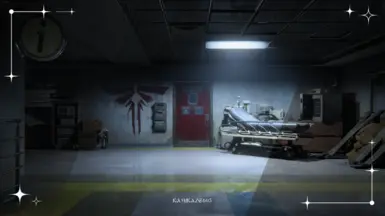
If the hud (ammo and health counter) and basically everything white looks like its glowing, open Reshade menu by pressing the "Home" button by default. Then select Blooming_HDR and turn the bloom intensity down to zero. Kept the game more vibrant compared to the vanilla version while eliminating the glow. Worked for me atleast
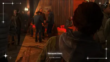
I've warned about the bloom effect multiple times, both in the description and the gallery, but yes, it is caused by the bloom effect. Basically, if you're in a dark area, it makes anything bright have a realistic light bloom effect. The darker the area, the bigger the bloom - the menu is white text on a black background, so that's why. If I remember correctly, I've applied two bloom effects in case somebody removes the one you've mentioned, so you're good (I think the other is named something like Magic Bloom? Not sure, can't check right now). Feel free to customize it to your liking, glad you've figured it out! :D
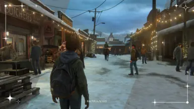
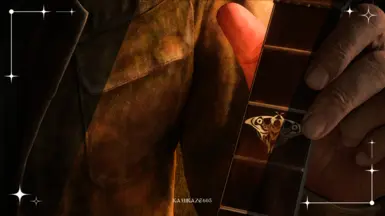
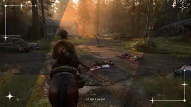
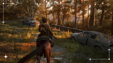
Looks really nice! Your method of making comparison screenshots needs some work though. Imo comparison images of the same area/scene side by side or on/off comparisons would be a lot nicer. Having one image with mixed parts doesn't show off the reshade very well
Thank you! I've always liked this type of comparison, because I don't like switching between two images when looking at a reshade, but now I know that others don't like it. I'll try to make new pictures when I have time! I really appreciate the feedback
Wow, I didn't know that that's a thing! I've added two Imgsli comparisons and two side by side photos, I'll take screenshots in different locations when I have time. Thank you again, you're awesome!
Hi! Thank you for the feedback. There are 4 effects in total, and all of them kinda contribute to the “whiteness”. I recommend turning them off one by one or playing with the sliders to customize the preset to your liking. If you're not sure how, I'm more than happy to help!
Hi, I'm sorry you feel that way, but there's no need to put me down like this AND pick at me for not having money to buy a good monitor. My whole PC setup is a hand me down. I usually play cozy games like Stardew which are bright and colorful, so I'm not used to games being so colorless. I wanted to create my first preset to fix that, it's purposely that colorful. Not only that, but I've attached a detailed tutorial on how to turn off or edit the saturation, because I know it's not for everybody, and that's okay. I truly hope you feel better and find kindness in your heart, have a great day
Thank you! I've always liked this comparison more than side by side so you don't have to switch between images, but now I know. Thanks for the feedback! As for the saturation, I've said in the description and on a picture in the gallery that you can turn it down or disable it - I've even written a detailed tutorial on how to do it :')


29 comments
I've created this preset for me, because I like colorful games, it's INTENTIONAL, but I understand it's not everyone's taste. There are plenty of other presets that aim to be realistic, mine is not and wasn't created to be realistic.
Imagine clicking something to complain about it. Peak form of loneliness and bitterness
If youve never heard of 'Imgsli' id definitely recommend it, seems like it might be a good middle-ground between separate images and combined images