Just some constructive criticisms from someone with a ton of experience making reshades.
Your white spots are too bright and over saturates the image, Your sharpening is too strong to the point of distorting the art style, Your black spots are way too dark to the point it distorts the original intent, The saturation added back on-top of the colours is too strong and has the opposite effect of grit.
My personal advice would be to experiment with different tools in reshade. Try out Levels to manually adjust the raw color balancing as a whole for whites and darks, then add FakeHDR on-top of that and make a subtle edit to the vanilla whites and blacks pallet, this will make it look more natural and less distorted. You can also use a minor Vibrance tweak to add back some color if you wish but I wouldn't over do it. Curve can also be really good to adjust the shadows of seams and corners, making them look darker and more natural. If you want a more gritty art style, add a Sepia filter and tweak it to be subtle, then add less saturation using the Vibrance tool to discolour the image.
Doing all of these will make your reshade stand out more, though that's just my opinion!
I think you can still have grit even if it's saturated, you just need something to make it more "bleak" or "barren".
Sepia can add a old western style grit, Adding a black and white filter over the saturation then adjusting the B&W filter to be subtle would make it look more bleak and depressing, etc.
You have to have something in place to desaturate the entire image a bit if you're going to saturate it prior.
While fair criticism, at that point you just end up with a reshade preset like Decent. I like the way this feels and looks, so i won't be changing it. But if you want to, feel free to take it and adjust it and reupload it.
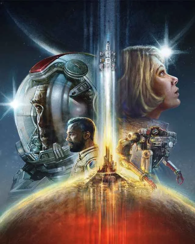
Perhaps gritty is the wrong word, english is not my native language. I was going for a cyberpunk style neon cement jungle vibe with the reshade. Especially in the city of Neon itself i think it fits the vibe really well.
Ah I see. You were going for a Punk vibe. Punk itself is a genre, specifically one of artistic expression. So the word before punk is just the sub-genre of Punk.
Cyberpunk is still just punk, however it takes place in a Cyberhell dystopia. Just like how Starfield is a Nasapunk because it has that old 80's sci-fi retro nasa style, but with a modern lens and artistic visuals.
Grit is less about colour and more about dirt, grime, bleak, depression, etc.


10 comments
Your white spots are too bright and over saturates the image,
Your sharpening is too strong to the point of distorting the art style,
Your black spots are way too dark to the point it distorts the original intent,
The saturation added back on-top of the colours is too strong and has the opposite effect of grit.
My personal advice would be to experiment with different tools in reshade. Try out Levels to manually adjust the raw color balancing as a whole for whites and darks, then add FakeHDR on-top of that and make a subtle edit to the vanilla whites and blacks pallet, this will make it look more natural and less distorted. You can also use a minor Vibrance tweak to add back some color if you wish but I wouldn't over do it. Curve can also be really good to adjust the shadows of seams and corners, making them look darker and more natural. If you want a more gritty art style, add a Sepia filter and tweak it to be subtle, then add less saturation using the Vibrance tool to discolour the image.
Doing all of these will make your reshade stand out more, though that's just my opinion!
Sepia can add a old western style grit,
Adding a black and white filter over the saturation then adjusting the B&W filter to be subtle would make it look more bleak and depressing, etc.
You have to have something in place to desaturate the entire image a bit if you're going to saturate it prior.
Cyberpunk is still just punk, however it takes place in a Cyberhell dystopia. Just like how Starfield is a Nasapunk because it has that old 80's sci-fi retro nasa style, but with a modern lens and artistic visuals.
Grit is less about colour and more about dirt, grime, bleak, depression, etc.