Hi, sorry to be that guy, but I am getting an error, I have all the required mods installed, I followed your instructions, copying the PRS 3.1 file to starfield root, installed Reshade and loaded your ini, then once installed I copied the shaders folder across overwriting the existing shaders installed (I presume that was the correct thing to do).
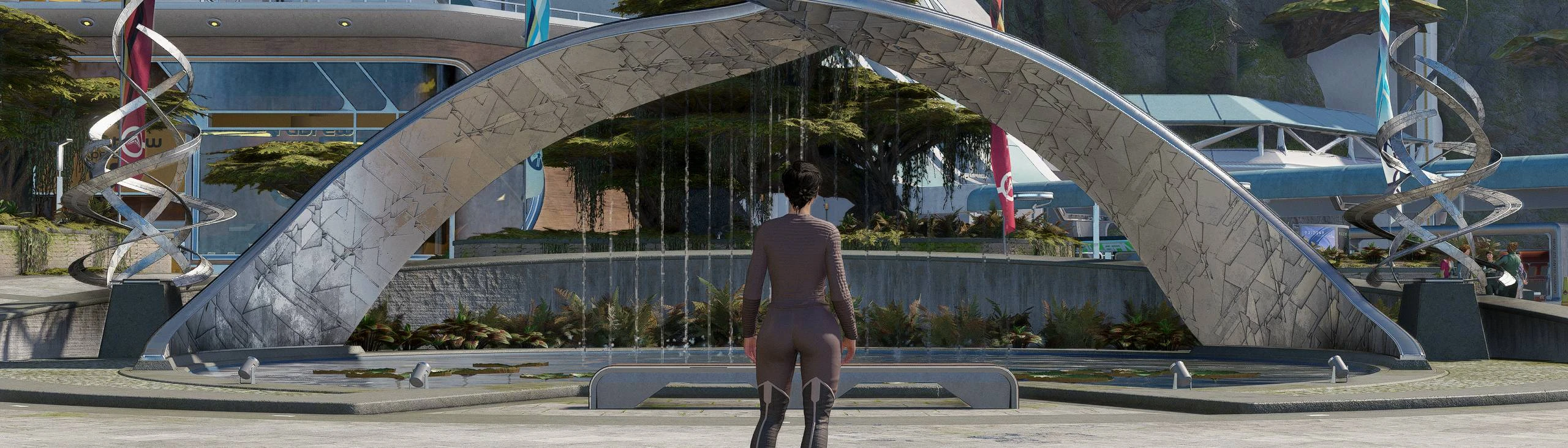
This is what it looks like once the game loads.
Any help on what I have done wrong would be appreciated.
At least for those using gravity LUT or stellar LUT, this appears to be a downgrade due to excessive contrast. It puts pitch black darkness in places that should be only lightly obscured by shadow.
There are 3 presets with 3 different gamma/black curves. Which one have you tried? Did you try it with SDR or HDR? Which versions of the LUTs mentioned have you tried?
The primary goal of this reshade is too correct certain cons of each outputs. I have not looked into Gravity LUT or Stellar LUT because they change the games gradients a lot and already is ''reshaded''. They should not need a reshade because the goal of the LUT is to create an artistic look.
You could try PRS 1.0 or 1.3. Those should be compatible with Gravity.
I was replaying cyberpunk 2077 and I was looking for a reshade preset when I noticed that 2077 also had a lot of "green" but I couldn't find a preset I liked, then I took the plunge and tried this Starfield reshade, unbelievable, perfect compatibility. Thanks again. Imgsli _____ Imgsli
this is still my favorite reshade, been using PRS 1.3 No Green this whole time. it does wonders on nearly everything, but especially faces. it pairs quite nicely with NaturalLUTs Enhanced, too, for what it's worth.
I've had this problem myself and I don't exactly know what's causing it, seems to be an issue with the shaders itself. I think I renamed the ini file and restarted starfield with the new preset. I think it's DELC sharpen that's causing the weird grain issue.
If that doesn't work then try disable all the shaders im using, restart starfield and enable all of them when your in game.
I tested it briefly at New Atlantis and I honestly prefer 1.3 shadows for now, as 2.0 might be a bit too blue. The 2.0 at sunlight is too bright for me. This is just a preliminary conclusion based on my personal tastes, and I'll continue to test. 2.0 vs. 1.3 vs. vanilla 2.0 vs. 1.3 vs. vanilla (2) ———————————————————— 22:34 I repeatedly switched convinced that version 2.0 was a few frames lower than version 1.3. I also seem to be experiencing stuttering issues that are hard to replicate.
For your own sanity, stick to neutral and gravity luts. (or just any one or two) The more (different luts) you try to "implement" (make it work with), the more obsticles you put yourself in the way.
Ok, I will recommend that players who are similar to me use prs1.3 and Gravity lut.For better performance and reality, the shadow of walking in the sun on the cement pavement is almost the feeling of gray with a little green. 【See my screenshot uploaded to the media or the link above.】 (from translation)
I agree with you. Most of the time, video games have unrealistic coloration (too many colors). We don't really notice it, but in reality, the world is duller. Until now, I've been using NaturaLUTs with Rudy ReShade. I just tried your ReShade, and I must admit that I find it more realistic. I'll edit my message later after I've played around with your ReShade a bit more to give a cooler opinion, as I'm reacting in the moment right after installing your ReShade.
I'm coming back to give a definitive opinion, I have totally adopted it. I tried version 1.2 and Vivid, I did not appreciate Vivid which was too bright in color, as for version 1.2, well, I was not able to see a visual difference with version 1.0 (my eyes are perhaps tired, or the change is too subtle, tested on Neon).
I saw a person talk about Gravity LUT, I tried it on my side and I found it much too dark, with the same flaw that I systematically have with Gravity, that is to say a too significant bloom effect. Tested in 1.0 before the release of 1.2 and Vivid.
What a great feedback! Thank you and I'm glad you like it :)
Difference between 1.0 and 1.2 is very subtle indeed, just a few very small hue, gamma, bloom and contrast changes. I agree about vivid, tho I made it for people who don't bump up the colors on their hardware/screen :)
If people request a gravity version then I'm up for it!
How about a Stellar LUT version? While I did like Gravity, I found that it didn't really feel right when every planet had very Earth like lighting, regardless of the type of star the planet was orbiting. Stellar LUT on the other hand just feels better for exoplanets in my opinion.
I agree with you guys, the gravitational LUT is indeed too grey in some ways, it also kills a lot of the stellar signature light, and I'm looking forward to that author's continued optimization. As for the stellar LUT, I haven't tried it yet, and some people have commented that they prefer the latter.


61 comments
This is what it looks like once the game loads.
Thanks
Edit: I've updated the guide on the page! Try out OpenDRT for best possible HDR quality.
:edit: giving ya kudos for just being dope
Kudos for kudos my friend, have a nice day :)
Which one have you tried?
Did you try it with SDR or HDR?
Which versions of the LUTs mentioned have you tried?
The primary goal of this reshade is too correct certain cons of each outputs. I have not looked into Gravity LUT or Stellar LUT because they change the games gradients a lot and already is ''reshaded''. They should not need a reshade because the goal of the LUT is to create an artistic look.
You could try PRS 1.0 or 1.3. Those should be compatible with Gravity.
Thanks again.
Imgsli
_____
Imgsli
Feels like a new game.
(in-game film grain is turned off)
https://i.imgur.com/JBPfxZ1.png
try disabling "unsharp" ?
If that doesn't work then try disable all the shaders im using, restart starfield and enable all of them when your in game.
That would be a nice "feature" to add to the changelog ;)
Thank you
EDIT:
In your screenshots (New Altantis with Andreja), the only difference I see is minimal change in the.... rose/pink sky...
EDIT 2:
Seems I have overseen the first line in the files, because my eyes had just blended out those "if you already installed ...."
Check out my new reshade!
I just wanted to submit a video to your page using PSR 2.0, but seems I can only add it to "starfield" in general, not to your mod :(
https://www.nexusmods.com/starfield/videos/703
idk...
If you like it, feel free to add it "as your own".
Direct link: https://www.youtube.com/watch?v=plio2X-atRQ
2.0 vs. 1.3 vs. vanilla
2.0 vs. 1.3 vs. vanilla (2)
————————————————————
22:34 I repeatedly switched convinced that version 2.0 was a few frames lower than version 1.3. I also seem to be experiencing stuttering issues that are hard to replicate.
You can adjust the tint there as well, right next to global temp.
Lightroom - global temp
Comparison: Starfiled hue temp - Imgsli
After adjusting according to your method, the shadow performance can indeed recover to my favorite 1.3. Thank you again.
PRS2.0 is still experiencing lower framerates for me at the moment.
New Atlantis: 57FPS (vanilla) >54FPS (PRS1.3) >50FPS (PRS2.0).
I feel that the color of 2.0 is more saturated and the public should like it better.
I will continue to test 2.0 to provide more feedback.
(All of the above are from translation software)
The more (different luts) you try to "implement" (make it work with), the more obsticles you put yourself in the way.
【See my screenshot uploaded to the media or the link above.】
(from translation)
I saw a person talk about Gravity LUT, I tried it on my side and I found it much too dark, with the same flaw that I systematically have with Gravity, that is to say a too significant bloom effect. Tested in 1.0 before the release of 1.2 and Vivid.
I want to thank the author for his work.
Difference between 1.0 and 1.2 is very subtle indeed, just a few very small hue, gamma, bloom and contrast changes.
I agree about vivid, tho I made it for people who don't bump up the colors on their hardware/screen :)
If people request a gravity version then I'm up for it!
Thank you again.