I actually fixed it (for StarUI Inventory, at least):
Open StarUI Inventory.ini (found in StarUI Inventory install package). Scroll down a bit until you see "Fonts" list, add another option "; 7 Helvetica" and below change "iUseFont = 7". Should work, if it looks like this:
; Fonts ; Available fonts: ; 0 Default ("NB Architekt") ; 1 NB Architekt Light ; 2 NB Architekt ; 3 NB Grotesk R Semibold ; 4 NB Grotesk R Bold ; 5 Arial ; 6 Consolas ; 7 Helvetica iUseFont = 7
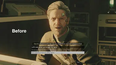
I really prefer the look and readability of the Helvetica mod (obviously) but I'd already been using the icons mod and I can't part with the gameplay changes. Being able to see at a glance what's junk and what's a resource (and the resource's rarity), what's just food and what has other effects, etc, is just too much to part with.
It seems the Starfield String Sharpener mod found a way to be compatible with Icon Sorting Tags (unfortunately SSS keeps the games awful all-uppercase styling).
So perhaps there's hope for a decent font, lowercase letters, and icon tags all coexisting.
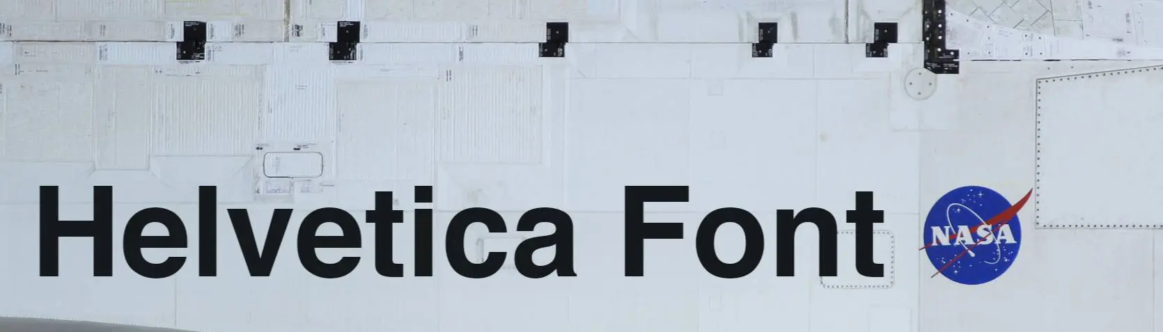
Unfortunately, the capital letters in Helvetica are much wider than the default font NB Architekt, so there are a lot of clipping errors where text goes out of bounds. Also, the headings should be all-caps, not mixed case to fit in with the default game strings. I think to use Helvetica, one would need to do a more comprehensive overhaul that makes use of various weights and widths of Helvetica. For example, using Condensed Helvetica 500 + 300 for the headings (NB Architekt + NB Architekt Light) and then regular Helvetica 400 for body (NB Grotesk R). Helvetica is not licensed for free public use, however, so it's not quite so easy to drop in.
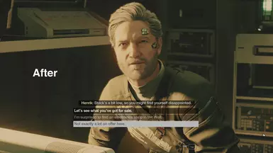
I haven't bumped into serious clipping issues so far. I've checked the ship UI, crafting benches and computer screens. But I do agree the mixed case didn't look like vanilla, but considering the vanilla NB Architekt had no lowercase letters, then the mixed case is really just how Bethesda originally typed the strings. It's just a font replacement. But yeah, it would take a further typography overhaul to really perfect the arrangements.
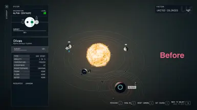
Yeah, you're totally right, they got sloppy when typing out the heading strings and some of them are mixed case! You would have to convert your .ttf to be all uppercase like the original, as you point out. If you look at your last posted screenshot of the solar system, you'll see "Magnetosphere" overflows a bit, and then the "Resources Unknown" is partially cut off. I love Helvetica, so I'm happy to see you create this. I just wonder what it would look like with some other flavors of Helvetica thrown in to really perfect it!
Wouldn't it be possible to include an edited version of the Helvetica font that simply has all the lowercase letters replaced with uppercase letters so that it ends up being all caps so it can more accurately replace NB Architekt?
Helvetica is such a beautiful font. I have a copy of Helvetica Display Now, which is a little more brutalist / futuristic in my opinion. Maybe I'll look into figuring out how do what you did.
Would you create a version where only the first letter of each word is upper case with the rest of the letters being lower case? I.e. how a normal human being would write, as opposed to this forced upper case abomination Bethesda came up with?


35 comments
Is it because my language is set to French ? or new updates ?
I tested other font mods, and they work.
Open StarUI Inventory.ini (found in StarUI Inventory install package). Scroll down a bit until you see "Fonts" list, add another option "; 7 Helvetica" and below change "iUseFont = 7". Should work, if it looks like this:
; Fonts
; Available fonts:
; 0 Default ("NB Architekt")
; 1 NB Architekt Light
; 2 NB Architekt
; 3 NB Grotesk R Semibold
; 4 NB Grotesk R Bold
; 5 Arial
; 6 Consolas
; 7 Helvetica
iUseFont = 7
I really prefer the look and readability of the Helvetica mod (obviously) but I'd already been using the icons mod and I can't part with the gameplay changes. Being able to see at a glance what's junk and what's a resource (and the resource's rarity), what's just food and what has other effects, etc, is just too much to part with.
Let me know if you find a way to make both work
So perhaps there's hope for a decent font, lowercase letters, and icon tags all coexisting.
I.e. how a normal human being would write, as opposed to this forced upper case abomination Bethesda came up with?