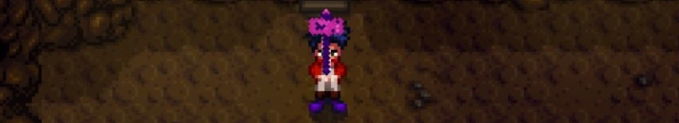
Treat this as constructive criticism. I know this is a WIP so I don't expect everything to be on point yet. That said, here are the few things I noticed from the images: -The colors are not in sync with the rest of the game. Maybe you could try darkening them a bit and see if that helps. -The weapon handles are a bit too big. Maybe you could shorten them to be more similar to the original, vanilla versions.
I think this is a great idea. I hope that this helped you. Have a nice day
I will look into making some of the weapons a bit darker like you suggested, although I wanted to be a bit different from the game just a tad. As for the handles part, I wanted them to be larger so I can have some leeway when doing some fancy hilt designs and such. Though, I will probably extend some of the blades a bit downwards to try to compensate.
Edit: Thank you for your suggestions. I also constantly compare my edited versions to the vanilla versions to somewhat get an idea, as well. Even though I use some of the colors from the original version to work with.


3 comments
-The colors are not in sync with the rest of the game. Maybe you could try darkening them a bit and see if that helps.
-The weapon handles are a bit too big. Maybe you could shorten them to be more similar to the original, vanilla versions.
I think this is a great idea. I hope that this helped you. Have a nice day
Edit: Thank you for your suggestions. I also constantly compare my edited versions to the vanilla versions to somewhat get an idea, as well. Even though I use some of the colors from the original version to work with.