i use the classic tabs with the simple icons! i like it because it doesnt stray too far from the vanilla aesthetic but you can tell it's different :) really cute as well
Tbh, this is such a great idea, do you pretend to add more types of tabs? or maybe something to change color or the existing ones? For example the bookmark in different colors i think would be great! And if you don't mind i have some suggestions; 1 - You have 2 screenschots showing the menu, but you could use only one screenshot showing how it works, in the side tabs, and in the upper ones, maybe would also be cool to add a screenshot of every tab type, so we can see how it's in-game. 2 - In the original tab, they "connect" when they are selected, but your mod can't connect, since the colors and shapes doesn't match. I think that a cool thing that you could do, its to make a more smooth "end" to the tab, for now it's like it's just cut or flat, UNLESS this is your intention, i hope you can understand. Maybe just round edges would do the job, idk. 3 - I think would be nice to include the other buttons that the interface have, for example the organize and the community center buttons. 4 - Maybe would also be cool to do some more details in the interface, for example, the frame that show our character, and the clothes and rings squares? Anyways, i loved the mod, keep the good work
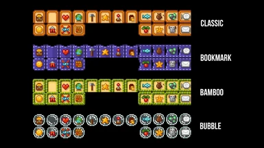
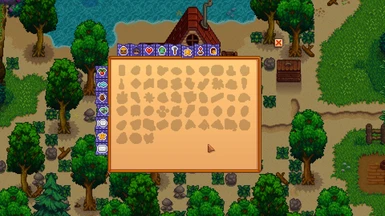
Unfortunately, the only way to completely solve this problem is to completely redo the entire inventory. But here are 2 examples of how you can visually hide the link.
As for redoing the rest of the elements, that's in the plans, but I need time to finish what's already planned. That's what I'm working on right now:
Wow, these look much better tbh, they don't look like the're cut. And good to know your future plans for the mod, also, these icons are pretty, i liked them a lot. Keep the good work!
Thank you for your interest in the mod. Unfortunately, I haven't tested compatibility yet, but I would really appreciate it if you could describe your experience. 💖
Ok I tested it with and without Sakura Interface Redux since that's what I use, and it seems like it works BUT you have to use the patch reload command, because the configs don't stick. It's the same even if you're not using a UI mod.


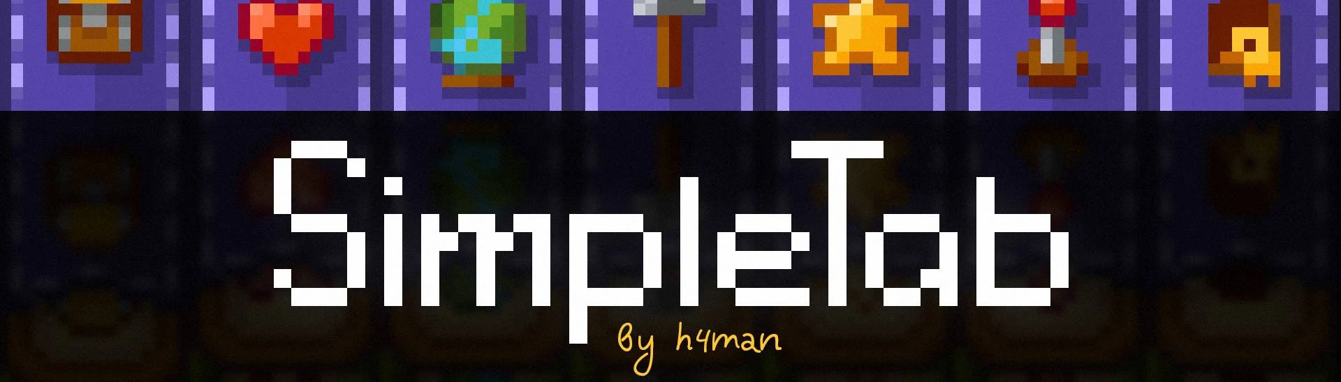
20 comments
And if you don't mind i have some suggestions;
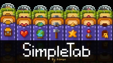
1 - You have 2 screenschots showing the menu, but you could use only one screenshot showing how it works, in the side tabs, and in the upper ones, maybe would also be cool to add a screenshot of every tab type, so we can see how it's in-game.
2 - In the original tab, they "connect" when they are selected, but your mod can't connect, since the colors and shapes doesn't match. I think that a cool thing that you could do, its to make a more smooth "end" to the tab, for now it's like it's just cut or flat, UNLESS this is your intention, i hope you can understand. Maybe just round edges would do the job, idk.
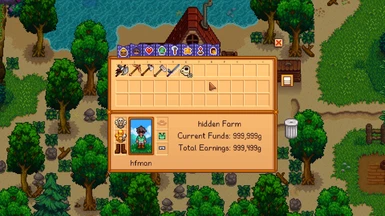
3 - I think would be nice to include the other buttons that the interface have, for example the organize and the community center buttons.
4 - Maybe would also be cool to do some more details in the interface, for example, the frame that show our character, and the clothes and rings squares?
Anyways, i loved the mod, keep the good work
As for redoing the rest of the elements, that's in the plans, but I need time to finish what's already planned.
That's what I'm working on right now:
And good to know your future plans for the mod, also, these icons are pretty, i liked them a lot.
Keep the good work!