2020 - 12 - 09 New Version 3 released with FOMOD installation. Big update with several options available, all viewable in the images tab.
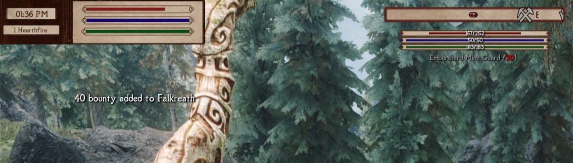
My philosophy with this update was to go with thinner bars that took up less space - actually going back to vanilla proportions as the original bars I made were all wider in an attempt to come closer to Dear Diary's inventory style. Actually these proportions aren't the same even in base SkyUI vs the vanilla HUD, so no reason to build the entire design around them being a certain size.
By going thinner it opens up more space on the screen for other elements, not least the actually gameplay. As well as tidying up the notepad style, I also decided to go with several different options for full frames (bars) covering the top or bottom (or both!) of the screen. The idea here is to create a tidy space on the screen in which the HUD and widgets can be placed so they're not 'floating' in the main gameplay area. It's quite an old-school RPG theory of UI design, certainly not what you see in modern ARPGs, but we're here to try something different anyway, right? I threw together a couple of quick examples in the images tab of what can be done here, and if you devote more time to positioning your HUD features (particularly iEquip) you can probably achieve something much nicer than those examples.
Also, mere minutes before uploading this I decided to add an alternate Compass style, which you can see on the description tab. It's very simple in design, but I feel it fits very well with the new paper frames in-game. The description tab explains how to switch to this in your skyhud.txt config file.
Textures from mod are working, but Health, Stamina, Magika HUD are appearing vanilla... Have tried Paper HUD & Paper HUD - Directors Cut. Getting the same problem with both.
This is my favorite HUD by far. Along with Imperial UI and Oblivionesque icons, it's perfection.
I hate to ask, but I have one little request if you ever get around to it... Is there any chance you might have an option that removes the diamond symbol and "empty" text for containers? I find it really distracting and would prefer to just see the container name (i.e. Chest / Bookcase) rather than the "empty" with the diamond beneath it. There is a mod that does this for LE but obviously it conflicts with the hudmenu.swf from this so I can't use it.
Good HUD. I actually managed to fix the widget order issue, where the AMOT background randomly loads on top of other widgets. I forced the AMOT widget to always load first (on the bottom) by SkyUI's widgetloader action script. Not sure if anyone needs it.


; Should work well with any SkyHUD preset")

")


230 comments
My philosophy with this update was to go with thinner bars that took up less space - actually going back to vanilla proportions as the original bars I made were all wider in an attempt to come closer to Dear Diary's inventory style. Actually these proportions aren't the same even in base SkyUI vs the vanilla HUD, so no reason to build the entire design around them being a certain size.
By going thinner it opens up more space on the screen for other elements, not least the actually gameplay. As well as tidying up the notepad style, I also decided to go with several different options for full frames (bars) covering the top or bottom (or both!) of the screen. The idea here is to create a tidy space on the screen in which the HUD and widgets can be placed so they're not 'floating' in the main gameplay area. It's quite an old-school RPG theory of UI design, certainly not what you see in modern ARPGs, but we're here to try something different anyway, right? I threw together a couple of quick examples in the images tab of what can be done here, and if you devote more time to positioning your HUD features (particularly iEquip) you can probably achieve something much nicer than those examples.
Also, mere minutes before uploading this I decided to add an alternate Compass style, which you can see on the description tab. It's very simple in design, but I feel it fits very well with the new paper frames in-game. The description tab explains how to switch to this in your skyhud.txt config file.
https://www.nexusmods.com/skyrimspecialedition/mods/71433?
How would I get rid of the paper bar? I already have a flash decompiler
Thank you for this great mod :]
I hate to ask, but I have one little request if you ever get around to it... Is there any chance you might have an option that removes the diamond symbol and "empty" text for containers? I find it really distracting and would prefer to just see the container name (i.e. Chest / Bookcase) rather than the "empty" with the diamond beneath it. There is a mod that does this for LE but obviously it conflicts with the hudmenu.swf from this so I can't use it.