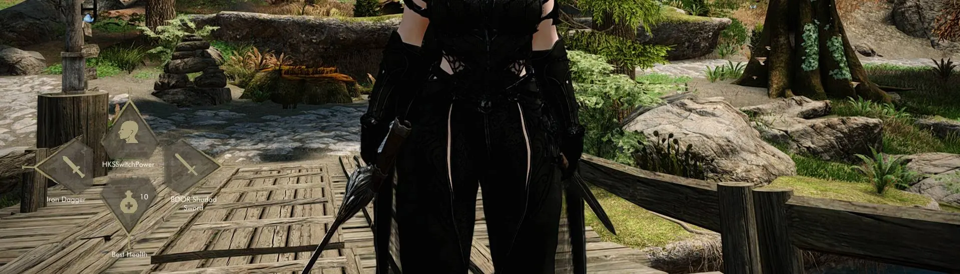
For anyone interested in having it set to bottom right align copy the following and go into your skyhud.txt that comes included in the download, select all and paste and save.
# A square layout that can show equip sets.
# This layout uses the new layout design.
#
# All SoulsyHUD layouts are written in TOML. To learn more about TOML,
# visit its official website: https://toml.io/
#
# Global scaling factor: the whole hud size changes when you change this.
global_scale = 1.0

# A named location for the HUD. Use this as a shortcut for common anchor
# points. These work no matter what the player's screen resolution is, because this
# is turned into a location point at run-time.
# Values: bottom_left, bottom_right, top_left, top_right, center,
# center_top, center_bottom, left_center, right_center
anchor_name = "bottom_right"

# You can also specify the anchor point like this if a named anchor point
# doesn't work for your layout. These values are NOT scaled.
# anchor = { x = 2700.0, y = 825.0 }

# The size of the HUD bounding box. This is used to help place the HUD on the screen
# but is not enforced in any way. (The HUD isn't clipped to this region, for instance.)
size = { x = 75.0, y = 250.0 }

# Only draw the ammo slot when a weapon that uses ammo (ranged) is equipped.
hide_ammo_when_irrelevant = true
# Hide the left hand slot when a ranged weapon is equipped. This lets you
# use the same location as the left hand to show ammo.
hide_left_when_irrelevant = true

# The file containing the typeface to use. Must be truetype. Must be in resources/fonts.
font = "futura-book-bt.ttf"
# A font sizing hint to the font loader about what size most of the text will use.
# Text rendered at this size will look best. This value is scaled before the font is loaded.
# Text alignment calculations are made using this font size.
font_size = 18.0

# Enable any of these you need text rendering for.
# You will need to supply a true-type font with the glyphs; futura doesn't have them.
# The "Inter" font packaged with the i18 layout does have them.
chinese_full_glyphs       = false
cyrillic_glyphs           = false
japanese_glyphs           = false
korean_glyphs             = false
simplified_chinese_glyphs = false
thai_glyphs               = false
vietnamese_glyphs         = false

# An optional background image. If your layout doesn't have an overall background, you
# can safely leave this out. All image elements look like this.
[background]
# This is the file name of an SVG, relative to  `./resources/backgrounds`.
svg = "hud.svg"
# The size to draw the image.
size = { x = 440.0, y = 5000.0 }
# The color to draw the image with. If alpha is zero, the background is not drawn.
color = { r = 255, g = 255, b = 255, a = 0 }


# ----- right hand slot

# The slot showing what's in the right hand.
[right]
# Where the center of this element is relative to the HUD anchor.
offset = { x = -90.0, y = -35.0 }

# Optional slot background image: if not present, not drawn. You can have
# different background images for different slots if you like.
[right.background]
color = { r = 255, g = 255, b = 255, a = 255 }
size  = { x = 150.0, y = 60.0 }
svg   = "edge_right.svg"

# the icon element of this slot. Color might be overridden if
# the user has "colorize icons" enabled.
[right.icon]
color  = { r = 170, g = 160, b = 122, a = 255 }
offset = { x = -20.0, y = -30.0 }
size   = { x = 45.0, y = 45.0 }

# Optional display for the slot's hotkey. All hotkey elements look like this.
[right.hotkey]
color  = { r = 255, g = 255, b = 255, a = 0 }
offset = { x = -50.0, y = 0.0 }
size   = { x = 30.0, y = 30.0 }
# An optional background image for the hotkey. You can leave this out to not
# draw a background for the hotkey display.
[right.hotkey.background]
color = { r = 255, g = 255, b = 255, a = 128 }
size  = { x = 30.0, y = 30.0 }
svg   = "key_bg.svg"

# An array of text elements for this slot. You can have as many
# as you want, but each one costs time to draw so keep the count low.
# The text can include values filled in from the item's info. To
# fill in a value, name it surrounded with curly braces, like the
# example.
# Possible values: count, name, kind,

[[right.text]]
alignment  = "center"
color      = { r = 176, g = 173, b = 163, a = 255 }
contents   = "{name}"
font_size  = 17.5
offset     = { x = -75.0, y = 55.0 }
wrap_width = 130.0

# An optional indicator for showing if this item is poisoned.
[right.poison]
offset = { x = 25.0, y = 20.0 }
[right.poison.indicator]
color = { r = 160, g = 240, b = 2, a = 255 }
size  = { x = 10.0, y = 25.0 }
svg   = "../icons/indicator_poison.svg"

[right.meter]
# What angle to draw the image at, an integer from 0 to 360.
# 0 is horizontal. >
# 90 is rotated counter-clockwise 90° to vertical.  ^
# The meter is presumed to fill from LEFT to RIGHT before rotation.
# Rotating 90° makes it fill from bottom to top.
# Rotating 180° makes it fill from right to left. Etc.  <
angle = 90
# An offset for the CENTER of the meter, from the center of the slot.
# The meter is rotated around this point. You should play with the offset
# until it looks correct for your chosen rotation.
offset = { x = 65.0, y = 0.0 }
# How to draw the empty part of the meter, or any decoration around the meter.
[right.meter.background]
# This size is the size of the image before rotation!
size = { x = 100.0, y = 20.0 }
# The SVG file to use for the progress bar. This should like in the
# `resources/backgrounds` folder. You can reference another folder with
# `../icons/file_in_icons_dir.svg` if you need to.
svg = "meter_bar_empty.svg"
# The color for the background, or empty part, of the meter.
color = { r = 255, g = 255, b = 255, a = 255 }
[right.meter.filled]
# You can leave the filled svg empty if you want. If you do this, the
# filled portion of the meter will re-use the background image, but
# shortened to indicate the percentage of the meter that's filled.
# E.g., 50% full would be half the length.
svg = "meter_bar_filled.svg"
# The size of the filled meter when the charge/fuel/whatever is at max.
size = { x = 96.0, y = 18.0 }
# The color for the filled part of the meter.
color = { r = 80, g = 0, b = 145, a = 255 }

# ----- left hand slot

[left]
offset = { x = -350.0, y = -35.0 }

[left.background]
color = { r = 255, g = 255, b = 255, a = 255 }
size  = { x = 150.0, y = 60.0 }
svg   = "edge_left.svg"

[left.icon]
color  = { r = 170, g = 160, b = 122, a = 255 }
offset = { x = 25.0, y = -25.0 }
size   = { x = 45.0, y = 45.0 }

[left.hotkey]
color  = { r = 255, g = 255, b = 255, a = 0 }
offset = { x = -50.0, y = 0.0 }
size   = { x = 30.0, y = 30.0 }
[left.hotkey.background]
color = { r = 255, g = 255, b = 255, a = 128 }
size  = { x = 30.0, y = 30.0 }
svg   = "key_bg.svg"

# An optional indicator for showing if this item is poisoned.
[left.poison]
offset = { x = 25.0, y = 20.0 }
[left.poison.indicator]
color = { r = 160, g = 240, b = 2, a = 255 }
size  = { x = 10.0, y = 25.0 }
svg   = "../icons/indicator_poison.svg"

[[left.text]]
alignment  = "center"
color      = { r = 176, g = 173, b = 163, a = 255 }
contents   = "{name}"
font_size  = 17.5
offset     = { x = -35, y = 55.0 }
wrap_width = 100.0

[left.meter]
angle  = 90
offset = { x = -65.0, y = 0.0 }
[left.meter.background]
color = { r = 255, g = 255, b = 255, a = 255 }
size  = { x = 100.0, y = 20.0 }
svg   = "meter_bar_empty.svg"
[left.meter.filled]
color = { r = 80, g = 0, b = 145, a = 255 }
size  = { x = 96.0, y = 18.0 }
svg   = "meter_bar_filled.svg"

# ----- utility slot

[utility]
offset = { x = -220.0, y = 0.0 }
[utility.background]
color = { r = 255, g = 255, b = 255, a = 255 }
size  = { x = 120.0, y = 120.0 }
svg   = "edge_bottom.svg"
[utility.icon]
color  = { r = 170, g = 160, b = 122, a = 255 }
offset = { x = 0.0, y = -20.0 }
size   = { x = 45.0, y = 45.0 }
[utility.hotkey]
color  = { r = 255, g = 255, b = 255, a = 0 }
offset = { x = -50.0, y = 0.0 }
size   = { x = 30.0, y = 30.0 }
[utility.hotkey.background]
color = { r = 255, g = 255, b = 255, a = 0 }
size  = { x = 30.0, y = 30.0 }
svg   = "key_bg.svg"
[[utility.text]]
alignment = "left"
color      = { r = 176, g = 173, b = 163, a = 255 }
contents  = "{count}"
font_size = 17.5
offset    = { x = 22.0, y = -40.0 }
[[utility.text]]
alignment  = "center"
color      = { r = 176, g = 173, b = 163, a = 255 }
contents   = "{name}"
font_size  = 17.5
offset     = { x = -51.0, y = 75.0 }
wrap_width = 105.0

# ----- power slot

[power]
offset = { x = -222.0, y = -130.0 }
[power.background]
color = { r = 255, g = 255, b = 255, a = 255 }
size  = { x = 120.0, y = 120.0 }
svg   = "edge_top.svg"
[power.icon]
color  = { r = 170, g = 160, b = 122, a = 255 }
offset = { x = -3.0, y = 15.0 }
size   = { x = 45.0, y = 45.0 }
[power.hotkey]
color  = { r = 255, g = 255, b = 255, a = 0 }
offset = { x = -50.0, y = 0.0 }
size   = { x = 30.0, y = 30.0 }
[power.hotkey.background]
color = { r = 255, g = 255, b = 255, a = 0 }
size  = { x = 30.0, y = 30.0 }
svg   = "key_bg.svg"

[[power.text]]
alignment  = "center"
color      = { r = 176, g = 173, b = 163, a = 255 }
contents   = "{name}"
font_size  = 17.5
offset     = { x = -54.0, y = -100.0 }
wrap_width = 105.0

[power.meter]
angle  = 90
offset = { x = 72.5, y = -17.0 }
[power.meter.background]
color = { r = 255, g = 255, b = 255, a = 255 }
size  = { x = 62.5, y = 20.0 }
svg   = "meter_bar_empty.svg"
[power.meter.filled]
color = { r = 150, g = 200, b = 244, a = 255 }
size  = { x = 62.5, y = 20.0 }
svg   = "meter_bar_filled.svg"

# ----- ammo slot

[ammo]
offset = { x = -90.0, y = -35.0 }
[ammo.background]
color = { r = 255, g = 255, b = 255, a = 255 }
size  = { x = 150.0, y = 60.0 }
svg   = "edge_left.svg"
[ammo.icon]
color  = { r = 170, g = 160, b = 122, a = 255 }
offset = { x = 25.0, y = -25.0 }
size   = { x = 45.0, y = 45.0 }
# Note that this slot separates count and name, and uses
# a text element for each.
[[ammo.text]]
alignment = "left"
color      = { r = 176, g = 173, b = 163, a = 255 }
contents  = "{count}"
font_size = 17.5
offset    = { x = 50.0, y = -40.0 }
[[ammo.text]]
alignment  = "center"
color      = { r = 176, g = 173, b = 163, a = 255 }
contents   = "{name}"
font_size  = 17.5
offset     = { x = -35, y = 55.0 }
wrap_width = 100.0

# ----- equipset slot

[equipset]
offset = { x = -110.0, y = -175.0 }
[equipset.background]
color = { r = 255, g = 255, b = 255, a = 255 }
size  = { x = 50.0, y = 50.0 }
svg   = "hud.svg"
[equipset.icon]
color  = { r = 200, g = 200, b = 200, a = 255 }
offset = { x = 0.0, y = 0.0 }
size   = { x = 30.0, y = 30.0 }
[equipset.hotkey]
color  = { r = 255, g = 255, b = 255, a = 0 }
offset = { x = -50.0, y = 0.0 }
size   = { x = 30.0, y = 30.0 }
[[equipset.text]]
alignment  = "left"
color      = { r = 255, g = 255, b = 255, a = 0 }
contents   = "{name}"
font_size  = 18.0
offset     = { x = -50.0, y = 55.0 }
wrap_width = 140.0
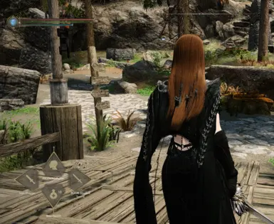
That reskin is beautiful ! is there a way to make it a little bit bigger tho , i feel like everything looks quite small with the reskin compare to what i had before ?
Do you happen to know why it won’t move properly to any other preset location. Works on bottom left, center left but nothing on the right. Also like the offset number is off In the skse file but I can’t figure out what to edit to fix


26 comments
Open animation replacer noted the ShieldSwordNpc folder as a warning, they were writing on the same file, so I merged the Scar files with the others.
# A square layout that can show equip sets.
# This layout uses the new layout design.
#
# All SoulsyHUD layouts are written in TOML. To learn more about TOML,
# visit its official website: https://toml.io/
#
# Global scaling factor: the whole hud size changes when you change this.
global_scale = 1.0
# A named location for the HUD. Use this as a shortcut for common anchor
# points. These work no matter what the player's screen resolution is, because this
# is turned into a location point at run-time.
# Values: bottom_left, bottom_right, top_left, top_right, center,
# center_top, center_bottom, left_center, right_center
anchor_name = "bottom_right"
# You can also specify the anchor point like this if a named anchor point
# doesn't work for your layout. These values are NOT scaled.
# anchor = { x = 2700.0, y = 825.0 }
# The size of the HUD bounding box. This is used to help place the HUD on the screen
# but is not enforced in any way. (The HUD isn't clipped to this region, for instance.)
size = { x = 75.0, y = 250.0 }
# Only draw the ammo slot when a weapon that uses ammo (ranged) is equipped.
hide_ammo_when_irrelevant = true
# Hide the left hand slot when a ranged weapon is equipped. This lets you
# use the same location as the left hand to show ammo.
hide_left_when_irrelevant = true
# The file containing the typeface to use. Must be truetype. Must be in resources/fonts.
font = "futura-book-bt.ttf"
# A font sizing hint to the font loader about what size most of the text will use.
# Text rendered at this size will look best. This value is scaled before the font is loaded.
# Text alignment calculations are made using this font size.
font_size = 18.0
# Enable any of these you need text rendering for.
# You will need to supply a true-type font with the glyphs; futura doesn't have them.
# The "Inter" font packaged with the i18 layout does have them.
chinese_full_glyphs = false
cyrillic_glyphs = false
japanese_glyphs = false
korean_glyphs = false
simplified_chinese_glyphs = false
thai_glyphs = false
vietnamese_glyphs = false
# An optional background image. If your layout doesn't have an overall background, you
# can safely leave this out. All image elements look like this.
[background]
# This is the file name of an SVG, relative to `./resources/backgrounds`.
svg = "hud.svg"
# The size to draw the image.
size = { x = 440.0, y = 5000.0 }
# The color to draw the image with. If alpha is zero, the background is not drawn.
color = { r = 255, g = 255, b = 255, a = 0 }
# ----- right hand slot
# The slot showing what's in the right hand.
[right]
# Where the center of this element is relative to the HUD anchor.
offset = { x = -90.0, y = -35.0 }
# Optional slot background image: if not present, not drawn. You can have
# different background images for different slots if you like.
[right.background]
color = { r = 255, g = 255, b = 255, a = 255 }
size = { x = 150.0, y = 60.0 }
svg = "edge_right.svg"
# the icon element of this slot. Color might be overridden if
# the user has "colorize icons" enabled.
[right.icon]
color = { r = 170, g = 160, b = 122, a = 255 }
offset = { x = -20.0, y = -30.0 }
size = { x = 45.0, y = 45.0 }
# Optional display for the slot's hotkey. All hotkey elements look like this.
[right.hotkey]
color = { r = 255, g = 255, b = 255, a = 0 }
offset = { x = -50.0, y = 0.0 }
size = { x = 30.0, y = 30.0 }
# An optional background image for the hotkey. You can leave this out to not
# draw a background for the hotkey display.
[right.hotkey.background]
color = { r = 255, g = 255, b = 255, a = 128 }
size = { x = 30.0, y = 30.0 }
svg = "key_bg.svg"
# An array of text elements for this slot. You can have as many
# as you want, but each one costs time to draw so keep the count low.
# The text can include values filled in from the item's info. To
# fill in a value, name it surrounded with curly braces, like the
# example.
# Possible values: count, name, kind,
[[right.text]]
alignment = "center"
color = { r = 176, g = 173, b = 163, a = 255 }
contents = "{name}"
font_size = 17.5
offset = { x = -75.0, y = 55.0 }
wrap_width = 130.0
# An optional indicator for showing if this item is poisoned.
[right.poison]
offset = { x = 25.0, y = 20.0 }
[right.poison.indicator]
color = { r = 160, g = 240, b = 2, a = 255 }
size = { x = 10.0, y = 25.0 }
svg = "../icons/indicator_poison.svg"
[right.meter]
# What angle to draw the image at, an integer from 0 to 360.
# 0 is horizontal. >
# 90 is rotated counter-clockwise 90° to vertical. ^
# The meter is presumed to fill from LEFT to RIGHT before rotation.
# Rotating 90° makes it fill from bottom to top.
# Rotating 180° makes it fill from right to left. Etc. <
angle = 90
# An offset for the CENTER of the meter, from the center of the slot.
# The meter is rotated around this point. You should play with the offset
# until it looks correct for your chosen rotation.
offset = { x = 65.0, y = 0.0 }
# How to draw the empty part of the meter, or any decoration around the meter.
[right.meter.background]
# This size is the size of the image before rotation!
size = { x = 100.0, y = 20.0 }
# The SVG file to use for the progress bar. This should like in the
# `resources/backgrounds` folder. You can reference another folder with
# `../icons/file_in_icons_dir.svg` if you need to.
svg = "meter_bar_empty.svg"
# The color for the background, or empty part, of the meter.
color = { r = 255, g = 255, b = 255, a = 255 }
[right.meter.filled]
# You can leave the filled svg empty if you want. If you do this, the
# filled portion of the meter will re-use the background image, but
# shortened to indicate the percentage of the meter that's filled.
# E.g., 50% full would be half the length.
svg = "meter_bar_filled.svg"
# The size of the filled meter when the charge/fuel/whatever is at max.
size = { x = 96.0, y = 18.0 }
# The color for the filled part of the meter.
color = { r = 80, g = 0, b = 145, a = 255 }
# ----- left hand slot
[left]
offset = { x = -350.0, y = -35.0 }
[left.background]
color = { r = 255, g = 255, b = 255, a = 255 }
size = { x = 150.0, y = 60.0 }
svg = "edge_left.svg"
[left.icon]
color = { r = 170, g = 160, b = 122, a = 255 }
offset = { x = 25.0, y = -25.0 }
size = { x = 45.0, y = 45.0 }
[left.hotkey]
color = { r = 255, g = 255, b = 255, a = 0 }
offset = { x = -50.0, y = 0.0 }
size = { x = 30.0, y = 30.0 }
[left.hotkey.background]
color = { r = 255, g = 255, b = 255, a = 128 }
size = { x = 30.0, y = 30.0 }
svg = "key_bg.svg"
# An optional indicator for showing if this item is poisoned.
[left.poison]
offset = { x = 25.0, y = 20.0 }
[left.poison.indicator]
color = { r = 160, g = 240, b = 2, a = 255 }
size = { x = 10.0, y = 25.0 }
svg = "../icons/indicator_poison.svg"
[[left.text]]
alignment = "center"
color = { r = 176, g = 173, b = 163, a = 255 }
contents = "{name}"
font_size = 17.5
offset = { x = -35, y = 55.0 }
wrap_width = 100.0
[left.meter]
angle = 90
offset = { x = -65.0, y = 0.0 }
[left.meter.background]
color = { r = 255, g = 255, b = 255, a = 255 }
size = { x = 100.0, y = 20.0 }
svg = "meter_bar_empty.svg"
[left.meter.filled]
color = { r = 80, g = 0, b = 145, a = 255 }
size = { x = 96.0, y = 18.0 }
svg = "meter_bar_filled.svg"
# ----- utility slot
[utility]
offset = { x = -220.0, y = 0.0 }
[utility.background]
color = { r = 255, g = 255, b = 255, a = 255 }
size = { x = 120.0, y = 120.0 }
svg = "edge_bottom.svg"
[utility.icon]
color = { r = 170, g = 160, b = 122, a = 255 }
offset = { x = 0.0, y = -20.0 }
size = { x = 45.0, y = 45.0 }
[utility.hotkey]
color = { r = 255, g = 255, b = 255, a = 0 }
offset = { x = -50.0, y = 0.0 }
size = { x = 30.0, y = 30.0 }
[utility.hotkey.background]
color = { r = 255, g = 255, b = 255, a = 0 }
size = { x = 30.0, y = 30.0 }
svg = "key_bg.svg"
[[utility.text]]
alignment = "left"
color = { r = 176, g = 173, b = 163, a = 255 }
contents = "{count}"
font_size = 17.5
offset = { x = 22.0, y = -40.0 }
[[utility.text]]
alignment = "center"
color = { r = 176, g = 173, b = 163, a = 255 }
contents = "{name}"
font_size = 17.5
offset = { x = -51.0, y = 75.0 }
wrap_width = 105.0
# ----- power slot
[power]
offset = { x = -222.0, y = -130.0 }
[power.background]
color = { r = 255, g = 255, b = 255, a = 255 }
size = { x = 120.0, y = 120.0 }
svg = "edge_top.svg"
[power.icon]
color = { r = 170, g = 160, b = 122, a = 255 }
offset = { x = -3.0, y = 15.0 }
size = { x = 45.0, y = 45.0 }
[power.hotkey]
color = { r = 255, g = 255, b = 255, a = 0 }
offset = { x = -50.0, y = 0.0 }
size = { x = 30.0, y = 30.0 }
[power.hotkey.background]
color = { r = 255, g = 255, b = 255, a = 0 }
size = { x = 30.0, y = 30.0 }
svg = "key_bg.svg"
[[power.text]]
alignment = "center"
color = { r = 176, g = 173, b = 163, a = 255 }
contents = "{name}"
font_size = 17.5
offset = { x = -54.0, y = -100.0 }
wrap_width = 105.0
[power.meter]
angle = 90
offset = { x = 72.5, y = -17.0 }
[power.meter.background]
color = { r = 255, g = 255, b = 255, a = 255 }
size = { x = 62.5, y = 20.0 }
svg = "meter_bar_empty.svg"
[power.meter.filled]
color = { r = 150, g = 200, b = 244, a = 255 }
size = { x = 62.5, y = 20.0 }
svg = "meter_bar_filled.svg"
# ----- ammo slot
[ammo]
offset = { x = -90.0, y = -35.0 }
[ammo.background]
color = { r = 255, g = 255, b = 255, a = 255 }
size = { x = 150.0, y = 60.0 }
svg = "edge_left.svg"
[ammo.icon]
color = { r = 170, g = 160, b = 122, a = 255 }
offset = { x = 25.0, y = -25.0 }
size = { x = 45.0, y = 45.0 }
# Note that this slot separates count and name, and uses
# a text element for each.
[[ammo.text]]
alignment = "left"
color = { r = 176, g = 173, b = 163, a = 255 }
contents = "{count}"
font_size = 17.5
offset = { x = 50.0, y = -40.0 }
[[ammo.text]]
alignment = "center"
color = { r = 176, g = 173, b = 163, a = 255 }
contents = "{name}"
font_size = 17.5
offset = { x = -35, y = 55.0 }
wrap_width = 100.0
# ----- equipset slot
[equipset]
offset = { x = -110.0, y = -175.0 }
[equipset.background]
color = { r = 255, g = 255, b = 255, a = 255 }
size = { x = 50.0, y = 50.0 }
svg = "hud.svg"
[equipset.icon]
color = { r = 200, g = 200, b = 200, a = 255 }
offset = { x = 0.0, y = 0.0 }
size = { x = 30.0, y = 30.0 }
[equipset.hotkey]
color = { r = 255, g = 255, b = 255, a = 0 }
offset = { x = -50.0, y = 0.0 }
size = { x = 30.0, y = 30.0 }
[[equipset.text]]
alignment = "left"
color = { r = 255, g = 255, b = 255, a = 0 }
contents = "{name}"
font_size = 18.0
offset = { x = -50.0, y = 55.0 }
wrap_width = 140.0