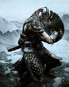
Is the current state of the WIP like in the 4th picture, or the second picture? The 4th one says compare cover, I think. I like the brightness in that one versus the second pic in the lineup that also says cover.
Thanks for your work on this, the update looks like a huge improvement, judging from the screens.
First 3 are the latest version of the mod 4th screen is without the mod bit still has the depth of field effect. My mod is the one that makes things blueish or brighter
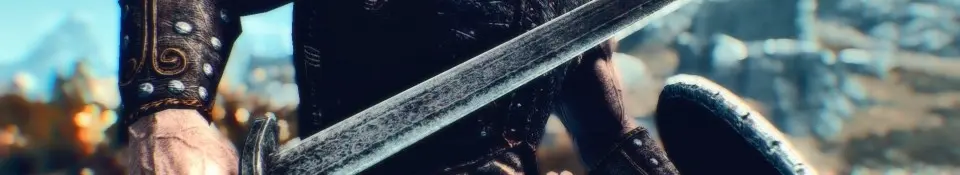
i think this could be a good set but right now it kinda looks like someone took a picture of their monitor with a cellphone the darks are so dark theres no detail showing through. if it brightens up a bit i could see using this with ELE or RLO as long as it doesnt look like my old crt monitor i played caeser II on and holy balls lighten up on the dof i dont think they have lensecrafters in skyrim. just keep up work and go easy on those effects.
Ya I'm trying to fix that. No garauntee I actually will. I'm quite noobish with ReShade.
If nothing works I'll eventually rebuild it from the ground up.
I'll work on more subtlety in future releases. One of my goals is to maximize on the vibrance of the colors without it coming out bad and looking like a cartoon. Kinda having a bit of trouble though,
Well you don't need to download it if you don't like it.
I haven't really had enough time to master ReShade, I'm not so devouted as your master preset makers. I crammed this together in 15 minutes, that's all I have time for for today.
I barely payed attention to the DOF settings, but I wanted it to be very vibrant in this first starting point. I'll worry about washing out and/or evening out the colors and contrast later. I only wanted to establish the general look and idea I had for this early build.
Also, this is also to suit my personal tastes and it's a wip. I wanted to make something that has a more Nordic feel to it with dark blue haze in the shadows and CA to go for a viking movie type look like Centurion or Pathfinder. WIP.


12 comments
Thanks for your work on this, the update looks like a huge improvement, judging from the screens.
If nothing works I'll eventually rebuild it from the ground up.
I'll work on more subtlety in future releases. One of my goals is to maximize on the vibrance of the colors without it coming out bad and looking like a cartoon. Kinda having a bit of trouble though,
Anyways thanks for the advice!
Way too much DOF
Way too much chromatic aberration
Way to much saturation
Way too much contrast/crushed blacks
I haven't really had enough time to master ReShade, I'm not so devouted as your master preset makers. I crammed this together in 15 minutes, that's all I have time for for today.
I barely payed attention to the DOF settings, but I wanted it to be very vibrant in this first starting point. I'll worry about washing out and/or evening out the colors and contrast later. I only wanted to establish the general look and idea I had for this early build.
Also, this is also to suit my personal tastes and it's a wip. I wanted to make something that has a more Nordic feel to it with dark blue haze in the shadows and CA to go for a viking movie type look like Centurion or Pathfinder. WIP.