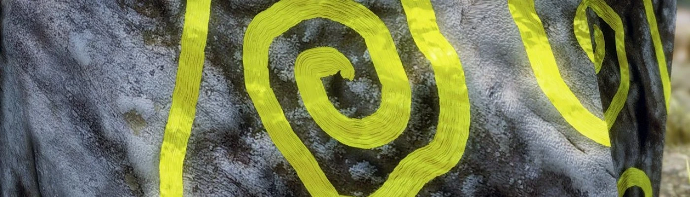
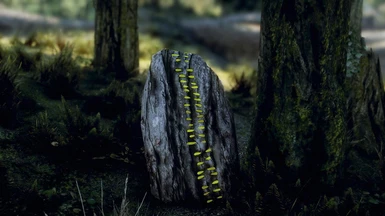
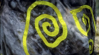
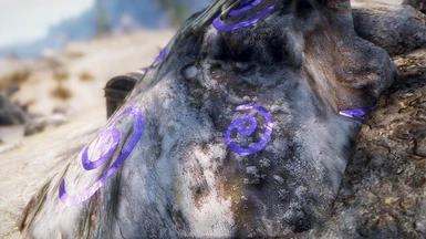
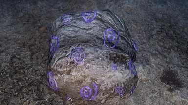
I'm going to add an unpopular opinion... I don't like them. I think the colors are too bright. The yellow looks like a neon yellow, the red is a bright cherry red, and I don't think purple is a realistic color as an option. Purple was a rare color in the middle ages because there were so few things that were purple. That's why purple was considered the color of royalty - it was so rare and expensive that only royalty could afford it.
Don't get me wrong; I think it's great that you're retexturing these overlooked textures, and I've already downloaded a number of your other textures. I just think that this one was a miss when it comes to the actual colors used.
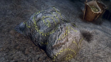
I have to say that I somewhat agree :s Even though I specificly requested you to do this but I cannot get it in my mind that Giants would have made these
There is quite a few retextures that I enjoy from you, ElSopa, this however is not one - sorry!
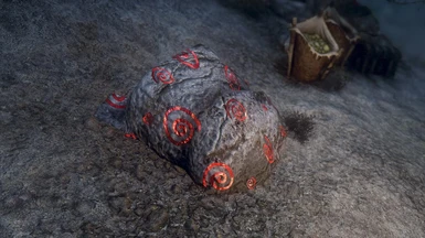
One, the textures ARE way to bright and neat. Think of it this way: These are painted by giants, who have rather long fat fingers Idoubt any of the giants are some form of Picasso's using some fancy brush. Then add on the fact these are drawn rocks which are exposed to the sun and harsh weather conditions of Skyrim. In my opinion, a good point of referance would be taking a child's finger paintings and given them a desaturated, dirty, chipped look to them. And yes, avoid the purple and any other bright colors.
Im done with this one at the moment. You can open the one you like with Paint.NET and lower saturation-brightness or whatever, then press "save". Maybe eventually I could release a compilation pack with everything and some errors fixed, maybe not.
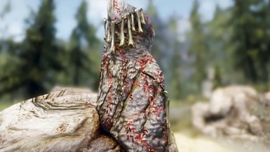
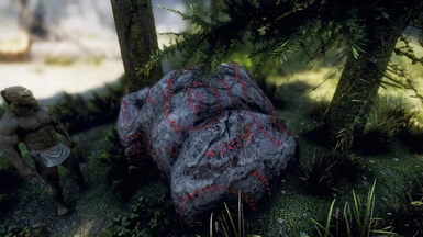
I'm sorry ElSopa that I doubted you! I should have checked the files carefully before judging, these are fantastic!! I did not know there was a vanilla option...
It might be not realistic, I really like the bright colors. I'm using Rudy's ENB and its soo gloomy and dark sometimes that its really good to see some bright color from time to time. It freshens the environment a little.
They look good, although you could of went for a texture where it looks like a big finger painted it rather than a brush stroke... Come to think of it, I wonder how did the Giants make them?


28 comments
Don't get me wrong; I think it's great that you're retexturing these overlooked textures, and I've already downloaded a number of your other textures. I just think that this one was a miss when it comes to the actual colors used.
There is quite a few retextures that I enjoy from you, ElSopa, this however is not one - sorry!
One, the textures ARE way to bright and neat. Think of it this way: These are painted by giants, who have rather long fat fingers Idoubt any of the giants are some form of Picasso's using some fancy brush. Then add on the fact these are drawn rocks which are exposed to the sun and harsh weather conditions of Skyrim. In my opinion, a good point of referance would be taking a child's finger paintings and given them a desaturated, dirty, chipped look to them. And yes, avoid the purple and any other bright colors.
Cheers!
Then can you add a more worn off version with bigger drawn lines alternative (to simulate big fingers' art of the giants)?
You can open the one you like with Paint.NET and lower saturation-brightness or whatever, then press "save".
Maybe eventually I could release a compilation pack with everything and some errors fixed, maybe not.
ElSopa: True, True.