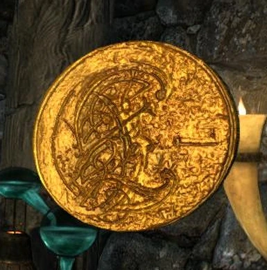
While it is a tad bright, I don't have a problem with it! I would imagine that merchants and bandits alike would end up polishing their oh-so-precious gold from time to time =D
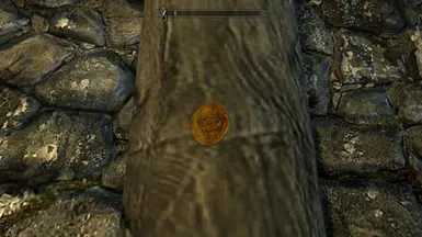
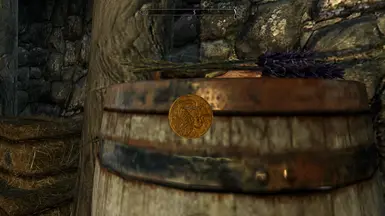
Version 3 is the first 3 pictures, version 4 is the following 3 pictures I've tried to adress the various points people were making,but I'm figuring One of these two should be good enough.
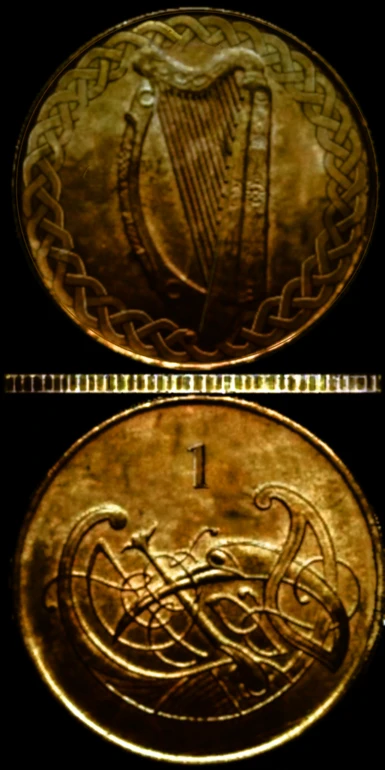
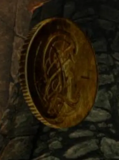
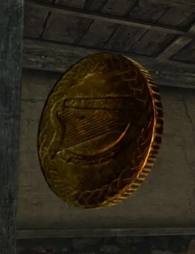
My favourite coin at the moment, it's a very nice celtic design, so for me it's a keeper. However, it still needs some work. Like xirishx said it's still too bright, it might be the bump map... it should be much duller. Could you make it look even more worn by dulling parts and add more dirt and blur parts of the decorations? The knotwork around the harp is too sharp and please make the number 1 much bigger and bolder. Nice works so far


11 comments
Probably this mod got so few attention not because it patches a small thing but because the texture weight way too much.
Endorsed. Thanks.
Going by you surname JOseph im guessing you are indeed irish ?
Check out my Irish tavern mod mate :]
Slà inte.
version 4 is the following 3 pictures
I've tried to adress the various points people were making,but I'm figuring One of these two should be good enough.
Look out for version 2 soon,I'll add you to the credits...