So, let me preface this by saying that I am not a UI designer nor do i ever plan to be :) Never made a UI mod like this for an RE engine game and it was very annoying and time consuming! This alone took me 5 hours to figure out since every tiny change required a game restart and stuff! Some things maybe aren't aligned perfect with other UI aspects but it works! Lets just call this v0.9 for now! :D
Hi there. I'm trying to play around with UI elements but so far haven't had any luck. How did you manage to modify the 'gui.540034' files? Any special tool?
Can you tell me which files affected the UI? I'm trying to remove the Health bar, ammo, knife, and Ashley Icons without removing all the interaction icons that the minimal hud menu option provides.
would it be possible for you to create a mod for the weapon switches interface so that the weapons switch UI isn't in the D-pad layout but rather next to one another left to right kind of like the half life 2 weapon switching UI?
The HUD was the one thing I really disliked about Mercenaries, but this mod fixes it! No idea why with both RE8 Mercenaries and now RE4 Remake, Capcom wants really in-your-face HUDs. You're awesome, thank you for making this!
That was actually my original goal for this, but i ran into a few issues with putting those elements on the left side mainly since when the numbers go up, they go the left side which made it hard to find a good spot that didnt start to go off the screen as the number got higher but i'll consider trying that again


17 comments
Never made a UI mod like this for an RE engine game and it was very annoying and time consuming! This alone took me 5 hours to figure out since every tiny change required a game restart and stuff!
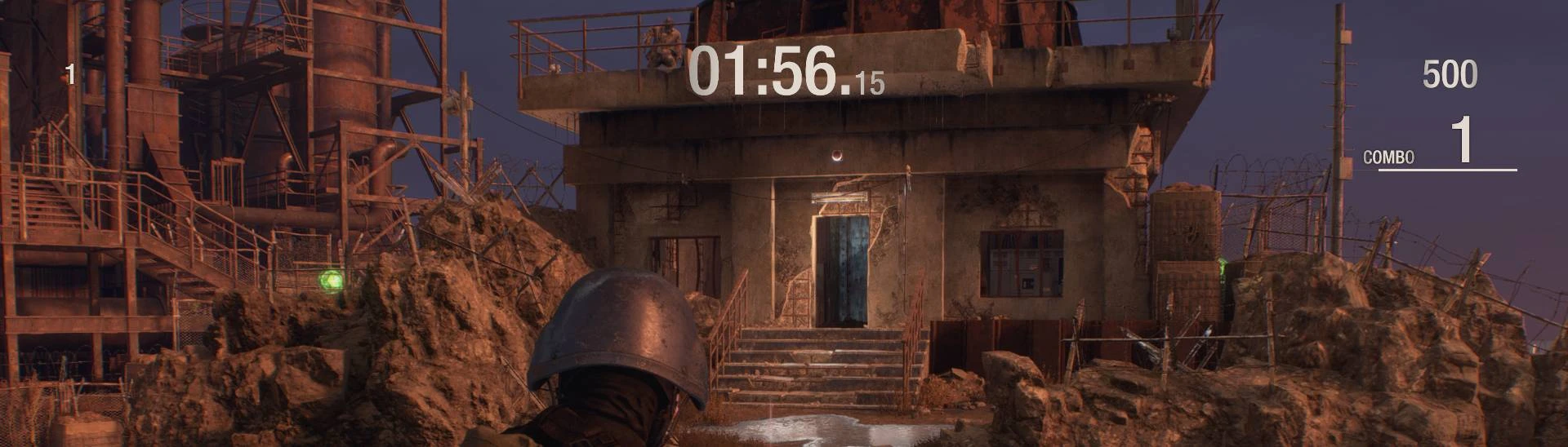
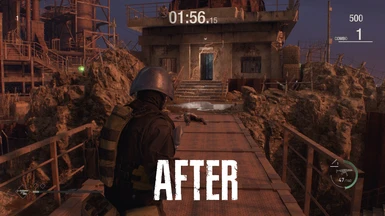
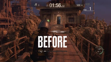
Some things maybe aren't aligned perfect with other UI aspects but it works!
Lets just call this v0.9 for now! :D
To give you one opinion, I think it would be okay to print the score and combo on the upper left like the original.