No matter if I set this high or low in the loadorder, my alchemy-kit always comes up as garbled looking 'sprites'/icons... Disabling this mod gives the default icons with the 2 missing ones. At first install it was okay and very nice looking, have installed many mods since and changed the game-detail from high to medium (not the 1280x1024 resolution!)...
Apparently you need to set set the game-detail back from medium to high. Supposedly the versions of the icons at menus80 and menus50 folders would have prevented what you are describing, but I haven't had luck with them. Sometimes they work, often they don't.
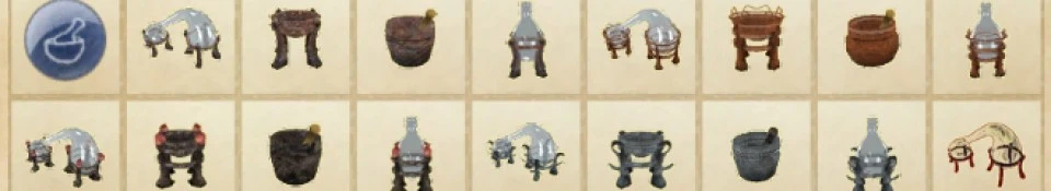
A very nice looking set that I'll greatly appreciate in my game once I get back to my usual gaming laptop. Your description's last statement makes me curious what other goodies may come out of this And yeah, dementedrabbits is one of my favourite tutorial (and miscellaneous) sites, too. It taught me all the necessary things to begin modelling in blender with Oblivion in mind. I don't mind the blue glass, but you could try a simple trick - in a few cases I see it could work. If you use gimp, you can use a "colour to alpha" command (In Colours tab) and choose the colour closest to the redundant blue of your icon (in your case it'll be something along the afb5b8 shade). If an item has other areas - besides glass - in the same colour it's more difficult and probably needs some more tedious manual work. Anyway, to show you what I mean, this is a very quick and dirty effect of colour to alpha. See if it's worth trying:
Thanks for the suggestion. That does look good with the default UI color scheme. However, turning the colors to alpha, I have to wonder if the icons would still look good with a UI color replacer like DarkUI. My understanding is that they would show whatever color is behind them. Which is what glass does anyway. And in any case I don't know how would I exactly match the look of the default alembic and retort icons. Therefore I think I'll take the easy route, offering an optional replacer to make them match my scheme, instead of the other way round.


 Give Feedback


8 comments
as garbled looking 'sprites'/icons... Disabling this mod gives the default icons with the 2 missing ones.
At first install it was okay and very nice looking, have installed many mods since and changed the game-detail
from high to medium (not the 1280x1024 resolution!)...
Supposedly the versions of the icons at menus80 and menus50 folders would have prevented what you are describing, but I haven't had luck with them. Sometimes they work, often they don't.
And yeah, dementedrabbits is one of my favourite tutorial (and miscellaneous) sites, too. It taught me all the necessary things to begin modelling in blender with Oblivion in mind.
I don't mind the blue glass, but you could try a simple trick - in a few cases I see it could work. If you use gimp, you can use a "colour to alpha" command (In Colours tab) and choose the colour closest to the redundant blue of your icon (in your case it'll be something along the afb5b8 shade). If an item has other areas - besides glass - in the same colour it's more difficult and probably needs some more tedious manual work.
Anyway, to show you what I mean, this is a very quick and dirty effect of colour to alpha. See if it's worth trying:
Good luck and thanks for a cool set of icons
And in any case I don't know how would I exactly match the look of the default alembic and retort icons. Therefore I think I'll take the easy route, offering an optional replacer to make them match my scheme, instead of the other way round.