They should work out of the box. This is a texture replacer and replaces vanilla files with the same file path. I know for a fact it works with Hitman's Hit - B42 Inject Animation Pack - Season 1...
Absolutely beautiful! And those screenshots contain effort I can't even recall seeing anywhere else before. Thank you so much for completing this project and sharing it with all of us! :)
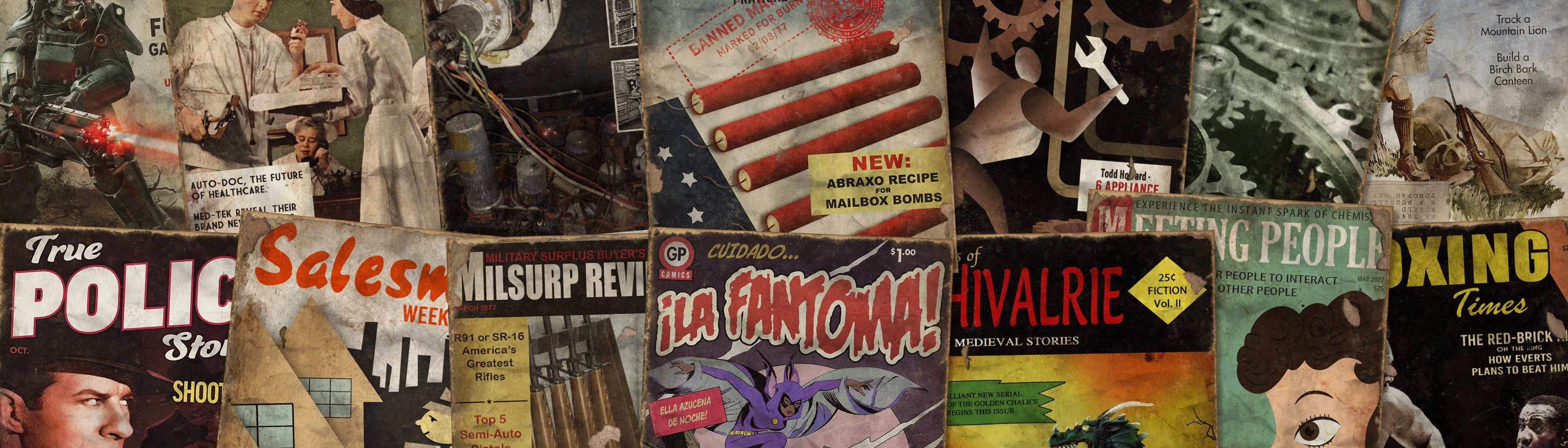
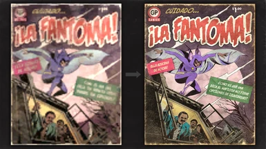
Everything looks perfect, man. You're a talented guy. My only problem is the cover of La Fantoma. Nothing that the cover says makes any sense, it's complete gibberish.
I didn't come up with the text on the cover. The way I see it right now is that I'll only change it if someone can provide me with EXACTLY what it's meant to say, not just with what they think it says. I also don't care much myself because I don't speak Spanish, plus the text appears so small in game that I'm not going to get overly pedantic about something which, in the grand scheme of things, doesn't really matter.
I will change it in future if I find an authority on what should be there. I'll probably have to ask pommy for the font he used too, as I don't have it.
I know you didn't come up with the cover. It's an issue that's been around for a long time. I point it out to people because I realize if you don't speak Spanish you wouldn't notice and I wish it would stop showing up.
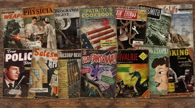
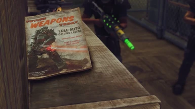
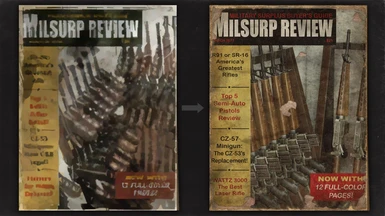
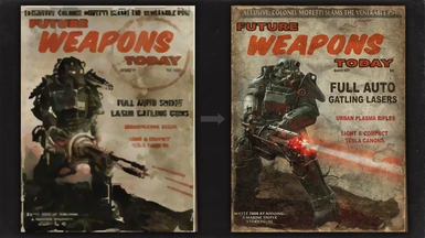
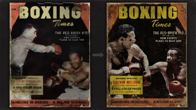
The one thing I take issue with is saying that it's pedantic to care about detail. Looking at the pictures, I can see there's a lot of small things that were fixed, such as the proper Gatling laser replacing a minigun in the cover of Future Weapons Today. How many people actually take the time to look at the cover of magazines in the game? Honestly, I hadn't even noticed that the weapon used in that cover was a minigun. It's easy to argue that something so small as a magazine doesn't matter in the grand scheme of things, but that attention to detail is, I think, at the very core of a mod like this. Obviously this is me giving you my perspective. At the end of the day, it's your mod, you're free to care or not care about whatever it is important to you.
Now, if you want to know exactly what it's supposed to say, from someone who does speak Spanish, the pink rectangle is supposed to say "Ella acecha de noche", and the green one "Como es que una chica tan hermosa obtuvo poderes tan especiales?"
And just to be clear, it is impossible to know with 100% certainty what it says since the original cover is a blurry mess, you'd have to ask whoever originally wrote it. But I'm not simply guessing here either. Again, from someone who speaks Spanish as his native language, I can recognize the shapes of words and letters and I know the patterns and what makes sense for the language. There's always the the possibility of a mistake, but I can tell you with 98% confidence, that's what it is supposed to say.
Anyways, hope you'll consider it. If not, no big deal. Like I said, it's your mod, you're free to handle things however you want.
A conspicuous step up from Magazine Retexture. Admirably patient adherence to the vanilla color schemes. Recommend a future revision of the Unarmed magazine with "countdown" corrected. And perhaps a little desaturation of the colors in Melee? These are basically just nitpicks.
Ha! Didn't notice the "Contdown" until you mentioned it. Bruno, the artist of that piece, is not a native English speaker, so I assume that's the reason it slipped him by. Will look to correct both of those things in future, although I don't have the original photoshop files he worked with. Regardless, I'll see what I can muster up.
Thanks. In the grand scheme of things, I'm probably the only person who even really cares, so no big deal. But yeah, I do place a certain amount value on the aforementioned color schemes because 5000 hours of FNV have trained my brain to respond to those patterns. I normally just do such minor color tweaks myself. With this set, there are practically no changes I'm tempted to make, and I always find such a result admirable. What is far more typical is a replacer whose chief concern was higher resolution, with resemblance to the vanilla original being essentially off the radar.


27 comments
I will change it in future if I find an authority on what should be there. I'll probably have to ask pommy for the font he used too, as I don't have it.
The one thing I take issue with is saying that it's pedantic to care about detail. Looking at the pictures, I can see there's a lot of small things that were fixed, such as the proper Gatling laser replacing a minigun in the cover of Future Weapons Today. How many people actually take the time to look at the cover of magazines in the game? Honestly, I hadn't even noticed that the weapon used in that cover was a minigun. It's easy to argue that something so small as a magazine doesn't matter in the grand scheme of things, but that attention to detail is, I think, at the very core of a mod like this. Obviously this is me giving you my perspective. At the end of the day, it's your mod, you're free to care or not care about whatever it is important to you.
Now, if you want to know exactly what it's supposed to say, from someone who does speak Spanish, the pink rectangle is supposed to say "Ella acecha de noche", and the green one "Como es que una chica tan hermosa obtuvo poderes tan especiales?"
And just to be clear, it is impossible to know with 100% certainty what it says since the original cover is a blurry mess, you'd have to ask whoever originally wrote it. But I'm not simply guessing here either. Again, from someone who speaks Spanish as his native language, I can recognize the shapes of words and letters and I know the patterns and what makes sense for the language. There's always the the possibility of a mistake, but I can tell you with 98% confidence, that's what it is supposed to say.
Anyways, hope you'll consider it. If not, no big deal. Like I said, it's your mod, you're free to handle things however you want.
Cheers.