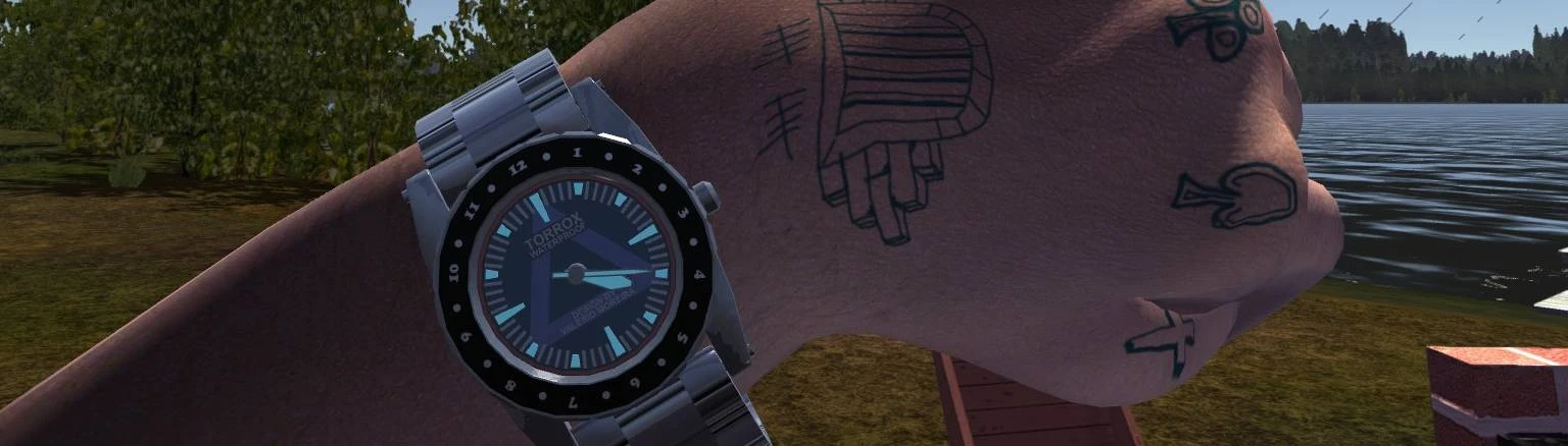
There's one little problem with your mod, the normal map file for the wristwatch is unchanged, resulting in something like a ghost or imprint of the old numbers. The reason for that is that the wristwatch_n.tex file also acts as a bump map. It gives the numbers a more bumpy look, as if they stick out, makes the watch more realistically looking. Its hard to describe, but you get the gist.
Anyway, besides that, I also was not happy with the size of the numbers, they were a bit small, made them harder to see sometimes.
So I went ahead and modified the textures myself. Of course I am an amateur at best, and I used GIMP for this, but I think the end result was rather acceptable (for me at least).
Here are the results: https://imgur.com/a/PqizRHo
In the 1st image is the unchanged texture you uploaded here in this file. You can see the dark "dent" looking thing that the old numbers have. 2nd image is my larger numbers, but with the same normal map file, so the same exact dent appears. The 3rd image is the final result, with the normal map file smoothed, so that the numbers basically dont have ANY bump maps, but still reflect light as they should.
Unfortunately, as I said I am but an amateur, so I do not know how to do the bump mapping properly. I tried, but they looked hideous and just...wrong. The bump maps had color, so that changed the light reflection.
So I gave up on that, but they now look ok, without the ghosts of the old numbers.
Let me know what you think, and if you want me to give you the files so you can upload them here. I can get more screenshots too if you wish.
I suppose, yes, that does look good. I did see the "bumps" of the original numbers too, but i didn't personally bother me, plus i don't actually know how to edit them. I could try to make them bigger, but it's a bit of work, i might get around to doing that
Here you go: https://www.mediafire.com/file/1ew3uc0f7zasne5/Larger_Version_w_Normals.7z/file
"I could try to make them bigger" - The numbers are already bigger, but they arent perfectly centered. It doesnt bother me, but you might do a better job at it.
It's wrong. As i said, it's purposefully like that, but it's a cheap knock-off of a GMT clock, thus it's wrong, because as a clock it has no actual GMT watch function. Plus this way it's more understandable for the 12 hour clock. And if you're so bothered about it, just don't use this texture, that's not my problem.
if the part isn't supported by the watch it's wrong, even if the dev does it on purpose; you're the one not understanding him. the game emulates cheap knockoffs of the era, where this nonsense wasn't uncommon. it's an artifact because the chinese that made them either did not understand or did not care to have parts that made sense. wrong on purpose by the dev.


9 comments
The reason for that is that the wristwatch_n.tex file also acts as a bump map. It gives the numbers a more bumpy look, as if they stick out, makes the watch more realistically looking. Its hard to describe, but you get the gist.
Anyway, besides that, I also was not happy with the size of the numbers, they were a bit small, made them harder to see sometimes.
So I went ahead and modified the textures myself.
Of course I am an amateur at best, and I used GIMP for this, but I think the end result was rather acceptable (for me at least).
Here are the results:
https://imgur.com/a/PqizRHo
In the 1st image is the unchanged texture you uploaded here in this file. You can see the dark "dent" looking thing that the old numbers have.
2nd image is my larger numbers, but with the same normal map file, so the same exact dent appears.
The 3rd image is the final result, with the normal map file smoothed, so that the numbers basically dont have ANY bump maps, but still reflect light as they should.
Unfortunately, as I said I am but an amateur, so I do not know how to do the bump mapping properly. I tried, but they looked hideous and just...wrong. The bump maps had color, so that changed the light reflection.
So I gave up on that, but they now look ok, without the ghosts of the old numbers.
Let me know what you think, and if you want me to give you the files so you can upload them here.
I can get more screenshots too if you wish.
"I could try to make them bigger"
- The numbers are already bigger, but they arent perfectly centered. It doesnt bother me, but you might do a better job at it.
the game emulates cheap knockoffs of the era, where this nonsense wasn't uncommon. it's an artifact because the chinese that made them either did not understand or did not care to have parts that made sense. wrong on purpose by the dev.