Unlike the Raimi suits, the TASM suits are actually still in good condition. Andrew and his stunt doubles were able to wear the same suits from 2014 in NWH.
Unless you mean the CG model from NWH, the one with the different eye shape. At that point, just use the MSM2 version.
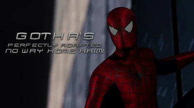
I understand why people don't care for this version of the suit in the film, but as for an adaptation for the game? 10/10, easily one of my new favorite suits to use at night.
i hate these types of people, my friend, its been 14 yrs since we last saw the suit, its obviously withered and teared down, they cant make an exact replica of the 2007 suit
Also the eyes have changed I know they had to remade the suit because the 2007 suit wasn't usable anymore but they could have put some extra care in it that's all. I think we can all agree that the suits in the trilogy looked better but of course anyone has different opinions and that's OK :)
I never understood this argument. How is the Raimi suit inaccurate in NWH when it's not even the same suit? It's been 20 years in universe since Spider-Man 3 and the mask got absolutely obliterated at the end of that movie. The costume department also stated behind the scenes that they tried to slightyl modernize it.
I really like the suits that you're making overall, But there are some things that i didn't really like about 2 of your suits
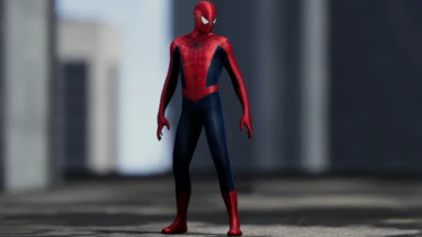
TASM 1 suit:
The web shooters looks so out of his arm, And just needed to be at least half the way inside his arm
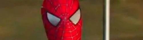
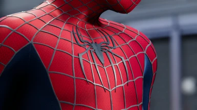
The NWH raimi suit (This 1 here):
1. The blue colors in this suit looks so dark, And it needed to be just a little higher blue brightness or something like that just more than that, But this is not really a big deal of course
2. But the 2nd thing and what is really annoying is that the eyes on his face looks kinda too far from each others, And just needed to be just a little closer to each others, Or maybe that's because they just needed to be a little bigger than that, I'm just not really sure
But other than that, all of these suits just looks almost perfect, Just really an amazing work of course
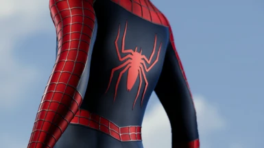
Made a 4k short for anyone that wants a zoomed in look on the texture. My only complaint about what the mcu did to this suit is the webbing around the nose. It's not a terrible suit tho, you did a great job on this Goth! Keep up the great work :)


56 comments
Unless you mean the CG model from NWH, the one with the different eye shape. At that point, just use the MSM2 version.
but i can understand how that could have been non-consistent
TASM 1 suit:
The web shooters looks so out of his arm, And just needed to be at least half the way inside his arm
The NWH raimi suit (This 1 here):
1. The blue colors in this suit looks so dark, And it needed to be just a little higher blue brightness or something like that just more than that, But this is not really a big deal of course
2. But the 2nd thing and what is really annoying is that the eyes on his face looks kinda too far from each others, And just needed to be just a little closer to each others, Or maybe that's because they just needed to be a little bigger than that, I'm just not really sure
But other than that, all of these suits just looks almost perfect, Just really an amazing work of course
Besides I have never liked Agro's, his colors always look way off when using vanilla atmos
https://www.youtube.com/shorts/LerQcirk0Dg