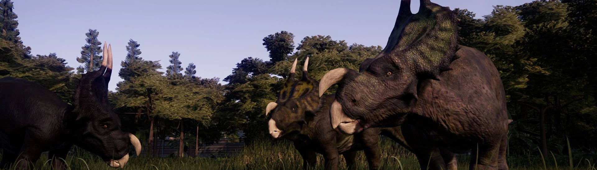
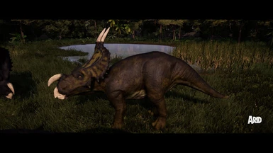
The demarcation between the nose horn and skin should be lower, more flush with the snout.
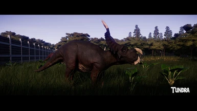
Also, I can't help but think that the Coastal skin doesn't follow the pattern with the other skins, like Alpine or even Arid. It all looks too uniform in comparison. The Null skin isn't bad, but it could use a bit of touching up too.
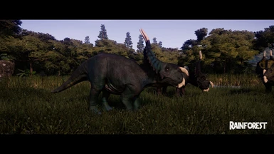
All said, thank you for bringing one of my favorite ceratopsians into the game.
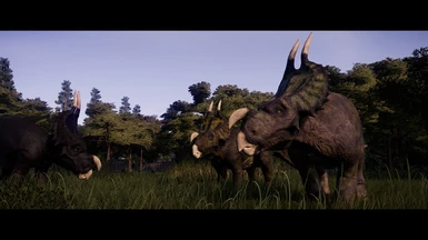
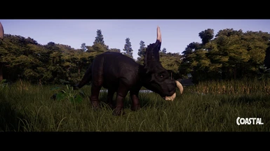
agreed. I feel like same thing could be said for the two horns at the top of the frill too. Certainly not bad overall, just textures in particular could use a little more polish / adjustments.
When you said "demarcartion", are you talking about the colors, the fading between the nose and the skin ? (sorry my english isn't perfect haha)
For the coastal skin, I like the idea that if you don't really like the pattern, you have this possibilities ^^ I like the fact that he is different :) But, otherwise, what's on your mind for the null skin ? :)
Yes, by demarcation, I'm referring to the border where the skin turns to bony nose horn and the two large spikes on the crest. That border is too high up and needs to be brought down to be more flush, more even with the skull.
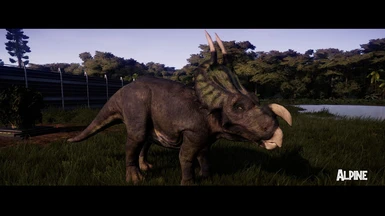
As for the Coastal skin, my main gripe is that it doesn't follow the pattern you already have going for the animal with the other skins. A base color with slightly darker splotches or dustings with a lighter, creamier underbelly. Look at your other skins for reference and you'll see the Coastal skin simply doesn't have variation to it. It's too uniform. It's especially noticeable when you consider that you can easily see the patterning on the frills for every other skin except for Coastal.
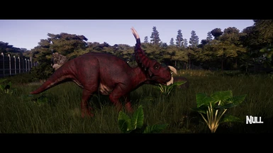
As for the Null skin, I like the fact you have a redder skin by default for this animal. It helps it stand out from other ceratopsians. However, I feel that the red used could be a bit more subdued, more earthy or grungy. Like, if you kept the red around the frill the same, but made the red elsewhere on the body less saturated and a tad darker, it would work. Of course, to compensate for that, the darker splotches on the Null's side should be a bit darker too to stand out and keep the pattern you have.
I hope this is more helpful this time. If I knew how to edit skins, I'd take a crack at it myself.
Everything is fine ! :) I did release the Walking With Dinosaur New Blood pack 5 days after your message tho haha I just have some very busy week lately :)
I'm glad everything is ok. Yep i saw that after i comment :P Well about that videos WWD, MOD: Walking With Dinosaur New Blood Pack - can I use dinos separately or i have to install all from the pack?
Oh yeah no I know it's supposed to curve outwards, what I meant was it looks kinda soft-droopy. I think making it larger could make it look like it's a harder consistency.
Thank you ! :D For the nose horn, I take some skull picture as reference and I'm not that far from what I saw so I don't really what I can't do more :(


24 comments
Also, I can't help but think that the Coastal skin doesn't follow the pattern with the other skins, like Alpine or even Arid. It all looks too uniform in comparison. The Null skin isn't bad, but it could use a bit of touching up too.
All said, thank you for bringing one of my favorite ceratopsians into the game.
When you said "demarcartion", are you talking about the colors, the fading between the nose and the skin ? (sorry my english isn't perfect haha)
For the coastal skin, I like the idea that if you don't really like the pattern, you have this possibilities ^^ I like the fact that he is different :) But, otherwise, what's on your mind for the null skin ? :)
Yes, by demarcation, I'm referring to the border where the skin turns to bony nose horn and the two large spikes on the crest. That border is too high up and needs to be brought down to be more flush, more even with the skull.
As for the Coastal skin, my main gripe is that it doesn't follow the pattern you already have going for the animal with the other skins. A base color with slightly darker splotches or dustings with a lighter, creamier underbelly. Look at your other skins for reference and you'll see the Coastal skin simply doesn't have variation to it. It's too uniform. It's especially noticeable when you consider that you can easily see the patterning on the frills for every other skin except for Coastal.
As for the Null skin, I like the fact you have a redder skin by default for this animal. It helps it stand out from other ceratopsians. However, I feel that the red used could be a bit more subdued, more earthy or grungy. Like, if you kept the red around the frill the same, but made the red elsewhere on the body less saturated and a tad darker, it would work. Of course, to compensate for that, the darker splotches on the Null's side should be a bit darker too to stand out and keep the pattern you have.
I hope this is more helpful this time. If I knew how to edit skins, I'd take a crack at it myself.
If I can give a bit of feedback - I think the nose horn should be a little bigger. Right now it looks a little droopy, like a nose