Sorry, this is my first mod so I don’t have this all figured out. The most recent update was changing the perk of issue 5 to be more accurate to fallout 2. Previous updates were changing the location of issue 4 to be less difficult and patching it for older versions of 4, and updating the covers as some had typos.
Fantastic work so far! Definitely a mod I'll be putting into my next playthrough, love the design and theming you've come up with based on two tiny source images from the OG games. I do have a few observations about some of it, though, if you'll humor me. Hopefully they're useful feedback:
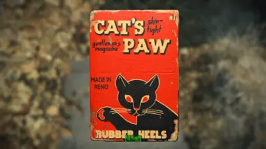
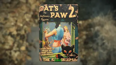
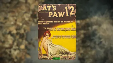
- The issue numbers are strangely inconsistent; the first issue is formatted "#1" but the rest forgo the '#' completely. The font's style doesn't match up between numbers either - some have soft, rounded lines and others wide, hard-edged 'brushstrokes'. It's a minor detail all in all, but impossible to unsee, especially when you notice the two side by side like in issue 10.
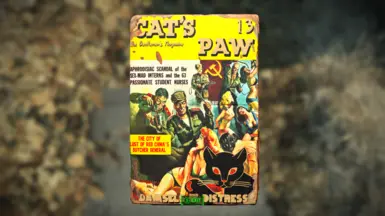
- The titles & text of some of the issues are a bit too close to the margins, to the point it sets off my 'editing best practices' alarm, lol. It's nothing too bad but they could do with being a tiny bit further from the edge, not too far so they're still often obstructed by the blemishes of wear and tear. Also, (perhaps intentionally?) #11 is missing a title entirely.
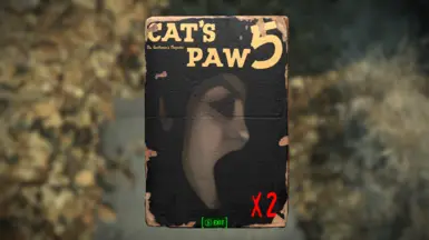
- Issue 5 looks a tiny bit too creepy/uncanny. Not a big deal either and it's a good effort at staying as true as possible to the original, but perhaps a similar enough photo could work a bit better; I reckon there's gotta some B/W picture of a singer or actress (or adult model, given the material) against a dark / easily keyed out background that gives the same vibe, and although the source image itself feels unfindable, maybe it's already been revealed or someone's done the detective work so it might be worth looking into that too.
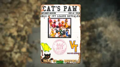
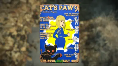
- The biggest issues... pun intended, are 8 & 9. The latter almost passes, but Shadman's vault girl drawing is very recognizable and sticks out like a sore thumb IMO, moreso when there's actual Vault Girl drawings right next to it. It will probably be hard to find an illustration that captures the same 'pin-up' energy & pose while keeping more in line with what the character actually looks like and having a more period-coherent artstyle, so all I can do is hope such an image already exists or an artist capable of making it takes interest in this mod and offers their help, as I don't think asking you to do something about it yourself is reasonable (unless you have a lot of expendable income I guess??). Issue 8, from top to bottom, feels really out of place and not super well put together. I hope I'm not being too harsh, it just doesn't mesh at all with the others, and feels at odds with itself even. The Windhelm bear as a - I assume - college football emblem is a cute idea, but put next to the very ornate & classical CIT emblem it clashes pretty bad, and then you add the VTU one into the mix and it makes even less visual sense. To end on a less sour note, the cheerleader illustration is a great pick for the issue, maybe it or a similar image can be used as a base for the cover like you've done with many of the others - or if no image fits that super well, you could go with a 'spread of photos' approach with a slew of cheerleader/college girl pictures bunched together as a base and maybe one or two being the most prominent & least occluded by the title and general cover text.
Writing this up, I'm almost tempted to dust off my years-out-of-date version of InDesign and offer to lend a hand, but I honestly have pretty limited time atm, and you've probably not even done this in a program of that type, considering image editing software is competent enough at the editing side of making a cover and leaps and bounds better at every other aspect of making a cover hahahaha. Still, if you think I can be of assistance, let me know. I'm not a 'real' professional but I've studied, trained and worked on stuff like this a fair bit, which you might be able to tell already by how opinionated and nitpicky I am about it :P Cheers


62 comments
There is no Changelogs section. Can the author tell us what was changed or added?
Also, the new update is showing the same version number (v1.2) as the previous one.
Thank you
I do have a few observations about some of it, though, if you'll humor me. Hopefully they're useful feedback:
- The issue numbers are strangely inconsistent; the first issue is formatted "#1" but the rest forgo the '#' completely. The font's style doesn't match up between numbers either - some have soft, rounded lines and others wide, hard-edged 'brushstrokes'. It's a minor detail all in all, but impossible to unsee, especially when you notice the two side by side like in issue 10.
- The titles & text of some of the issues are a bit too close to the margins, to the point it sets off my 'editing best practices' alarm, lol. It's nothing too bad but they could do with being a tiny bit further from the edge, not too far so they're still often obstructed by the blemishes of wear and tear. Also, (perhaps intentionally?) #11 is missing a title entirely.
- Issue 5 looks a tiny bit too creepy/uncanny. Not a big deal either and it's a good effort at staying as true as possible to the original, but perhaps a similar enough photo could work a bit better; I reckon there's gotta some B/W picture of a singer or actress (or adult model, given the material) against a dark / easily keyed out background that gives the same vibe, and although the source image itself feels unfindable, maybe it's already been revealed or someone's done the detective work so it might be worth looking into that too.
- The biggest issues... pun intended, are 8 & 9. The latter almost passes, but Shadman's vault girl drawing is very recognizable and sticks out like a sore thumb IMO, moreso when there's actual Vault Girl drawings right next to it. It will probably be hard to find an illustration that captures the same 'pin-up' energy & pose while keeping more in line with what the character actually looks like and having a more period-coherent artstyle, so all I can do is hope such an image already exists or an artist capable of making it takes interest in this mod and offers their help, as I don't think asking you to do something about it yourself is reasonable (unless you have a lot of expendable income I guess??).
Issue 8, from top to bottom, feels really out of place and not super well put together. I hope I'm not being too harsh, it just doesn't mesh at all with the others, and feels at odds with itself even. The Windhelm bear as a - I assume - college football emblem is a cute idea, but put next to the very ornate & classical CIT emblem it clashes pretty bad, and then you add the VTU one into the mix and it makes even less visual sense. To end on a less sour note, the cheerleader illustration is a great pick for the issue, maybe it or a similar image can be used as a base for the cover like you've done with many of the others - or if no image fits that super well, you could go with a 'spread of photos' approach with a slew of cheerleader/college girl pictures bunched together as a base and maybe one or two being the most prominent & least occluded by the title and general cover text.
Writing this up, I'm almost tempted to dust off my years-out-of-date version of InDesign and offer to lend a hand, but I honestly have pretty limited time atm, and you've probably not even done this in a program of that type, considering image editing software is competent enough at the editing side of making a cover and leaps and bounds better at every other aspect of making a cover hahahaha. Still, if you think I can be of assistance, let me know. I'm not a 'real' professional but I've studied, trained and worked on stuff like this a fair bit, which you might be able to tell already by how opinionated and nitpicky I am about it :P
Cheers