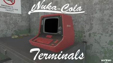
I like to put the bright and unique stuff such as nuka cola merch in the castle, whereas in more sensible or bland settlements like the Mechanists lair I use grey, dull colours, it really sets the mood and tone
Ah, someone actually using them as I intended (kind of). My general play throughs have various settlements designed as various things (Starlight is an entertainment settlement for example) so would have the Cherry editions, and anywhere not as glitzy would have others. It can look visually interesting in really colourful environments as there's all this colour and then something which is greyscale.
I've done a kind of distressed texture. The texture is basically the normal dirty texture just recoloured (how I've done the original) so it looks a bit more weathered and beat up. It will be posted in a few hours.
tl;dr answer: At present I won't be doing much more than making the logos slightly bigger. That is at present.
Proper answer: I'm probably going to alter the size of the logo, but adding many more isn't going to happen. They're designed for corporate use (Nuka-Cola offices) so they wouldn't be sticker bombed (one place I worked at wouldn't allow us to put post-it note reminders on monitors - I actually covered my whole monitor in them on the last day). To be honest, the most corporate machines would have been beige (the real world cause for this is thanks to the German government(1)), so I really don't want to go too wild.
This is also a spin off from something else I'm working on, and there's Nuka-Cola branded/coloured corporate furniture in it (this will become more than just terminals), so I want it to remain consistent. I may expand it to a home consumer line at some point which is a bit more "fun" and add it here, but it won't be an end-goal as such. Argh! I've even managed to develop ideas for home versions! Excuse me while I get neuralised.
It might happen (no promises), but I can't say when that will be if it happens.
Footnotes: 1 - A German workplace law required all computers to be beige and inoffensive. Due to pure efficiency (don't make beige cases for Germany, and do something different for the rest of the world) and costs this ended up affecting the rest of the world. When IBM brought out the Thinkpad computers and dared to think different with their colours and chose black, Germany required them to be sold with a sticker attached stating that they weren't for office use.
If you mean the red bits of the terminal, then it would probably require the NIF to be edited. The NIFs usually use either a BGSM or BGEM that contains data and setup for the texture. If you want the transparent effect that glass has then the NIF would probably need to be set up for BGEM. It can be done with a BGSM but you wouldn't actually see anything. The bounding box would be there and it would probably have the normal interactions it would with the world, but there would just be a levitating screen with no keyboard etc. There's nothing internally so it wouldn't look like it had a transparent case.
If you're on about the screen, then I've had varying results with that, so I tend to avoid it. Also, having a transparent screen can cause some really funky effects when it's part of one of these terminals (I did it by accident once while trying to do something else). Pra has a mod called Three Random Terminals, and one of the terminals has a transparent screen (it looks really cool). You might want to have a look at how he's done that and see if you can work from there. One thing you'll notice is that the screen is kind of "separate" from the actual case and there's nothing behind it to cause any weird effects.


.")
.")


17 comments
can use a bit more stickers and such tho. the nuka cola lunchbox textures has lot of them.
Proper answer: I'm probably going to alter the size of the logo, but adding many more isn't going to happen. They're designed for corporate use (Nuka-Cola offices) so they wouldn't be sticker bombed (one place I worked at wouldn't allow us to put post-it note reminders on monitors - I actually covered my whole monitor in them on the last day). To be honest, the most corporate machines would have been beige (the real world cause for this is thanks to the German government(1)), so I really don't want to go too wild.
This is also a spin off from something else I'm working on, and there's Nuka-Cola branded/coloured corporate furniture in it (this will become more than just terminals), so I want it to remain consistent. I may expand it to a home consumer line at some point which is a bit more "fun" and add it here, but it won't be an end-goal as such. Argh! I've even managed to develop ideas for home versions! Excuse me while I get neuralised.
It might happen (no promises), but I can't say when that will be if it happens.
Footnotes:
1 - A German workplace law required all computers to be beige and inoffensive. Due to pure efficiency (don't make beige cases for Germany, and do something different for the rest of the world) and costs this ended up affecting the rest of the world. When IBM brought out the Thinkpad computers and dared to think different with their colours and chose black, Germany required them to be sold with a sticker attached stating that they weren't for office use.
If you're on about the screen, then I've had varying results with that, so I tend to avoid it. Also, having a transparent screen can cause some really funky effects when it's part of one of these terminals (I did it by accident once while trying to do something else). Pra has a mod called Three Random Terminals, and one of the terminals has a transparent screen (it looks really cool). You might want to have a look at how he's done that and see if you can work from there. One thing you'll notice is that the screen is kind of "separate" from the actual case and there's nothing behind it to cause any weird effects.
I'm sorry I can't be of any further help.