I thought well, maybe I'd d/l this because of the fewer vertices and triangles, and then I read your comment--wait, what, there's a Binford version?Ar ar ar! Forget the maybe--download for sure. I second that kudos.
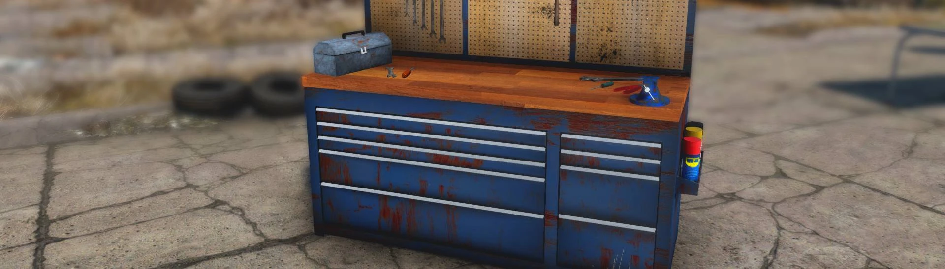
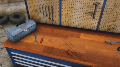
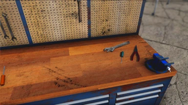
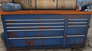
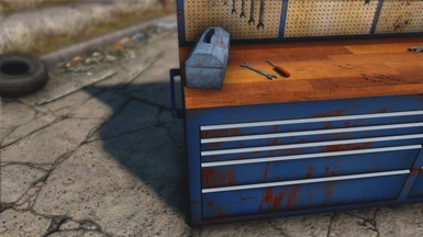
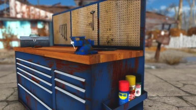
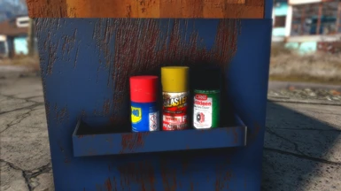
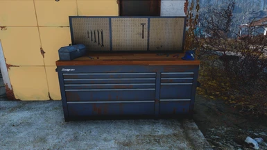
I will offer one point of constructive criticism in that in the future elements like the cans on the side would be best to use imagined brands instead of real ones. I find recognizable brands like WD-40 is a little immersion breaking for my tastes. Nothing some basic texture editing on my end can't fix, but yes, in the future I'd recommend you try to create more thematic textures.
As much as I laughed over the WD-40 (it really IS a tinkerer/handyman's best friend), I kinda agree with this, too. And I think I might be just institutionalized at this point, but workbenches not being red is taking some adjusting to. :)
That said, I really like the overall design -- a little clutter, not too much, looks great. And blue is my favourite colour, so adjust I shall. ;) Thanks for sharing! Will endorse when it lets me.
I second this with the OP. They look fantastic and would download but the WD-40 (while invented in 1953 the label is modern) if you could make them look more in line with the style of Fallout that would make it an instant download and 'never leave' on my load order.
To assist with some reference material: WD-40 (https://www.packagingdigest.com/packaging-design/wd-40-turns-back-clock-50s-style-packaging)
I couldn't find PB Blaster vintage can but found G.U.D Penetrating Oil which might inspire (https://priceguide.thecollector.com.au/ngg_tag/motoring/nggallery/page/19 )


44 comments
Thank you for your work and sharing.
Endorsed, and kudos to you....
There are 2 logo/name styles, this one would be easier/preferred?
If not, Thanks for all the brands already!
Either way, AWESOME work!
Keep up the good work! 👍
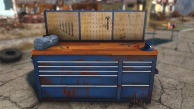
I will offer one point of constructive criticism in that in the future elements like the cans on the side would be best to use imagined brands instead of real ones. I find recognizable brands like WD-40 is a little immersion breaking for my tastes. Nothing some basic texture editing on my end can't fix, but yes, in the future I'd recommend you try to create more thematic textures.
That said, I really like the overall design -- a little clutter, not too much, looks great. And blue is my favourite colour, so adjust I shall. ;) Thanks for sharing! Will endorse when it lets me.
To assist with some reference material: WD-40 (https://www.packagingdigest.com/packaging-design/wd-40-turns-back-clock-50s-style-packaging)
I couldn't find PB Blaster vintage can but found G.U.D Penetrating Oil which might inspire (https://priceguide.thecollector.com.au/ngg_tag/motoring/nggallery/page/19 )
Hope it helps :)
This is very nice too, and I'm tempted to switch. Beautiful work.