


0 of 0
About this mod
A FallUI preset that respects the spirit of the vanilla design, but makes an effort to clean it up, remove or reduce obtrusive elements, and generally add character to an otherwise bland HUD without going overboard.
- Requirements
- Permissions and credits
- Changelogs
VANILLA HUD PLUS | FALLUI PRESET
The video lets you see the HUD in action, and is likely a better demonstration than a description of static images.
The video lets you see the HUD in action, and is likely a better demonstration than a description of static images.
DESCRIPTION
Bethesda's HUD design typically doesn't bother me, but Fallout 4's HUD always stands out as being overly busy and lacking real character. This mod is an attempt to overhaul the HUD in a way that respect the design intentions--making the game more readable, and keeping things simple--while reducing the cluttered nature of the vanilla HUD and injecting more changes into it. This preset should be both PC and TV friendly. The screenshots and video will show the HUD off best; there is a brief list of bullet-points here below.
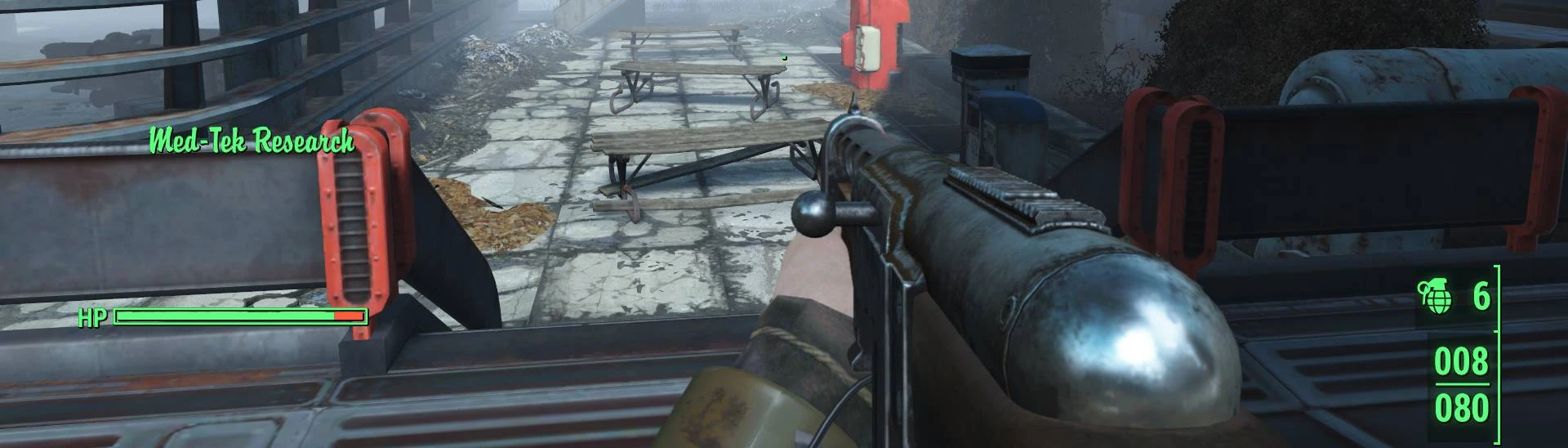
- The line underscore of all bars (health bars, XP bars, etc.) has been entirely dropped, and replaced with nice, solid boxes that the bars can now fill. Bars don't need to be underlined.
- Brackets were generally traded for solid lines, which results in a cleaner, more elegant look. There were a few exceptions here: with the ammo/grenade counters, as the brackets allowed for a nice little divider between them; and with the Workshop Prompt, which evidently has no available options to change the brackets.
- Health, AP, the Critical Meter, and chem/Pip-Boy Light status are all grouped on the bottom-left side, so your most important character-status related info is all in one spot.
- The RAD and Fatigue text have been removed from the RAD and Fatigue damage indicators, although the icons remain (both to the right of their respective bars), and the RAD pop-up retains the number of rads damaging you.
- Ammo, grenades, animated Vault-boy perk indicators (Well-Rested, Idiot Savant), and power armor battery warnings are all now on the bottom-right. This condenses all of your equipment/perk related info on one side.
- The sneak indicator is centered in the bottom, where it's easy to read without getting in your face.
- The XP Bar is centered below your crosshair and above the dialogue box. As Fallout 4 is very combat heavy, these centered XP pop-ups make combat feel more satisfying.
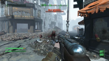
- Enemy health and the compass have been moved to the top of the screen, Skyrim-style. I find that having these UI elements up here helps you keep your focus on the enemy/world exploration, respectively, as you have to look up the screen to scan this information.
- The compass has also received some colored elements: yellow for quest markers/doors, and blue for your player-placed marker. These helps these markers stand out amongst a very busy compass. Colored elements are otherwise kept to an absolute minimum.
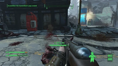
- The location pop-up is shifted to be centered above your status bars, and has been increased in size in an effort to give you a better sense of the name of the place you're at (as opposed to just meandering through a compass). It has also received a font-change to help inject some of the 50s-style into the UI.
- The Workshop prompt was shifted to the top-right of the screen.
- Quest completed pop ups are centered at the top, just below enemy health.
- Messages, tutorials, and animated quest images are all keep on the top-left.
- The quick-loot menu is more directly to the right of the crosshair and more centered than vanilla, resulting in a cleaner, less overwhelming quick-loot experience.
- Looting has received some coloration: blue icons for tagged materials, yellow for legendary, and a brighter green for items that are better than what you have equipped.
- There is an optional version of this preset included in the main file that disables both the Hit Indicator and the Grenade Warning Indicator if, like me, you don't like having those elements clutter up your screen. These are useful, though, and are enabled by default.
Note that everything should be pixel-aligned--if something isn't, post in the comments, and I'll fix it.
REQUIREMENTS
Spoiler:
Show
CREDITS & THANKS
Spoiler:
Show
- m8r98a4f2, for the excellent FallUI - HUD mod that this mod relies on.
- registrator2000, for making the absolutely essential Mod Configuration Menu.