0 of 0

File information

Last updated

Original upload

Created by

Jaya

Uploaded by

JA1881

Virus scan

Safe to use

Tags for this mod

10 comments

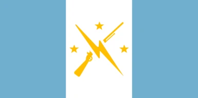
  1. I  love this redesign. What I never liked about the flags in Fallout 4 was how they all had the same motif of one color + faction symbol. Boring! and nonsensical. This design gives the MM a lot more of a distinct character than the vanilla flag imo
  2. SacerdosIacobvs
    SacerdosIacobvs
    • supporter
    • 13 kudos
    Guatemalan minutemen time
    1. Lol I thought that too when I first saw it
  3. Solitaire38
    Solitaire38
    • supporter
    • 2 kudos
    This is a very beautiful flag for us, thank you!
  4. NCRRANGERNEXUS
    NCRRANGERNEXUS
    • member
    • 1 kudos
    First thing I thought of was the Irish flag when I saw how the bars were arranged. Must be my heritage showing its head again LOL

    Honestly I like this redesign!
    1. exilestudios117
      exilestudios117
      • member
      • 2 kudos
      ya know Irish inspiration would make sense for boston due to its rather large Irish population 
  5. kettleworks
    kettleworks
    • premium
    • 1 kudos
    really lovely colour combination for this, but i'm not sure about the use of yellow/gold on the white triband. maybe it could serve well to have an alternate version that uses black for the minutemen logo to stand out more?

    lovely work regardless!
  6. TVOYTOVARISCH
    TVOYTOVARISCH
    • member
    • 0 kudos
    In my opinion, the colors should be swapped because light yellow on white will not be visible from afar, and the flag looks cooler when it is contrasting
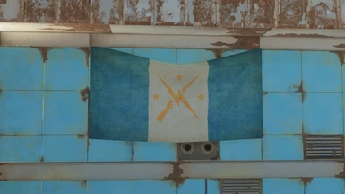
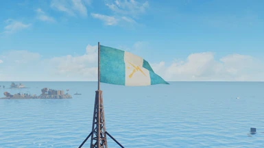
    Maybe increase the size of the decals at the same time?
  7. ImmortalAbsol
    ImmortalAbsol
    • premium
    • 36 kudos
    Are the shapes and colours symbolic like IRL flags?
  8. Argonianamazon
    Argonianamazon
    • member
    • 8 kudos
    If the bars were horizontal, it would look like the Argentine flag.