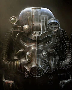
I love the look of these! I'm currently using the lightning bolt with the large, centered MO for my main MO2 install. I'm recovering from a massive hard drive failure and doing a full rebuild of my load order from scratch. Technically, MO2 wasn't on the HD that died, so I still have it as backup/reference, but it was easier to start with scorched earth, since I lost all my notes and such. Telling the difference between the two MO2 installs that are both (technically) managing Fallout 4 was getting to be tedious - now, I can tell at a glance which is new and which is old.
If you're taking criticism/suggestions: The Vault-tec logo frequently vanishes for me, because most of my monitors have a blank black background, at the moment. I'd love to see one with maybe Vault-tec blue, or maybe a contrasting border color around the icon.
Some of these might also work decently well as splash screens, if you're willing to upload jpg or png versions.
Endorsed & tracked! Can't wait to see what you do next. :)
Excellent taste, it’s my personal favourite style! Ugh that sounds like such a massive pain, hope nothing important was lost… I’m glad my little ol’ icons could make things a touch easier :)
Always open to suggestions – and that sounds like a good one! I’ll be sure to look into the contrasting border and splash screens :) (something I can apply to my Skyrim icons too).
Thanks a lot, and thanks for taking the time to comment :)
EDIT: I've added a blue border version as you suggested, hope you like it!


10 comments
If you're taking criticism/suggestions: The Vault-tec logo frequently vanishes for me, because most of my monitors have a blank black background, at the moment. I'd love to see one with maybe Vault-tec blue, or maybe a contrasting border color around the icon.
Some of these might also work decently well as splash screens, if you're willing to upload jpg or png versions.
Endorsed & tracked! Can't wait to see what you do next. :)
Ugh that sounds like such a massive pain, hope nothing important was lost… I’m glad my little ol’ icons could make things a touch easier :)
Always open to suggestions – and that sounds like a good one! I’ll be sure to look into the contrasting border and splash screens :) (something I can apply to my Skyrim icons too).
Thanks a lot, and thanks for taking the time to comment :)
EDIT: I've added a blue border version as you suggested, hope you like it!
What about replacing the Vault number with "MO" in Vault lettering? Would it look any good?
Good idea, I think that'll look cool - Hang tight!