I've mentioned this before, but I don't often make or backport mods for the OG version anymore. For a few reasons:
1. A lot of tools (since 2020) have been made for the DE version and don't work for modding the OG version.
2. The OG version has an extremely small playerbase these days. Either people have stopped playing or moved to the DE version. So mods that are made or backported for OG get a tiny, tiny fraction of the downloads that DE mods do.
So, because of that, I usually only backport mods that wouldn't take a lot of additional time.
I might backport something that might only need a handful of tweaks to work on the OG version, but something that would need extensive reworking or manual hex-editing (due to other tools not working) is not really worthwhile in my mind.
If you're asking about this mod, specifically...I'm not sure it'd be a great idea either. It might take awhile getting some aspects to work backported, so even if it were done, you'd end up with a stripped-down version of the mod with 1/2 the features.
That said, i'm happy to share some of the resources/assets I have if someone is interested in making their own mods (or backports) for the OG version.
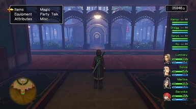
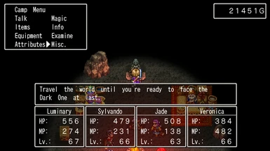
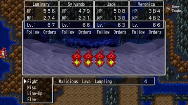
I think I saw your comment on another post, but any chance / possible to fix the dividers so they're white and not brown? Just a tiny visual quirk here that shows up fairly often (Battle Menus).
Well done! Font in this is an absolute must. In original game font it felt like someone was forcibly trying to gouge my eyes out when i attempt to read whats written in 2D. Comparison: (maybe if it could be just a touch smaller? (i was wrong here, its spacing that are bit too long, not size of font, but i remember that JP fonts always had that issue when used for alphabet. ) and apostrophe looks bit weird? :) (Only affects 2d, 3d looks perfect)
Hmm, well what you labeled as the "original" here is actually the font from the Retro UI Mod lol, so i'm a bit confused. (It still uses the same spacing as the original font though, so I suppose I see your point. Still a lot better than the true original font imo)
Ur right its retro style. But font was identical in both retro and default , wasnt it? Or at least it was to my eyes. Maybe little less wobbly? As if drunk person was arranging the letters What troubled me the most is that it looks exactly like super upscaled old games. It gets that same very ugly texture
Nah the retro font looked much better than the garbage thin font they used by default in 2D mode, but the method used had a bunch of its own limitations as it required the glyphs to essentially be matched 1-by-1 to the original- it's effectively an edit of the text itself inside the same font "package".
This one has its own limitations as it completely swapped the fonts out (attributes and all) for the JP font. Hence why the size and spacing are different.
For some reason the text will all smoosh together while playing like no space between words. It happens pretty frequently not constantly or anything but enough.
I'm not sure about that prompt- i've seen it in others images, but I don't believe i've ever really noticed it for myself.
As for the minimap, there is a way to disable that (I noticed you DM'ed me on here mentioning that) and there is also a bind available for this in my fork of DQXI-SDK.
Side note: There is an open pull request for this in the official branch, so if this is something you'd like to see in the mainline release of DQXI-SDK, comment there.
You might try asking about that prompt (maybe post a screenshot too so everyone knows what you're talking about) in the Yggdrasil Modding Discord linked in my profile. Someone else might know how to get rid of it.
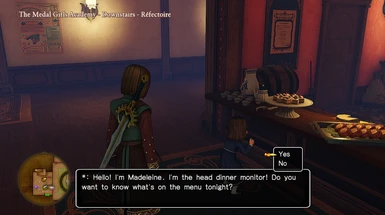
Great mod. Just wondering if there's any way to get the opaque black windows for the 2D version? Reading the text there is a nightmare regardless of font.
Thanks in advance for any suggestions. (Also happy to poke around in the paks myself, but it doesn't look like the format or structure is publicly available anywhere.)
The paks and most any 3D mode assets are decently documented: you could go to the Yggdrasil Modding Discord (linked in my profile), our Google Sites page, even the Mod Customization Tools (search here on Nexus)
As of yet, however, 2D mode is the polar opposite- we really don't have any documentation on any of the formats used
This is another issue that has to do with the font change introduced in this mod. Basically the JP-Style font only includes standard alphanumeric characters (A-Z, a-z, 0-9, etc) for EN and western languages. So accented characters used by ES, DE, and IT simply won't show up ("blank")
Nice work! You're almost there. If it wasn't for the stuff from the 3DS version which would take the source code of both versions to recreate (i.e. simultaneous 3D and 2D play with battle style depending on which controls you're using, 3D Tickington, etc.), there'd no longer be any reason to acknowledge that any other version exists.


22 comments
1. A lot of tools (since 2020) have been made for the DE version and don't work for modding the OG version.
2. The OG version has an extremely small playerbase these days. Either people have stopped playing or moved to the DE version. So mods that are made or backported for OG get a tiny, tiny fraction of the downloads that DE mods do.
Example:
https://www.nexusmods.com/dragonquestxi/mods/109
vs
https://www.nexusmods.com/dragonquestxisdefinitiveedition/mods/118
----------------
So, because of that, I usually only backport mods that wouldn't take a lot of additional time.
I might backport something that might only need a handful of tweaks to work on the OG version, but something that would need extensive reworking or manual hex-editing (due to other tools not working) is not really worthwhile in my mind.
If you're asking about this mod, specifically...I'm not sure it'd be a great idea either. It might take awhile getting some aspects to work backported, so even if it were done, you'd end up with a stripped-down version of the mod with 1/2 the features.
That said, i'm happy to share some of the resources/assets I have if someone is interested in making their own mods (or backports) for the OG version.
I think I saw your comment on another post, but any chance / possible to fix the dividers so they're white and not brown? Just a tiny visual quirk here that shows up fairly often (Battle Menus).
Font in this is an absolute must. In original game font it felt like someone was forcibly trying to gouge my eyes out when i attempt to read whats written in 2D.
Comparison: (maybe if it could be just a touch smaller? (i was wrong here, its spacing that are bit too long, not size of font, but i remember that JP fonts always had that issue when used for alphabet. ) and apostrophe looks bit weird? :)
(Only affects 2d, 3d looks perfect)
This one has its own limitations as it completely swapped the fonts out (attributes and all) for the JP font. Hence why the size and spacing are different.
Can I ask, what's the name of the font it's using?
The font is called "IW4RD3" in the game's files.
As for the minimap, there is a way to disable that (I noticed you DM'ed me on here mentioning that) and there is also a bind available for this in my fork of DQXI-SDK.
Side note: There is an open pull request for this in the official branch, so if this is something you'd like to see in the mainline release of DQXI-SDK, comment there.
Great mod. Just wondering if there's any way to get the opaque black windows for the 2D version? Reading the text there is a nightmare regardless of font.
Thanks in advance for any suggestions. (Also happy to poke around in the paks myself, but it doesn't look like the format or structure is publicly available anywhere.)
As of yet, however, 2D mode is the polar opposite- we really don't have any documentation on any of the formats used
Example: "Über Falcon Blade" becomes "ber Falcon Blade"
I'll go ahead an append this to the existing bug report.