Hey! The Mod looks awesome, definitely something for my next female playthrough. I know its been five years, but I for one am still holding out for the male version. :)
Hope I'm not bothering but I added this mod to my favorites and have checked every few weeks for an update. Do you still have plans to release the male version of this mod, or has that become something you aren't really interested in anymore? Tyvm, and congrats on the good mod either way.
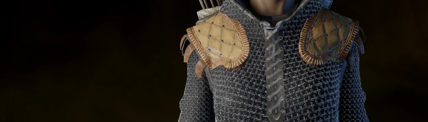
I agree with Meneldur. This is already in a very good state, but to push it above and beyond you should definitely take more advantage of contrast in your PBR textures.
Quick Edit: Apparently, there's some misinformation about whether or not DA:I uses PBR. It was released prior to an actual PBR system being in place in Frostbite, though it seems they were still utilizing a roughness/gloss map prior to the implementation of Frostbite's PBR system. Thus, you can ignore the stuff about PBR in this post as it would mostly not apply to several of the texturing methods you'd use for DA:I since they didn't utilize that rendering system. Though, it still stands that you should likely add more contrast in your specular map, and if DA:I does have a gloss or roughness map, you should consider editing that as well. I'd also edit your albedo/diffuse to create a better color contrast between the mail and the shirt underneath.
If you're not aware of the basics/setup of a PBR system, which Dragon Age Inquisition uses given Frostbite, the people that made Marmoset Toolbag have a fantastic post covering how the different maps work and interact with each other in a PBR system here: https://www.marmoset.co/posts/physically-based-rendering-and-you-can-too/#create
Now, different companies implement these systems somewhat differently, and in some cases specular or other map information might actually utilize the Alpha channel in a texture to minimize file size impact. I haven't done any modding of DA:I, nor have I messed around with Frostbite, so I can't comment on the particular's of their texture setup. However, that being said you should definitely tighten up the density of the chainmail. Chainmail for combat is fairly dense in order to protect the wearer from piercing weapons and slashing weapons. The tighter the density of the mail the more protection you had.
The other thing you may want to alter if you update this in the future would be creating more contrast between the mail and the shirt underneath the mail whether it's leather or cloth. Some of the readability of the mail is lost as it blends in with what's underneath. Like Meneldur, please don't take this post as anything else but constructive criticism to help you improve your texturing technique. It's already a fantastic improvement over the default scale mail in DA:I.
Even though I very much like this idea, I think you could increase the quality of the textures. The normal map may need a bit more height and the mail itself would look better with smaller rings and more defined contrast.
I don´t know exactly how DA:I textures work, but AFAIK the one handling how the metal glint looks (specular in total war games) looks as if you simply made a lighter version of the base texture. This in my experience would actually need way more contrast than the base texture.
It may just be nitpicking, but all of this is meant as constructive criticism.


 Give Feedback


20 comments
Does it work with frosty?
Quick Edit: Apparently, there's some misinformation about whether or not DA:I uses PBR. It was released prior to an actual PBR system being in place in Frostbite, though it seems they were still utilizing a roughness/gloss map prior to the implementation of Frostbite's PBR system. Thus, you can ignore the stuff about PBR in this post as it would mostly not apply to several of the texturing methods you'd use for DA:I since they didn't utilize that rendering system. Though, it still stands that you should likely add more contrast in your specular map, and if DA:I does have a gloss or roughness map, you should consider editing that as well. I'd also edit your albedo/diffuse to create a better color contrast between the mail and the shirt underneath.
If you're not aware of the basics/setup of a PBR system, which Dragon Age Inquisition uses given Frostbite, the people that made Marmoset Toolbag have a fantastic post covering how the different maps work and interact with each other in a PBR system here: https://www.marmoset.co/posts/physically-based-rendering-and-you-can-too/#create
Now, different companies implement these systems somewhat differently, and in some cases specular or other map information might actually utilize the Alpha channel in a texture to minimize file size impact. I haven't done any modding of DA:I, nor have I messed around with Frostbite, so I can't comment on the particular's of their texture setup. However, that being said you should definitely tighten up the density of the chainmail. Chainmail for combat is fairly dense in order to protect the wearer from piercing weapons and slashing weapons. The tighter the density of the mail the more protection you had.
The other thing you may want to alter if you update this in the future would be creating more contrast between the mail and the shirt underneath the mail whether it's leather or cloth. Some of the readability of the mail is lost as it blends in with what's underneath. Like Meneldur, please don't take this post as anything else but constructive criticism to help you improve your texturing technique. It's already a fantastic improvement over the default scale mail in DA:I.
The normal map may need a bit more height and the mail itself would look better with smaller rings and more defined contrast.
I don´t know exactly how DA:I textures work, but AFAIK the one handling how the metal glint looks (specular in total war games) looks as if you simply made a lighter version of the base texture.
This in my experience would actually need way more contrast than the base texture.
It may just be nitpicking, but all of this is meant as constructive criticism.