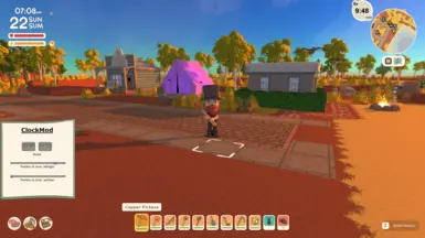
Works for me too with the latest version of Dinkum (Aug patch). I would prefer to see the digital time under the mini-map to replace the "M and map icon" that are pretty redundant to be honest - same size text would fit just right and look pretty cool too - IMHO.
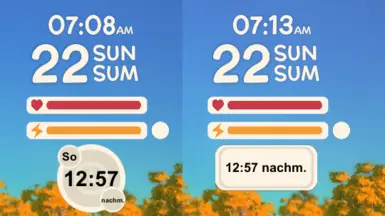
I sincerely thank you for the effort, but it seems you may have to make the position of the clock adjustable in a config file - it might solve the widescreen bug too. Problem is there are so many screen resolutions and aspect ratios nowadays that everyone needs to tweak the position. (Sorry I uploaded an image to the "images" tab so you could see the result - please delete once you've seen it!)
Thats the next step i wanted to make. But dont wanna make a black menu i wanna do it a little bit ingame style so i have to make a nice background. Hope i am done with today or tomorrow
All good - sliders are a little too sensitive, but made final adjustments in the file so got it spot on, thanks again for all your work - no excuse for missing things in the real world now!
Could you also check the way you are freeing up the cursor during setting the size - I have a couple of other mods that have a settings panel, but they no longer get a free cursor - the only way to adjust them is to open your settings UI first to get a free cursor, then open the others to change their settings!
Try my best but dont have much time. If you or someone could upload me a ultra widescreen screenshot for the mod side would be nice. With menu open so i could fix stuff if there are other problems.


18 comments
I would prefer to see the digital time under the mini-map to replace the "M and map icon" that are pretty redundant to be honest - same size text would fit just right and look pretty cool too - IMHO.
Could make a selection of styles
(Sorry I uploaded an image to the "images" tab so you could see the result - please delete once you've seen it!)
Thanks for all the effort and speedy development.