Man, I wish retro mode didnt half my FPS, I played with this for awhile and i couldn't understand what was going wrong with my fps. This is such a good mod.
Is it retro mode itself, or is it this mod? If you activate retro mode but disable this mod, do you still get low frame rates? Are you using the higher resolution option or are you sticking with the basic 640x400 resolution? In normal mode (non-retro), the graphics are drawn directly to the screen. When you activate one of the retro modes (with or without this mod) the graphics are first drawn to memory and then copied to the screen, so it is bound to be at least a little slower. If your fps are being cut in half, I wonder what resolution you are using.
I see the problem for 16:10, but what about adding a bottom bar with the hotkeys? Many android devices are 16:10, so maybe that would open up android use too?
I've been thinking about additional alterations for other screen sizes. It might involve sacrificing some view space but hopefully something can be done.
I absolutely love this mod, however I noticed that if your name is too long like "Meralyn Gilvani," it gets cut off. I can understand single names like "Pippinpaddleopsicopolis" getting cut off, not much you can do about that. However, the game already has "first name" detection when in dialogue with NPCs (as in they'll say anything before the first space. So if your character's name is "Frank Killsalot," it'll just say "Frank"). I was wondering if there was a way for you to integrate this into the name display on the HUD?
I'm actually using WilhelmBlack's mod which uses yours as a base. So if you already have this feature and Wilhelm just messed with the code or something, then I apologize. But if it's not too hard to integrate, that'd be pretty cool.
I noticed somebody else mentioned the "detect" issue, and that's mostly fine with me. But I've been using a mod called Clairvoyant, and being able to point to the quest item has really helped me to relax a bit more when playing. I totally get that the rotating compass won't allow for detect spells to function— what I was wondering is if there is some way to get the game to render the old compass on the screen as well or something as a stop gap temporary work around until you make future changes. I wouldn't mind the duplication on the screen.
if not, I understand. I'll keep switching in and out of 4:3 if needs be. If anyone has any ideas I'd be super grateful.
Absolutely love the vibes on this mod. Just wish it would work with 16:10 retro mode. Not a fan of 4:3, since it's squished. (I use an ultrawide, so I have black bars even on 16:10 - just think it'd be cool to have the option)
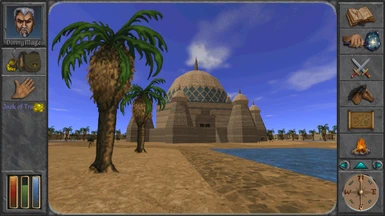
I just discovered this great mod, but mostly for it's ability to use retro mode in higher resolutions. Playing with the Daggerfall palette in a higher res is something that I wanted for a long time, thanks for that!
Would it be possible to allow 16x9 resolutions or at least 1920x1080, even if it is an independent module?
DFU normally renders graphics directly to the screen using the resolution specified in Advanced Settings->Video. If using retro modes it renders to memory and then copies the result to the screen.
I've noticed and tested that the hud compass appears to be unable to display detect treasure and other similar effects. I tried without and the little red line shows up again. Other than that this mod is grand.
Yes, the detect spells only work with the yellow compass, not the rotational one. I was thinking about changing the detect spells to show object locations on-screen instead of the compass.
Thanks, I did! A bit too retro for my taste. Thank you for supporting Dream 90s natively, that’s just awesome. Btw, apart from the hotkey bar and the HUD light, do you know if any of the mods recommended on Dream 90s modpage are incompatible with this mod?


73 comments
If you activate retro mode but disable this mod, do you still get low frame rates? Are you using the higher resolution option or are you sticking with the basic 640x400 resolution?
In normal mode (non-retro), the graphics are drawn directly to the screen. When you activate one of the retro modes (with or without this mod) the graphics are first drawn to memory and then copied to the screen, so it is bound to be at least a little slower.
If your fps are being cut in half, I wonder what resolution you are using.
I'm actually using WilhelmBlack's mod which uses yours as a base. So if you already have this feature and Wilhelm just messed with the code or something, then I apologize. But if it's not too hard to integrate, that'd be pretty cool.
I noticed somebody else mentioned the "detect" issue, and that's mostly fine with me. But I've been using a mod called Clairvoyant, and being able to point to the quest item has really helped me to relax a bit more when playing. I totally get that the rotating compass won't allow for detect spells to function— what I was wondering is if there is some way to get the game to render the old compass on the screen as well or something as a stop gap temporary work around until you make future changes. I wouldn't mind the duplication on the screen.
if not, I understand. I'll keep switching in and out of 4:3 if needs be. If anyone has any ideas I'd be super grateful.
(I use an ultrawide, so I have black bars even on 16:10 - just think it'd be cool to have the option)
Would it be possible to allow 16x9 resolutions or at least 1920x1080, even if it is an independent module?
If using retro modes it renders to memory and then copies the result to the screen.
I was thinking about changing the detect spells to show object locations on-screen instead of the compass.