Any chance of revisiting this for the update and PL? These icons are awesome yet are now a *bit* larger than they need to be to function correctly on the map.
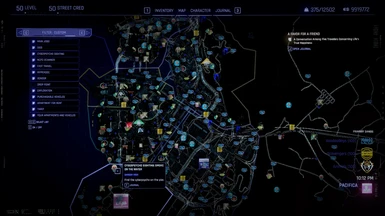
I second this - some of the colors are washed out, and some are tiny - especially the fast travel points, which are pinhead size (I have to sometimes get up and walk to the TV to find them on the map. The vendor icons are great, but sometimes that faded off-white blends right in. Others, like tarot cards, are fantastic just as-is.
Is there a way to adjust this, either your end or ours? I love the diversity of icons, but fast travel and being able to see icons clearly is critical.
Not to look a gift horse in the mouth, but to me the Colored Map Markers looks more improved than this mod. They look more clean and are easier to read and to spot on the map. This is just my personal opinion anyway.
This is a yeet free zone!!! No yeeters!!! Your cyber-ish punk-er in the image is not allowed to have joy in NC. Take your yeet'n happiness elsewhere!!!
nice mod BTW . I like the more vibrant colors in this replacement! Thank You


12 comments
Is there a way to adjust this, either your end or ours? I love the diversity of icons, but fast travel and being able to see icons clearly is critical.
No yeeters!!!
Your cyber-ish punk-er in the image is not allowed to have joy in NC. Take your yeet'n happiness elsewhere!!!
nice mod BTW .
Thank You