Thank you so much for this mod! You did an amazing job with accessibility here, and I’m really grateful to you for that.
I suffer from a degenerative corneal disease called keratoconus, which causes severe irregular astigmatism. And since the world is one big joke, developers think it's amazing to add the effects of a visual impairment to the game environment as an artistic decision— as if living with it every day wasn’t already enough of a challenge. They don’t consider that the artificial effect will stack with the natural one. I had to sit just 30 cm from the monitor to read some things in this game before I started disabling and modifying some settings.
if i had to only pick one of my hundreds of mods, this would be the one. i just wanted to chime in as another disabled gamer who really appreciates that this was made, i legitimately gasped when i saw this the first time.
hope you have a wonderful 2025 and thank you so much for making this!
Thank you so much for this! I just picked it up to do a fresh playthrough with the DLC on my Steam Deck. It runs well but obviously at a lower resolution; the glow around a lot of the text made the original font really hard to read. This one though is far better. I would like to mention that there are a few artifacts where the text gets cut off because it's a bit wider than the original one, but I can't say for sure if this is because I had my overall font size set to 58 or not. For instance, I noticed the cutting off happening on the price bar of a drink on a vending machine (I noticed it specifically on the one in Regina Jones's office).
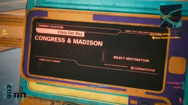
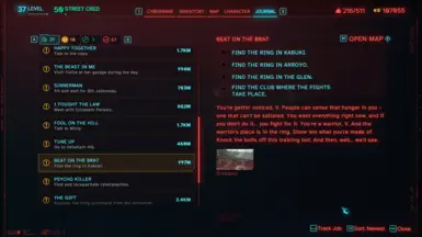
all of the in world signs are built around the default font. theres no way i can change it right now, or if its possible. happy to hear it works on smaller screens tho.
While Im not 100% sure I agree that the style fits the rest of the game. But it sure is much easier on the eyes and much nicer to read. I dont think my eye-problems are the reason its so much nicer. But at least now I feel able to read the lengthier messages the game throws my way :)
Dude genuinely from the bottom of my heart, thank you for making this. I don't wanna have to make you sit through an explanation of my lengthy medical issues lol. The important part to know is how my autoimmune issues left me with a fraction of my normal eyesight off and on from October 2023 up until just a few months ago. I spent about half that time struggling to play through the pain, having to pull my monitor up to just inches from my face. Ugh, it was so frustrating.
Just a teeny portion of players would need this for accessibility reasons so I really appreciate you using your time to help others stay active in the things they love. My eyes are fully healed now and my vision is back to normal, but I know it could always come back. I'll definitely be saving this for that case and will make sure to send others who have similar issues this way to try it out too.
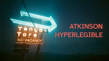
thank you for the kind words! yea i wished more games would implement this font as part of their accessibility options. it is such a huge boost to readability, its kind of a no brainer to add it and benefits everyone.
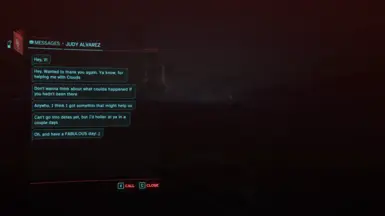
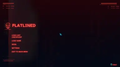
The stylistic choices of this game are more than questionable. Just one example, writing everything in red ink. A punishment for the eyes.
Especially in terms of the HUD and all the quest messages, which require reading. Some, if not many, are simply unreadable. When I bought this game, I was convinced that I would find the visual quality of The Witcher III, but I was very disappointed to say the least, while remaining polite.
Thank you for providing a solution to limit the problem
Note: CDPR has joined BETHESDA in my Blacklist of game creation studios.


8 comments
I suffer from a degenerative corneal disease called keratoconus, which causes severe irregular astigmatism. And since the world is one big joke, developers think it's amazing to add the effects of a visual impairment to the game environment as an artistic decision— as if living with it every day wasn’t already enough of a challenge. They don’t consider that the artificial effect will stack with the natural one. I had to sit just 30 cm from the monitor to read some things in this game before I started disabling and modifying some settings.
hope you have a wonderful 2025 and thank you so much for making this!
Just a teeny portion of players would need this for accessibility reasons so I really appreciate you using your time to help others stay active in the things they love. My eyes are fully healed now and my vision is back to normal, but I know it could always come back. I'll definitely be saving this for that case and will make sure to send others who have similar issues this way to try it out too.
Seriously, thank you 💗💜💙
Just one example, writing everything in red ink.
A punishment for the eyes.
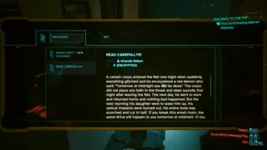
Especially in terms of the HUD and all the quest messages, which require reading. Some, if not many, are simply unreadable.
When I bought this game, I was convinced that I would find the visual quality of The Witcher III, but I was very disappointed to say the least, while remaining polite.
Thank you for providing a solution to limit the problem
Note:
CDPR has joined BETHESDA in my Blacklist of game creation studios.