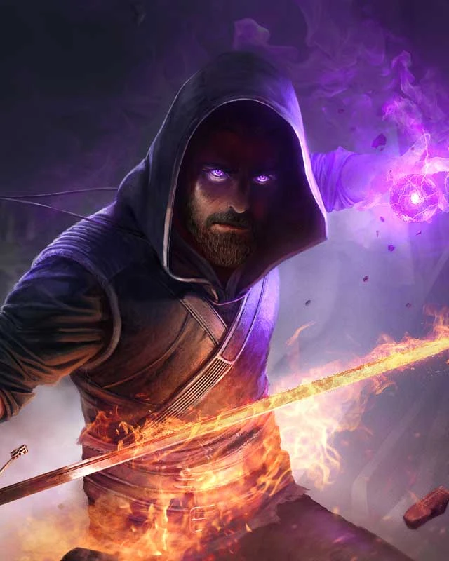
i like how the image for both mods is just so low effort. im not saying anything bad about the mod itself but you did put 0 effort into the pictures you cant deny that.
I put some effort in. Why is it any different from any other mod? It has the title, and the mod. Thats all you need. I concede it could be better, but that would require me having some kind of vector creating skills that I don’t have
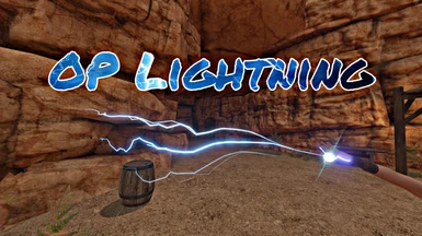
its showing lightning, and has the name, what more you want? flashy font, crazy effects? for once Im actually kinda happy its not over the top or over edited, shows what it is, and is to the point, the image isn't the point of the mod, the description or a video is more the point. sides...OP lightning is...kinda obvious.,..stronger lightning, better imbuement, etc. its lightning.
not to sound like a dick, which Im sure my comment does, but for something more simple like this, it really doesn't need much effort, or any EXTRA effort tbh lol.
Well, Butters made a better picture for me so I’m using that now. Thanks butters. But I’ll just have to learn how to make better ones, even if it just means putting in a cool font
video doesn't load up for some reason. all i'm getting is a small square with the "this is where a video should be, but it isn't" microsoft pic art image.


19 comments
not to sound like a dick, which Im sure my comment does, but for something more simple like this, it really doesn't need much effort, or any EXTRA effort tbh lol.