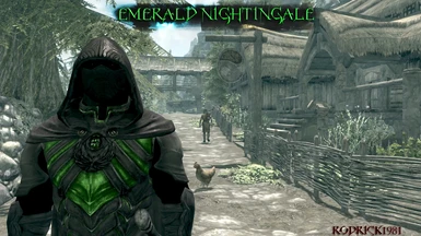
really why would you put emerald in letters on the cloack, it bothers me and maybe you should try upgrading your mod to look better i like the idea but for how it looks like right now i wont download it, sorry for bothering man
thanks for the comments guys and the tips im still noob at this and researchin for better techniques any tips for better texture work is more than welcomed
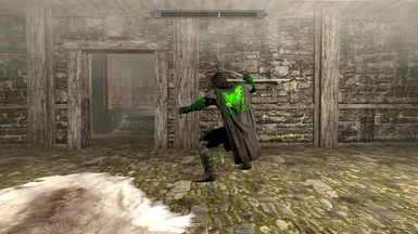
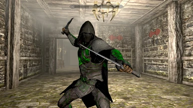
I like the concept, but I'm not crazy about the execution. I think that if the green were a bit darker, it would make it a little less garish. The locations where you added the green look like the right spots, but imo the color is just a tad too bright.
Regarding text, whenever I do art (which, admittedly, isn't often because I suck at it) I always try to remember something my 1st grade art teacher said: "I almost never put words in my art, because they draw too much attention away from the rest of the piece. Our brains focus on the words, and we kinda end up wasting all the extra details everywhere else." Just some food for thought. If you like it and wanted to share it, more power to you! Just not my thing.
Love the creativity and time put behind this one! YOU sir got a bright future ahead of you! Thanks for the lovely art! Don't mind the judgementality of some porkchops! This is brilliant, tho' not even close to what i prefer (colors) but it's been noticed and appreciated! Thank you.
I hope you ignore the people who get butthurt over a re-tex xD
While green isn't my colour, I do indeed love the way you've implemented it into the armor. I think it would look nice with less green on the arms, so it's more subtle like the rest. I'm also not a fan of the cape having Emerald on it, but that is a matter of taste as well
Please continue what you're doing. I've seen all your other re-textures on here and for some of your first re-textures you are showing promise ^_^ Bold is not a bad thing, as everyone likes something different, right?
As a note, I agree with the points that Rex1029 has made. It was certainly nice of him to take the time to go so in depth.


 Give Feedback

14 comments
A skimpier version for females too.
Regarding text, whenever I do art (which, admittedly, isn't often because I suck at it) I always try to remember something my 1st grade art teacher said: "I almost never put words in my art, because they draw too much attention away from the rest of the piece. Our brains focus on the words, and we kinda end up wasting all the extra details everywhere else." Just some food for thought. If you like it and wanted to share it, more power to you! Just not my thing.
Sidenote: is that emblem taken from 40K?
While green isn't my colour, I do indeed love the way you've implemented it into the armor. I think it would look nice with less green on the arms, so it's more subtle like the rest. I'm also not a fan of the cape having Emerald on it, but that is a matter of taste as well
Please continue what you're doing. I've seen all your other re-textures on here and for some of your first re-textures you are showing promise ^_^
Bold is not a bad thing, as everyone likes something different, right?
As a note, I agree with the points that Rex1029 has made. It was certainly nice of him to take the time to go so in depth.