for anyone wondering what the changelog implies with "visual aesthetic": the texture of the stone rubble started to look like gravel, and less like parts actually broken from the tower (i.e. bigger chunks). i suggest finding a good retexture is the better solution here.
that is not on me to decide. you see, basically the fix is purelly cosmetical. is it convincing enough for a majority of the uskp team? who knows. they can use it, if they want to. and for all other purposes, it's now here for everyone to use. i did it for myself, and thought i'd share. enjoy.
Well, this mod IS my attempt to convince them. I think the wood does look better without the vertex colors, but quite frankly it still looks bad. Maybe it would be better to let brumbek from smim have a look at it? He did some wood improvements before, and any changes beyond what i did for those planks would be outside of the scope of uskp, even in my eyes.
Well i like it! Kudos for your work! And coincidentally it doesn't matter if arthmoor adopts it or not, since it's not an ESP file! Well done again devil hides in the details!
It never bothered me until i saw your file. It still doesn't bothers me, because the dragon that appears there breathes fire, right? The wood could be burned... But it really should at least have a burned/charred texture then :p
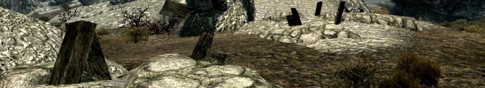
those rubbles appear throughout the whole land though at each fort. not sure what they had in mind with those wooden parts, but i know that they knew how to make better looking burned wood. take a look a helgen for example. this is not what they did here. (also compare with the much nicer and actually dark looking wood[that is not actually dark] on the bridge in picture 2 and 4) my interpretation is, that they wanted this wood to be weathered and dark, but two guys did it at the same time (texture and vertex color on mesh) and it ended up too dark in the sum. now you can at least see the structure again, and it's not pitch black most of the time. it's still very dark though. incidentally, this also means the difference is not that noticable. oh well.
I'd message both Arthmoor and rolloLG about this fix, see if either of them will adopt it. I'd rather not have any more patches in my load order than necessary.


 Give Feedback


15 comments
i did it for myself, and thought i'd share. enjoy.
As for convincing the USKP team, they created a texture for the Markarth banner, an object that isn't used anywhere in the game!
I think the wood does look better without the vertex colors, but quite frankly it still looks bad.
Maybe it would be better to let brumbek from smim have a look at it? He did some wood improvements before, and any changes beyond what i did for those planks would be outside of the scope of uskp, even in my eyes.
my interpretation is, that they wanted this wood to be weathered and dark, but two guys did it at the same time (texture and vertex color on mesh) and it ended up too dark in the sum.
now you can at least see the structure again, and it's not pitch black most of the time. it's still very dark though. incidentally, this also means the difference is not that noticable. oh well.
not sure he's convinced though