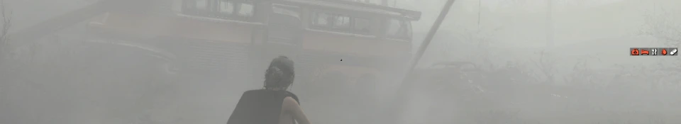
Okay, this HUD is in fact beautiful. But imh, that "effects" bar, should go to the bottom, like the ammo. Also, I miss the map to point me directions (not really a map, but that thing from the normal HUD that tells you what direction you're travelling, you know?)
Seeing no one else has said this, I actually like the surival notices in the middle. My TV screen tends to clip the edges, so ill have to see if I lose the health bar using this. Thanks!
But the author is asking for opinions. And I think cthu miss-read his post by the looks of it.
I agree with indycurt. Otherwise, the info is still in your face" or so to speak. Maybe bellow your ammo count. That would balance the HUD out nicely IMO. Either way, great idea!
I like it. Haven't installed yet. Couple of thoughts: 1) Playing at 4k it's key for me that all controls/read-outs are shown, but using minimalist sizes like yours. Other HUDs tend to show or not show which misses my point. 2) I'd move all the not-critical things to the bottom. 3) I'd move Critical things (enemy name, alerts, container contents etc) right next to the aim point


14 comments
Edit: never mind I figured it out
I agree with indycurt. Otherwise, the info is still in your face" or so to speak. Maybe bellow your ammo count. That would balance the HUD out nicely IMO. Either way, great idea!
1) Playing at 4k it's key for me that all controls/read-outs are shown, but using minimalist sizes like yours. Other HUDs tend to show or not show which misses my point.
2) I'd move all the not-critical things to the bottom.
3) I'd move Critical things (enemy name, alerts, container contents etc) right next to the aim point
I'll give it a try.