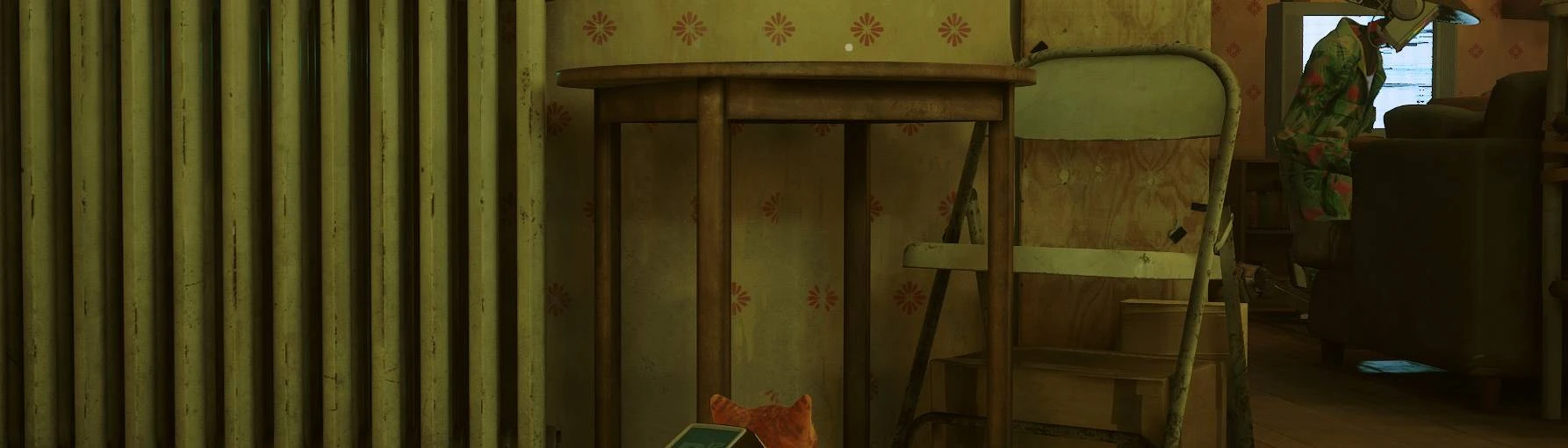
I love this a ton, it makes the game so much prettier to play/watch! However, while the triangle is perfect for me, I can never seem to see the circle, so I've still been unsure about my jumps. Would it be possible to have a version where the circle is about the same size as and with the outline like the triangle? I feel like that'd make it stand out just enough
Immersion mods are always appreciated! I toggled the jump button prompt off completely though and still can see if I jump up or down and if I can jump at all, because the cat actually looks in the direction it will jump to! It's not as fast and immediate as a button prompt, but enough for me to quickly find my way!
Sorely underappreciated mod. Thanks for making this; those button indicators are huge and distracting after awhile. You're absolutely right, too - removing the indicators altogether makes it too easy to jump somewhere you don't mean to. This is a perfect compromise and doesn't detract from the gorgeous scenery.
EDIT: This is not a request, but an idea for future. The red dot and white dot are great for me personally, but the red can sometimes appear very low contrast. For people who are colour-blind, a version where it's a white dot for A and and a square or star for Y - could be an idea!
Agree with you on the red dot part. I've found myself looking hard at the environment sometimes because the red dot seems missable in emeny infested areas lit in stark red light. I'll change it to a white triangle since tiny square and tiny circle both might seem similar.


 Give Feedback


10 comments
I toggled the jump button prompt off completely though and still can see if I jump up or down and if I can jump at all, because the cat actually looks in the direction it will jump to! It's not as fast and immediate as a button prompt, but enough for me to quickly find my way!
You're absolutely right, too - removing the indicators altogether makes it too easy to jump somewhere you don't mean to. This is a perfect compromise and doesn't detract from the gorgeous scenery.
EDIT: This is not a request, but an idea for future.
The red dot and white dot are great for me personally, but the red can sometimes appear very low contrast. For people who are colour-blind, a version where it's a white dot for A and and a square or star for Y - could be an idea!