About this image
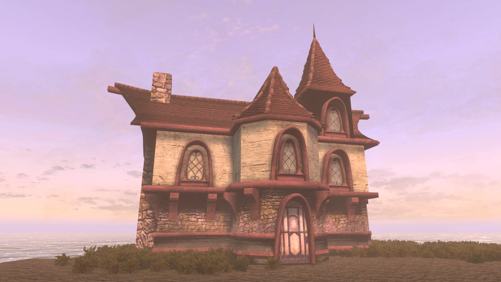
I worked on trying to add some more detail and worked on the textures a little bit. Let me know what you guys think and please be specific. :) I can't tell if it looks too low poly or not so I'd also appreciate your thoughts on that. Be sure to check out my previous post on this nif here for comparison. Cheers :)
Note: The normals on the tower need to be corrected but you can see what that looks like in the link above.


4 comments
But here are my observations:
1. The overall image looks a bit washed out and hazy making it more difficult to evaluate the quality of the textures.
2. I like the style of the architecture; looks pretty much like how I remember Cheydinhal.
3. The chimney does not appear to be plumb/straight. In fact the entire left side of the house doesn't look straight but maybe it's the angle of the picture but the right side of the house does look more vertical.
4. From what I remember of Cheydinhal, the wood should be darker; more like a dark walnut tone.
5. I also remember the plaster being whiter creating more contrast with the darker wood.
This is pretty much how I remember it:
I would recommend one of firemanaf presets: Skyrim Re-Engaged, NVT or Intrigued ENB or Silent Skies ENB by LoneyKitsune.