Skyrim Special Edition
Working On New Signs

Image information

Added on

Uploaded by

Skyking2020

About this image

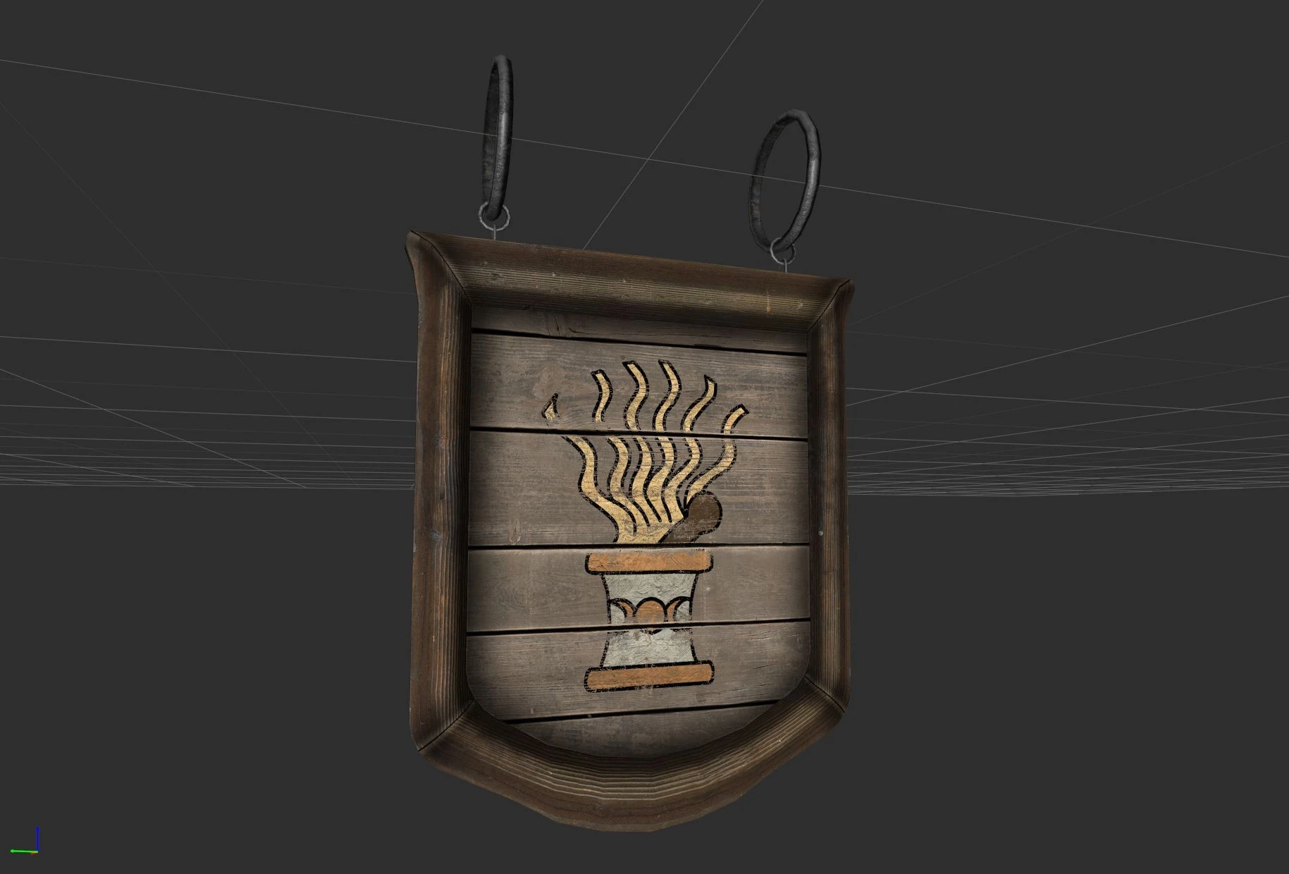
So, after making my new town mod with custom signs, I decided to make all new meshes and texture for the signs. Problem is the sign artwork. I suck at drawing. But, nose to the grindstone and try to come up with a solution. Here's a hand drawn alchemy logo for my sign. Again, I can't draw. I know the inn signs will be tough.

13 comments

  1. banebain
    banebain
    • member
    • 5 kudos
    It looks great. I use a lot of Rally's mods, so I believe it'll fit well with those mods. Your artwork looks great as well. I love Vanilla's style but adding some personal flair wouldn't hurt. ;^)
  2. m1sf1t711
    m1sf1t711
    • premium
    • 10 kudos
    I'm another vote for sticking with close to vanilla for the sign artwork :) I love the mesh design!

    Will they react to the wind?
    1. Skyking2020
      Skyking2020
      • premium
      • 2,428 kudos
      Yes, they will react to the wind! Just sorted that out actually.
    2. m1sf1t711
      m1sf1t711
      • premium
      • 10 kudos
      Oh that's awesome! Can't wait for this mod
  3. LazyBuddhist
    LazyBuddhist
    • member
    • 0 kudos
    Same, just an improved version of vanilla would be awesome. Looks good so far!
  4. RavenKing95
    RavenKing95
    • member
    • 2 kudos
    Honestly, that's pretty good. Like, I've definitely seen better, but for what I assume is an early attempt, you've done quite well. So far as the inns are concerned, that is going to be a little more of a challenge (especially depending on the name!), but I have confidence you'll see it done and that your craft will continue to improve as you go along. If it helps, try and remember that these are signs meant to hang outside, in the wind and the rain. They're meant to convey what the place is and ideally they're not meant to be replaced often. Simplicity is often better purely because it's quicker to touch up if needed.
    1. Skyking2020
      Skyking2020
      • premium
      • 2,428 kudos
      Yup. Compared to vanilla, the artwork isn't bad, I just see flaws in it. The meshes and mesh texture are awesome. It's just the artwork and copying the vanilla artwork faithfully.
    2. RavenKing95
      RavenKing95
      • member
      • 2 kudos
      Actually, comparing the two, you've done very well. I quite like the slight break between planks.
    3. Skyking2020
      Skyking2020
      • premium
      • 2,428 kudos
      So, do you think I should just do all new custom artwork, or stay close to vanilla?
    4. JuicyArts
      JuicyArts
      • member
      • 7 kudos
      I VOTE VANILLA! LOOKS EPIC MAN
    5. RavenKing95
      RavenKing95
      • member
      • 2 kudos
      I would stay close to vanilla, but maybe try and put your own spin on it. Recognisable symbols, but maybe with little twists on the design. I notice that the mortar and pestle always seems to have the triple moon design, but that's historically more emblematic of so-called 'Goddess' worship (looking at you, Gardner) than anything truly alchemical. Fun thing about alchemy, mind you, is that there's a LOT of symbols to choose from. May I suggest the Monas Heiroglyphica, for example? It's nice, subtle, you can easily make it out of shapes and as a bonus, anyone who sees it and actually recognises it will get to spend the rest of the day being smugly satisfied at their own cleverness.
    6. GabonZ
      GabonZ
      • premium
      • 17 kudos
      Looks very nice! I also think staying close to the vanilla artwork would be nice, there are already designs that go in a very different direction and in my opinion don't always fit.
  5. namesmatt
    namesmatt
    • member
    • 0 kudos
    Can't wait! Great job.