It is really nice but i dont understand how to change to the other fonts to try them out , also i want to disable the regal and galant letters because i can barely read them (if they look like the images uploaded ) , any plan to add another letter font ?
In its current state, this mod requires that one font in each category is chosen. You cannot have the UI font without also taking one of the mod's book fonts and one notes font, or the game will crash. I can't read the notes fonts easily either - fingers crossed we get an update. Here is a step by step on how to make your selections:
1. Choose a UI font, a books font, and a notes font using the description and screenshots on this page. You may want to write them down. 2. Go to Steam\steamapps\common\Skyrim\Data\Interface. 3. Open fontconfig.txt.
Notice how most of the lines in this file begin with a semicolon(;). This is a comment. When the computer reads the .txt file, it ignores commented lines. Comments are for human eyes only and won't do anything to the game. To comment a line, put a semicolon at the start. To uncomment a line, remove the semicolon.
Comments may be used for writing simple notes... (as in '; Skyrim Vanilla Fonts') ...or for leaving inactive lines of code in the file so that they may be uncommented and used later (as in 'map "$ListFont" = "Fertigo Pro" Normal'). When you deactivate lines of code in the fontconfig.txt file, you could just delete those lines, but commenting them instead means you can go back on those changes later if you change your mind.
4. In UI/Menu Fonts, make sure the font you want has 6 uncommented lines below the line with the font title. The font title line must remain commented. You want to make sure the other 2 font title lines both have the 6 lines below them commented. 5. In Book Fonts, uncomment the line for the font you want, and comment the other 2. 6. Do the same in Notes Fonts.
I LOVE this mod, especially for replacing the god-awful sans serif UI font. It makes the game so much more immersive and just plain nice to look at. I like Fertigo Pro because it is still bold enough to be quite easy for me to read.
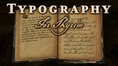
I find both the notes fonts (Regal and Galant) in this mod hard to read. I settled for Galant, but I still struggle to read things in this font. I think this is one thing the vanilla game does quite well: the calligraphy-style notes font is believable and highly legible. On the topic of immersion/lore-friendliness, I struggle to believe bandits and such would write so gracefully. The default notes font strikes a good balance between being refined and casual.
I also don't think a printing press is in Skyrim's technology, which means this mod's book fonts don't make a lot of sense to me, either. In my opinion, Skyrim's books are copied by hand - which means they should be much more expensive!! Haha.
Unfortunately commenting out all fonts in any category (books, notes, UI) in fontconfig.txt results in CTD, and I wouldn't know where to start with editing the .swf's. If the author plans to update the mod, then making all default fonts still available and functional would be the change I would want to see. --------------- Related: I was adding mods to my game when a blurry text bug happened. Books/notes no longer looked sharp and clear. Example: text used to look like this, but suddenly looks like this One of these changes caused the bug: ?Installed aMidianBorn Book of Silence, NobleSkyrimMod HD-2K, and SMIM ?Uninstalled the official HD Texture Pack mod. Solution: I installed Books Notes Paper 2K HD?. I'm not sure I like the look of the paper - but my chosen Typography for Skyrim font still works and looks clear. Anyone else troubleshooting, use this as a starting point, since this mod may work and the author provides links to other mods that should work. --------------- Thanks to ciathyza for the great mod!! The true value of your work is intangible.
Hi This is a really great mod. It perfectly fits the climate of Skyrim. One of the few must have mods. I would like to ask you for the possibility of adding the Polish letters "ęółśążźćńĘÓŁŚĄżŹĆŃ"? Because in my game with this mod everything that contains these letters looks like this "[] [] [] [] [] [] [] [] [] [] []". I will understand if you refuse. I wish you have a nice day.
I'm not sure if this just a problem with Oldrim, but fonts in journals and books appear to be a bit blurred when compared to fonts in notes and those in your screenshots.
Is this due to Oldrim or have I made a mistake when assigning fonts?
The only change I made was changing the displayed font in books from Morris to Galant.
EDIT: I didn't realise while mod testing that the default resolution for text in books and journals were poor. So the problem is one for Oldrim, I don't know if SE improved the quality of text in books.
Hi, I've tested the fonts in LE and they look all just as sharp and clear as in SE. The Regal Handwriting font might be somewhat hard to read depending on the note's size but the other font should not be a problem.
Everything looks great - except the console text. All I see there is squares "[][][][][] [][][] [][][]"... I wonder if it's because I use scandinavian keyboard layout o.O
I don't think it has anything to do with keyboard layout. All latin character sets are included. Can you check if any other fonts_console.swf overrides the one from this mod?


 Give Feedback


21 comments
1. Choose a UI font, a books font, and a notes font using the description and screenshots on this page. You may want to write them down.
2. Go to Steam\steamapps\common\Skyrim\Data\Interface.
3. Open fontconfig.txt.
Notice how most of the lines in this file begin with a semicolon(;). This is a comment. When the computer reads the .txt file, it ignores commented lines. Comments are for human eyes only and won't do anything to the game. To comment a line, put a semicolon at the start. To uncomment a line, remove the semicolon.
Comments may be used for writing simple notes... (as in '; Skyrim Vanilla Fonts')
...or for leaving inactive lines of code in the file so that they may be uncommented and used later (as in 'map "$ListFont" = "Fertigo Pro" Normal'). When you deactivate lines of code in the fontconfig.txt file, you could just delete those lines, but commenting them instead means you can go back on those changes later if you change your mind.
4. In UI/Menu Fonts, make sure the font you want has 6 uncommented lines below the line with the font title. The font title line must remain commented. You want to make sure the other 2 font title lines both have the 6 lines below them commented.
5. In Book Fonts, uncomment the line for the font you want, and comment the other 2.
6. Do the same in Notes Fonts.
I find both the notes fonts (Regal and Galant) in this mod hard to read. I settled for Galant, but I still struggle to read things in this font.
I think this is one thing the vanilla game does quite well: the calligraphy-style notes font is believable and highly legible.
On the topic of immersion/lore-friendliness, I struggle to believe bandits and such would write so gracefully. The default notes font strikes a good balance between being refined and casual.
I also don't think a printing press is in Skyrim's technology, which means this mod's book fonts don't make a lot of sense to me, either. In my opinion, Skyrim's books are copied by hand - which means they should be much more expensive!! Haha.
Unfortunately commenting out all fonts in any category (books, notes, UI) in fontconfig.txt results in CTD, and I wouldn't know where to start with editing the .swf's. If the author plans to update the mod, then making all default fonts still available and functional would be the change I would want to see.
---------------
Related: I was adding mods to my game when a blurry text bug happened. Books/notes no longer looked sharp and clear.
Example: text used to look like this, but suddenly looks like this
One of these changes caused the bug:
?Installed aMidianBorn Book of Silence, NobleSkyrimMod HD-2K, and SMIM
?Uninstalled the official HD Texture Pack mod.
Solution: I installed Books Notes Paper 2K HD?. I'm not sure I like the look of the paper - but my chosen Typography for Skyrim font still works and looks clear. Anyone else troubleshooting, use this as a starting point, since this mod may work and the author provides links to other mods that should work.
---------------
Thanks to ciathyza for the great mod!! The true value of your work is intangible.
This is a really great mod. It perfectly fits the climate of Skyrim. One of the few must have mods.
I would like to ask you for the possibility of adding the Polish letters "ęółśążźćńĘÓŁŚĄżŹĆŃ"? Because in my game with this mod everything that contains these letters looks like this "[] [] [] [] [] [] [] [] [] [] []". I will understand if you refuse. I wish you have a nice day.
Is this due to Oldrim or have I made a mistake when assigning fonts?
The only change I made was changing the displayed font in books from Morris to Galant.
EDIT: I didn't realise while mod testing that the default resolution for text in books and journals were poor. So the problem is one for Oldrim, I don't know if SE improved the quality of text in books.
I wonder if it's because I use scandinavian keyboard layout o.O