About this image
Notice
This user's image description contains 1 images. Some authors like to showcase more of their work in their image descriptions or use the image description to provide a storyboard for the image provided.
You will need to be logged in before you can see this user's image description.


19 comments
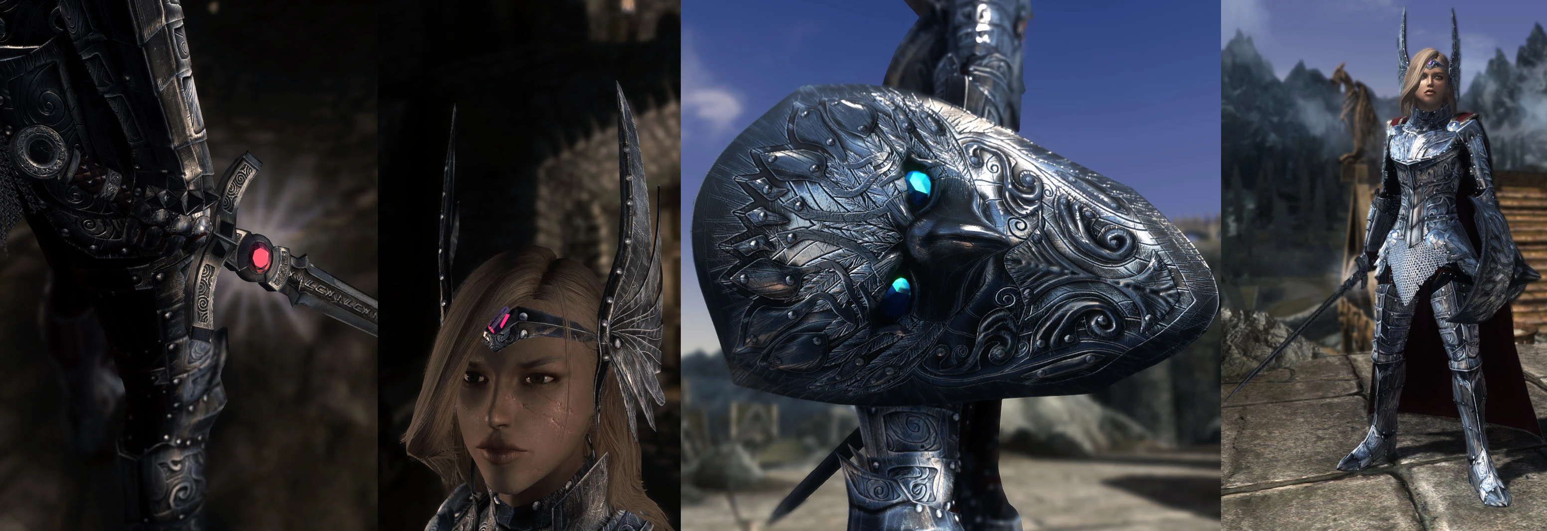
As for how dirty or how much lack thereof is, I'm kind of fine either way. I can see both options turning out well; one being a pristine, immaculate design representing purity, an aforementioned "arbiter [of justice]", the other suggesting some manner of use/being war-scarred, and/or adding a realistic element, even in the context of valkyries. Could wind up looking too clean and become a victim of Skyrim's subpar rendering qualities, though likely not to any great extent or at all. Do whichever you feel like, whether it's what's causing you the least amount of trouble or going with the route of what you consider the most fitting/best looking choice. It already looks pretty spectacular and not overdone in any manner currently, though, but perhaps worth a shot if you're willing to allocate the time to make a cleaner version, whether it'll be an optional texture or not in the final product.
What I'm not in agreement with would be the prior suggestion of altering the colour-scheme by incorporating elements of gold. Gold is typically a complimentary colour to those in the warmer part of the spectrum as well as deeper shades of blue (royal, navy blue etc) rather than silver blue metal, which is best complimented by colours in the cooler part of the spectrum if I recall my colour "theory" correctly, hence the recommendation to opt for blue gems above.
The chosen colour, a silverish blue, does tie in well with the theme of the armour and might even serve to make up for Skyrim's inherently lackluster post processing by virtue of being a generally metallic colour. Moreover, you've actually managed to achieve a metallic-ish looking armor despite the limitations imposed by Skyrim and that alone deserves commendation, of course in addition to the overall amazing design of the set.
I mean, for crying out loud, the least Bethesda could've done whilst they were in the process of making the remaster of Skyrim was to implement PBR as they had done in FO4 (assuming there were no major technical hurdles or unwarranted amounts of effort to incorporate it). Nope, ENV maps still have to do, apparently.
That'd be why I mentioned changing the Raven shield's gems to red, so it would be consistent theme of silver/red without any mismatches coming along. If it were to be silver/blue, then the cape with the silver Valkyrie armor must also be blue.
fantastic work! i hope you get the results you desire with this!
First suggestion: a little adjustement to overall colour scheme: silver + steel with blue tint + gold would make it look great
Second suggestion and observation: every armour piece has a gem of different colour, unneccesary chaos that makes set looks like wrongly made up sunday suit
circlet saved the bunny ears
Edit: The armor looks masterpiece as it is. Keep it dirty and interesting