Site design update, file backgrounds and hot file cropping
As promised I’ve made some changes to the layout that aren’t too different from the original. So, far from being an overhaul, it’s more an update to the original design. Right now we’ve made changes to the headers of all the Nexus sites and to the file page layout. We’ve got a few more page layout changes in the works, and next will be the category/search result page, but right now lets run through the current changes.
As mentioned the header has changed. The search, messages, notifications and account options are all accessible from the top bar now and we’ve removed the need for the originally (relatively garish) coloured bar, thus saving a few pixels in height in the process. Clicking the search button will produce a bubble box for you to do a quick search, and we’ve also made it more obvious that we have an advanced search as well. One thing that really surprises me from doing the internet rounds is that lots of people still don’t know we have an advanced search feature to really drill-down into what you’re looking for.
We’ve changed our logo area a bit; each site is labelled as Nexus Mods and the name of the game is listed below it. This is going to fit in to our future plans a bit more, so this change is more a change for the future rather than a necessary change right now. The normal navigation is still in-tact from the original design, no changes there, so you shouldn’t get lost.
The file page changes are slightly more substantial.
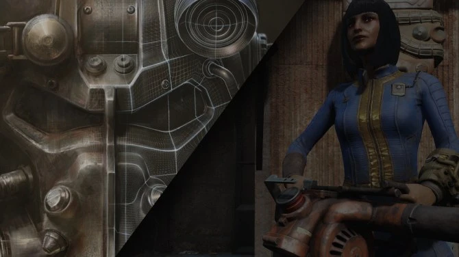
Probably the most notable change we’ve made is adding a file header background image that mod authors can create themselves through the site interface, to bring some more colour and variance from other mod pages out there. Something that makes your page look more unique from others. As is our way, creating a file header for your pages is completely optional, so if you don’t like them on your file pages you don’t need to do anything, you can stick with the default look (or you can play around with the system, then delete it if you don’t like the look).
To create a file header you need to go to your file images and click the background image icon underneath the image you’d like to use. You’ll be taken to a page where you can crop the image you’ve selected (much like you might crop your profile image on a social networking site like Facebook) and see how it’ll look on your page before you decide on whether you want to use it or not.
In the same vein we’ve also produced a similar tool that allows you to create your own hot file images for the site to use. Up until now the site has automatically generated these images and it’s been a bit hit and miss. Sometimes it produces a great hot files image, other times it produces an image of..the sky...or the sea...or a head...and it’s not so great. Now it’s all on you. If you think this feature is redundant for you because all your files were released a while ago and are no longer eligible for the hot files system then think again. We’re bringing in a “Feature file” system for the new category page. This system will show a random file from the category you’re viewing that changes every 10 minutes. Every file with a hot file image is eligible for the Featured File system, and we’ll rotate properly so every file gets equal time and exposure. We’ll also let you know how many times your file has been featured on a category, just for your own peace of mind. So creating a hot file image on your old files is highly recommended if you’d like some added exposure in the not too distant future.
We’ve moved the buttons to download the file, endorse it, vote for it and donate to the author to the top right in prominent green colours. We’ve also added a big “Track” button as well, as lots of people didn’t know we had a file tracking system. Clicking the vote, endorse and track buttons will make them turn orange (if it was successful), so you know when your vote, endorsement or track action has worked. They’ll remain orange when you revisit file pages, so you know at an easy glance whether you’ve already endorsed or tracked a file or not.
We’ve added some text below the “Action” buttons which should make it more obvious what each one does without being a mystery meat navigation that you can’t intuitively work out without hovering over the tiny icons. Similarly we’ve increased the size of the file tabs themselves and added a description at the top of each tab, once again to make it more obvious what each tab is for.
And that’s it!
If you think something isn’t looking right or working properly then feel free to let me know. I’ve tested the site in the latest versions of IE, Fire Fox and Chrome, but can’t account for every variation.


400 comments
Comments locked
A moderator has closed this comment topic for the time beingMany of the other features I never, or rarely, used, but just now I've been playing with the file header images. I like that!
white/light grey background
black text...