Hi, sure, I got the original .tex files from Darn's mod, used DC Font Converter to convert the .tex file into a .png, then I loaded it into photoshop and used the text tool to place new vectorized letters (using the source .ttf font) where the old ones were, upscaled the image to 4k and saved it as a png, then converted it back into a .tex file with DC Font converter.
The tricky part is getting the letters aligned properly, the original textures are low resolution and when you place them they might look pixel perfect but once upscaled turn out to be misaligned. There was a lot of manually moving things around pixel by pixel.
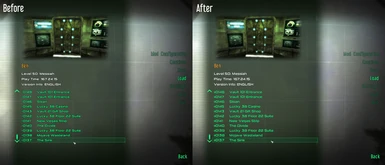
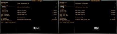
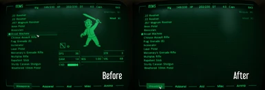
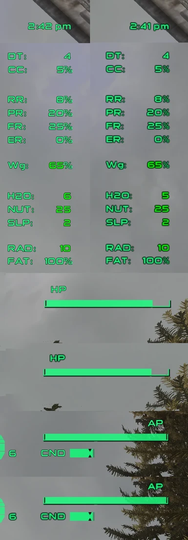
If you look at the screenshots and zoom in you can see the new fonts are significantly sharper and more detailed when you get into UHD resolutions. If you play at 720p or 1080p you might not notice as much of a difference.
The screenshots are a bit hard to decipher because you have to zoom in and then scroll to really compare them. When the screenshot is zoomed out it causes the After version to seem harsh and aliased. But it's a very good mod. I made a cropped, easier-to-compare screenshot here:
I'm on 1080p and it also looks worse for me.. but I'm not suprised heheh.. Gotta drop this for now, but in general it's nice thing for higher resolutions. Endorsed :)
Yeah, I've noticed that, I'm not sure what causes it, maybe something to do with the way the game scales the pip-boy? To me the Pip-boy actually looks better without the mod, but the game uses that font for other things so I have to include it.
I really like these font, but when i updated to the new darn version 20220121, all my items disappeared except for food/drink/chems. There are no tabs to switch to armor/guns/misc, etc.
i was happy at first seeing this mod really .. but after testing it in game it looks much worst than before .. but thx for your time for making this mod this is not a hate comment just a head up mybe to look into the mod again because tbh there is no other mod that does that .. but still not useable in my eyes at least atm hope u will try to fix the font mybe not 4x . try 2x i think 4x is a bit to much it look just like hard letter without AA


 Give Feedback


38 comments
Search google.
The tricky part is getting the letters aligned properly, the original textures are low resolution and when you place them they might look pixel perfect but once upscaled turn out to be misaligned. There was a lot of manually moving things around pixel by pixel.
Thanks.
If you play at 720p or 1080p you might not notice as much of a difference.
(Top: Before, Bottom: After)
https://i.imgur.com/82sSP00.png
Gotta drop this for now, but in general it's nice thing for higher resolutions. Endorsed :)
To me the Pip-boy actually looks better without the mod, but the game uses that font for other things so I have to include it.
Does it happen with this mod uninstalled?