


What's happening?
Our current notifications system has served the site well for many years but was starting to get a bit old and tired, plus it's not particularly easy to modify or scale up to fit the needs of the growing community. It really began showing its age in September 2020 when the system hit some database limits which required considerable maintenance work to get it going again.
To remedy this, we've built a brand new replacement system from the ground up with a focus on easier access to notification preferences, a cleaner design and full control of your notifications direct from the panel. While it may not look much different from what you're used to, it lays the foundation for a much more powerful and versatile system.
We've migrated all the notification types you're used to into this system, so you shouldn't be missing out on anything. In addition, it's now considerably easier to add new types of notifications to the site. So, if there are any events on the site you wish you were notified about let us know in the comments and we'll see what we can do!
You'll be able to get your hands on the new panel from 22nd March 2021, with the old system being switched off the same day.
As a quick summary, here are the things that are new (or different) with the upgraded system:
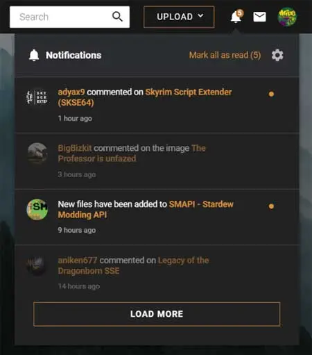
- Read notifications now remain in your notifications panel - As we've moved all controls for notifications into the panel, you'll be able to see any manage notifications you've already read. Here you'll also find controls to mark them unread or delete them.
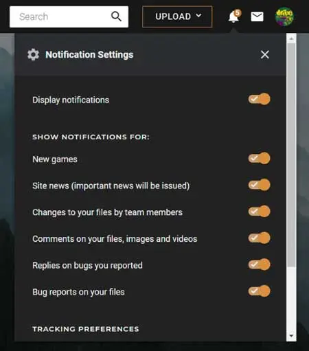
- Quickly toggle notification settings - Just click the cog icon and you can change your preferences without needing to leave the page you're viewing.
- 90-day cleanup - One of the problems the old system had is that it kept notifications forever. Meaning inactive users were collecting more and more notifications they may never read or at least would be overwhelmed with when they return. We'll now be keeping notifications for 3 months and then automatically clear them from your panel.
- No more game-specific notifications - While this may come off as bad news for some of you, we've removed the ability to filter notifications based on the game site you're viewing. In a survey we ran in November 2020 ~75% of users did not use this option and the overall consensus was that it would be largely unnecessary if we allowed more granular control over notifications.
As time goes on we'll be iterating on the system to add new notification types and better controls for managing which notifications you receive. For now, we've replicated the "old" system functionality so it should feel both new and familiar to you.
What's the catch?
Unfortunately, the data used by the new system is incompatible with the old system. This means that all of your existing notifications will be permanently removed on 22nd March 2021. We're giving you a heads up now so you have time to manage any important alerts from the existing system before the switch-over takes place.
We're keen to see what you guys make of the new system and, as before, please let us know in the comments if you have any good ideas for new types of notifications to show. We might even be able to get some of the best ideas in place in time for launch!
776 comments
Comments locked
A moderator has closed this comment topic for the time beingWe will soon be doing a cleanup of all leftover data and code related to the old system, so I wanted to provide you with another little update. At this point, we're pretty happy that all the major bugs are have been fixed so we've started looking at the highly requested improvements. I can't offer any sort of timeline for these changes as we're currently working on several internal projects that are very important and will take precedence over QoL changes to the notifications system.
Recent Changes
Post Launch Update 30/03/21
Following the initial wave of feedback, we've highlighted a few high priority issues with the new system which our developers are currently working on fixing.
Priority Issues List
Investigate cases where users are not getting any notifications at all(Complete)Restore notifications for "Comments on mods I'm tracking". (Fixed 02/04/2021 - see your preferences to toggle it on/off)Some users aren't receiving "Comments on mods I'm tracking" since the default was changed to "OFF"(Fixed 16/04/2021)Investigate issues with replies to comments in the Image and Video share.(Fixed 02/04/2021)Investigate missing notifications when some types of content are deleted from a mod page.(Fixed 07/04/2021)Fix the incorrect notification generated when a changelog is added by a team member on your mod page.(Fixed 02/04/2021)If you see an issue you're encountering above, please know that we are aware of it and don't need any further reports. I will keep this sticky post updated as work progresses. If your comment hasn't been mentioned in the list above, it's very possible we've noted it as an enhancement.
Once the bug fixing is out of the way we'll be going through the suggestions and requests you have submitted and compiling a list of priorities for Phase 2 of the release (and beyond). I aim to keep updating the pinned comments here with any new information on this.
Thank you all for sharing your thoughts with us and being patient while we iron out the kinks in the new system!
The new system is ... I don't want to be rude, but "objectively stupid" is not a wrong description.
Same here. I've changed my notifications to be only when new files are added because otherwise there would be no way to deal with it without a real notifications page. I've pretty much stopped participating in conversations about mods because of the change.
And workflow to remove notification is one of the worst I ever encountered in my life of professional UX developer:
- You have to open a menu (a "bell" icon opens a menu ? I expect a new page getting opened)
- Next you read the notification
- Then you want to remove it. There is no icon there like a trash can (standard in all operating systems)
- Next you click on it -> now it is marked as read (why it is not removed?)
- You suddenly notice that there is a hovering icon (three dots)
- You click on it -> a menu opens (a submenu in a menu)
- Now you can finally click on remove notification.
But how do I delete multiple notifications? Do I repeat this patterns hundreds of times? This cannot be a serious workflow.
- Notification settings: Cool now I can filter what I do not want to see.
- Close the menu
- open it again.
- settings are still open ? seriously ?
- close settings
- close the menu
- open the menu
- still all notifications are there
Is the filtering even working ?
- i have notification deleted
- I switch to different still open tab
- I click on notification icon
- the notification is still there
-> no update of notifications is performed when I click on the icon. Only when I reload the page.
So in this case it's working as intended. There's not currently a way for one tab to know what you did in another. The changes are saved but the copy in the second tab becomes out of date and you need to reload the page to update it.
Regarding the delete workflow, it's on our list to improve in the next phase of updates.
Now, put back the name of the games in the notifications and we're good (also, put back the notification if said content who is uploaded, like an image, is uploaded in the normal share, or in the supporter section).
I think I recall that the name wasn't displayed if you were already on the page of said game, but I'm not really sure.
And it was also absolutely present in the notification system from before the website update of last year, system who, as I repeated several times, was already perfect and did not need any modifications.
Anyway, it definitely was, I wouldn't waste my time complaining about the disparition of a feature if said feature didn't even exist in the first place, because the disparition of said feature is literally the very first thing I noticed when the update came.
Bring back the features of said system, and as I said, everything will be perfect, just like it already was before.
Also, I still don't receive any notifications from answers to my comments outside of images/video/mods, which I should.
As I said in the pinned comment, I'll keep everyone as updated as I can as we keep iterate through this project.
Anyway, it appears I was mistaken when I said the notifications were no longer grouper: they still are, and are still as of April 11th, and it is exactly as obnoxious, bothersome, tedious, and infuriating as it was two weeks ago.
Since the update, I have noticed a significant drop in views and endorsements of my images, and while it could be caused by the images themselves not being liked, it is much more likely than it is because if I post several times a day, or over several days, and the people who track me have not opened the notifications at the moment I posted, they only get a grouped menu which lead them to my profile where they will have to manually check themselves what's new, which is terrible design, as I already stated in an earlier post; and of course, it also means I do get grouper notifications for people I track, which makes much harder for me to see what they did.
As for now, I am refraining myself from posting, and limit my uploads at only one per day, because I know no one will look at it if they get grouper notifications.
This issue ought to be fixed as soon as possible, really.
This grouping of posts and then being directed to a profile page is just a complete waste of time.
Once on that tab, images are usually sorted from newest to oldest so it should be easy to see which ones are new.
However, notifications of comments, be it on a mod or an image, were indeed grouped, you just had the "You have X number of new messages on your Y image or mod", and on that matter, the current update hasn't changed anything about it, and I have personally have no complaints either about that specific grouping of answers.
Now what you get is one notification saying xyz has uploaded two images and now it seems you get directed to their images page, not the image(s) for the notification.
Having to delete 20 notifications with 40 clicks is just a joke.
And that's the problem: every time someone posts something, your only answer is to say "I don't think" or "I'm not sure", what you think is irrelevant, your opinion has no value here. We are talking about objective and quantifiable facts: the amount of time and efforts required to obtain the same results than before, this is not a matter of opinion.
Remember that you were also pretending that the removal of titles on notifications wasn't important either, and that I proved you wrong.
And in this case too I will prove you wrong.
So now you are trying to gaslight in an attempt to justify the mistakes made with this update, this is incredible. No, indeed, just because something was made a certain way before doesn't mean it is correct, however, in this particular case, that way of doing thing WAS the correct and more efficient one, AND I'm going to prove it to you (Even if I already did it before).
Do you even know the definition of the word efficient? How in the world is this going to be more efficient in any way, shape or form? Answer: it is not, it is the exact opposite of efficiency.
Efficiency:
What you are saying is that now, images will be grouped, a function NO ONE asked for, and that EVERYONE hates (Yes, that's slightly hyperbolic, doesn't make the point less valid), hiding the names of the images, an information, I already explained you in details and with clear and logical arguments, is very important; and that cliking on this notification will send you right to the image tab of the person's profile, where you will be able to click manually on said images, which will be "automatically sorted newest first" (Something that is ALREADY the case by default when you go on anyone's profile, by the way).
And you dare to say it is "a more efficient way of delivering the same information"? Are you for real? How can someone be saying that and pretend to be making a legitimate argument is beyond me.
How can that be more efficient in any way than the system existing before this pathetic excuse of an update made by incompetents? You know, a system where, I already explained, you had ONE notification for each image posted by a person, and then, clicking on said notification was sending you directly to the image posted by said person, not if or but, all you had to do was clicking ONE time, and hop, you where on the image, ready to look at it.
And you are telling me that clicking on a grouped notification, which then sends you to the image tab of the person's profile, where you then have to manually check yourself and click on each image individually is more efficient than simply having to click one time on a notification that sends you directly to the image? And are you being sent to the All images or only of the game you are currently on? And what about the Supporter images? It precisely happens I have one grouped notification of someone who posted one image in the Public area, and another in the Supporter area; except if I go on that person's profile, I can only see the Public Images tab, or the Supporter Images tab at once, I can't see both of them, which means I have to again go another extra mile to look at every image posted individually.
I am providing several pictures below to show you how ridiculous it is (Pics are put under spoilers as they contain NSFW content)
Picture of the grouped notifications, here I chose MrGoGoHippo.
First picture is from the Public area, only one of the 3 images posted is in this section. You can see the date where the image has been uploaded.
Picture of the Supporter area, where the 2 others images have been posted. I hovered my mouse on the second picture from the left, and you can clearly see the date too, showing that it is indeed one of the 3 images that is part of the grouping in the notifications.
Now, tell me again how it is "more efficient" for grouped notifications to send me to the image tab so I have to do the extra work myself, instead of this, below?
ONE notification line: here I chose Hammersmcp.
I click ONE time on said notification, and here is where I end up:
I end up exactly on the image the perso has posted, which is exactly where I wanted to go, and which is exactly the point of having notifications.
Now, remind me again how a grouped notification is better than this one? How this system is not "correct" ? Have you even realized that in order for the grouped notification system to work properly, you would have to drastically change the structure of the website by merging the Public and Supporter sections so people would be able to see BOTH of them at the same time? Which would of course require a lot of time and work, and would very likely cause a lot of bugs and structural problems everywhere? Which would lead to even more uproar and extra work to fix the bugs and numerous problems? And even worse ! It would still be MUCH LESS efficient that a notification for each image system ! As demonstrated right above !
HOW exactly having to click MORE and spend MORE time to get to the desired outcome is more efficient that having to click only ONCE on the notification that leads you directly to the outcome you want? Having to invest more time and efforts to get to the desired outcome is the EXACT opposite of efficiency ! Even the simple fact of writing the required steps to get to the desired results shows its longer !
I was willing to give you credit for admitting your mistakes with this update, and I gave you credit for the work you have done to repair the tremendous damage done by this update, but here, what I see is only blatant lies and bad faith arguments made by someone who very obviously seems to think that people who are reading are stupid.
You have your community in open arms since you got this garbage update out, not a single person who posted here posted to tell you you had done a great job, and you know what? Because by all intents and purpose, it was not a great job, it was the exact opposite: this update was the result of laziness and incompetence by people who don't even use the notification system in the first place.
Even now, as many of the mistakes have been fixed, the notification system is objectively worse than before, this is not a subjective opinion, this is an objective fact based on objective elements: user-friendly interface and efficiency.
Today, the user interface of the notifications is LESS efficient than before: several features have been removed without any explanation, nor any justification; removal of said features (Like a See all button, or a Delete all button) objectively renders the notification system harder and slower to use.
You pretend that the grouped notification images is going to be "more efficient", this is not the case: I just, and EXTREMELY easily pointed all its flaws, and proved beyond any doubt that this is NOT going to be "more efficient" in any possible way; but that it will be the exact opposite: LESS efficient.
What I see with your post is bad faith, bold lies, and an unwillingness to admit that this update sucks at every level, and that the only way to repair that is to scrap the entire thing and return back to the old system, which is something that pretty much everyone here has been telling you for 3 weeks already, and guess what? If almost your entire community is telling you that your update is terrible, it is because it is, this is not a matter of affect or of misplaced nostalgia, it is because this update is demonstably, and demonstrated as terrible.
The grouped notification system for images and video IS bad, and no amount of "hotfix" will change this, because this is the whole design of said system who is by itself wrong: the ONLY solution, the ONLY thing you need to do is to delete it entirely and never even consider bringing such thing back, ever. No hotfix, no attempt at justification, nothing, delete it, period.
Your unwillingless to listen, and the fact that you are making bad faith arguments and tell bold faced lies about efficiency when literally anyone above the age of 12 with a functional brain clearly understands this is not the case shows that you have no consideration, and even less respect, for your community who is almost unanimously hostile to this update since its inception.
This update had been up for 23 days, and as of now, the current state of the notifications is demonstrably worse than it was on the 21st of March, again, this is not a matter of personal opinion, this is a measurable and objective fact, and it clearly looks like you are determined to double down on this, instead of doing exactly what pretty much everyone is asking, and has asked you to do since the release of this update: revert all the changes you've made, and restore the previous notification system and make everyone happy again, instead of childishly trying to get a point because you prefer to win rather than being honests, because frankly, that's what it looks like to me: people who fully know they are wrong, but refuse to admit it because their ego doesn't let them, because they are convinced, and wrongly so, that they know better than everyone else, even when said everyone else know and prove them wrong everyday.
Grouping together is a downgrade, plain and simple. Why there is no option to stop grouping uploads is really beyond me.
Also not knowing when one clicks on a supporter image is another big downgrade because you can open such an image at inappropriate times.
The site offers less functionality to look more snazzy, I guess. It's not like the last notification system was that old and I barely heard complaints about it - except for it sometimes not working which the current one does just as well.
But at least we have some "community manager" telling us that it's "not a big issue" and that we are wrong.
"Thank you for your thoughts."
The notifiacations for new comments on mods are grouped and sometimes I get the same notificatios twice. I guess they are grouped for differents comments but because both notes are leading to the same mod and the same tab this is just stupid to get the same notification twice. Image notes are already perfectly explained in detail. clicking on an image notification just to get linked to a profile page is inefficient.
The deleting of notifications is also just stupidly solved. Why don't we have a "delete all seen notes" button? 40 clicks for 20 notes is not just inefficient, as soon as you know your users will get mor then 2 or 3 notes this way of solving this is totally stupid from an objective point of view.
To make the current system more eficient (not saying that it would be efficent rn) you could switch the positions of the "mark as read" and "delete note" buttons. This would give the system some sort of efficiency.
And compared to the previos system the new one isn't even working correctly. Looking at the notifications page (from the old system) and seeing that this page updates again and again I can say that lots of notes for new comments, in groupes or not is irrelevant, still just not get shown in the new system. Idk if notes for comments got grouped before too but at least I got notifications for ALL mods i traked and for ALL new commments on these mods. And that is ecactly the way how to make it work. If I track a mod (and if you understand what "tracking" means) if is just not stupid to notify me about EVERY comments or update on all tracked mods. that means it is again just stupid to make a system not showning EVERY commments, grouped or not.
That makes the new system in total objectively a stupid system, and even more stupid if you compare it to the previous system.
We will only have blatant lies like this?
Or this?
How can you even dare to pretend it is functional and that it is working "pretty well"? When it is evident that this is NOT the case, at all !
No ! That is NOT what we ask you. NO ONE asked for grouped notifications, EVERYONE hates it, and for good reasons, I demonstrated beyond any possible doubt that this system is BAD, and it CANNOT be repaired by any means, because the fundamental idea behind it IS BAD !
We don't ask for fixes: we ask for its REMOVAL !
Tell me Picky: how much are you paid exactly? And what are you paid for exactly? Because it's been 2 days since I posted that long post who laid down exactly what was wrong with this notification, I PROVED it was wrong, and why it was wrong, you have your ENTIRE community who is opposed to this system, and yet, you have posted only 3 comments, and you, I'm sure of it, deliberately avoided answering my comment and you clearly refuse to acknowledge the points that are made in it.
NO other community manager has come here to communicate either; so tell me exactly: what are you paid for? I'd really like to know exactly why the money made from premium substrictions is used to paid the salary of community managers who don't even bother adressing the most urgent issue of these last weeks. Is this salary versed so you can pretend to ask for feedback only to blatantly disregard it by saying "I don't think" even in the face of overwhelming evidence? Is it so you can ask for feedback only to dismiss it and not take it into account?
Or is this money only used to pay incompetent programers who committed the worst notification update since the beginning of the website and who can't even begin to fix it almost one entire month after? Even when the entire community, you know, the thing you are supposed to be a manager for, is explicitely telling you what is wrong and how to fix it?
Are these people so blinded by their own arrogance that they believe they know better than literally the entire users community? Are they trying to reinvent the wheel because they somehow think "newer is better"?
Are you so blinded that you cannot recognize when you are so blatantly in the wrong, when you are in the wrong, and demonstrably so?
Or is this worse? Are you being paid to be a bad actor on purpose because no one dares to tell these incompetent programmers to fix the mess they caused? Why has none of them even came here to speak by the way? Why no one of them has come to explain why they committed the worst update ever? Why they persist in this way when everyone is telling them they hate it? Probably because none of them even uses this website !
I remember I told you at the beginning that I wouldn't call them to be fired over this because it was too extreme, but the fact is, after almost one entire month after the inception of this fiasco, and as it becomes clear that you all absolutely refuse to acknowledge you are in the wrong and that this update is the product of incompetence and its justification is based on nothing but pure bad faith and blatant lies, the question of their continued employement should seriously become a matter of discussion, because in no business whatsoever, a team of so clearly incompetent people causing so much damage to the company would not have been fired long ago, and a team of much competent people would have been hired to replace them.
But maybe it is really the crux of the problem: you want to fire them but you have no one to replace them, so you are forced to do with them; fine, but don't pretend to be surprised when people will stop paying their premium subs when the service they pay for becomes subpar.
Oh really? Really?! That's funny then ! Because I still don't receive notification for answers to bug reports on my own mods ! Do I need to track MY OWN mod so I get notifications to the answers to the bug tab of my OWN mod?
And what about the fact I STILL don't receive notifications for answers to my comments on this thread? Is it made on purpose so people don't come back to call you out on your fails?
Highly requested improvements? What do you mean by "improvements"? You mean the features that have been removed WITHOUT ANY EXPLANATION? Like a "See all" button? A "Delete all" button? Features who have NOT been replaced by anything?
Seeing as you shown you don't know the meaning of the word efficiency, I'm not surprised you consider people asking for the return of removed features to be demands for "improvements".
Oh really? And how is this separation is going to be operated exactly? You will have grouped notifications for public images, and grouped notifications for supporter images? And of course, this is going to be much easier and simple of use than the old system where you had one notification for each post, which was leading you directly to the image in question, right? RIGHT?
This is not a "feel", you know fully well of this, stop trying to pass it as a tantrum made by a few. You are happy to listen? Really? You mean "I am happy to pretend to listen", right? And by "add them into the existing feedback", you probably really mean "So I can throw them to the garbage bin because we have no intention of taking your feedback into account".
Functional? Really? REALLY?! Do you even know the meaning of the word functional? How can anyone say it is "functional" when the system DOESN'T work? Functional according to what?
Oh really? REALLY?! Then why don't you answer to all the comments made about it? Why do you REFUSE to acknowledge all the people telling you exactly the same thing since the beginning? I will repeat it once more for you, so open your eyes: NO ONE WANTS THIS GROUPED NOTIFICATION SYSTEM !
And why no one wants this horrible grouped notification system? Again, open your eyes and engrave these words in your brain: BECAUSE THIS SYTEM IS NOT PROVIDING PEOPLE WITH THE INFORMATION THEY WANT AND NEED ABOUT THE IMAGES, BECAUSE CLICKING ON THIS GROUPED NOTIFICATION LEADS THEM TO THE IMAGE TAB OF THE PERSON'S PROFILE, FORCING THEM TO AGAIN CLICK ON THE PICTURES SO THEY CAN FINALLY LOOK AT THE IMAGES, WHEN THE OLD SYSTEM WAS ALREADY LEADING YOU TO THE IMAGE WHEN YOU WERE CLICKING ON THE NOTIFICATION ! UNDERSTOOD?
Again, I will repeat the definition of efficiency, the thing you so blatantly go wrong when trying to justify this horrendous system nobody wants:
Now, to end this:
No, you don't do this. I am going to tell you exactly what you are going to do: you are going to go to the office of these incompetents clowns who cobbled this mess of an update together, and you will say them exactly this: R.E.M.O.V.E this grouped notification system, period.
And if you refuse to do so, then, I want you to come here and explain, based on FACTS, not on your blatantly proven wrong irrelevant opinion, HOW and WHY this grouped notification system is better than the previous sytem.
How to massivly improve the new system in 3 or 4 steps:
1: Delete the grouped comments feature all together and make every note point at the exact image/comment/mod/post the notification is about.
I know you are trying to "fix" the grouped feature but you could only reach a "local maximum" with it. But grouped comments will never reach the "global maximum" of efficiency and functionality in terms of using the system. You can only reach the "global maximum" if every notifications is linked to the content witch has created this note.
2: change "mark all as read" to "delete all seen".
If you do that it would make the problem with having to click 36 times to delete 18 notes (or 54 to delete 27 and so on) obsolete. And if you don't want to delete all but just some specific you can still delete 4 or 5 manualy with 8 or 10 clicks.
Or, if you don't want to "loose" the mark all as read button you should at least add the delete all feature back in.
3: change "load more notes" to "load ALL notes".
That way you would indirectly add a "notification page" into the new system just that this page is now inside the pop up menu too. You could do this by changing "load [value = 20]" (or what the number is rn) to "load [value = number of notifications]". (I know code doesn't look like this but this is just an example.)
4: (or 3.2:) rearange the order of notifications that unseen notes are always above seen (or marked as seen) ones.
I mean come on. Do I need to explain why not having this is the polar opposite of efficiency? And if you have so many notificaions that you might think that grouped notes could be helpfull, you are WAY PAST the point where you would need to have every unseen at the top instead of somewhere mixed inbetween the rest. (now if I think about it this point should have even higher priority as geting rid of the grouped notes.)
reads, to me at least as basically saying this is it for this "update". like it or lump it.
I don't think anyone has asked for "QoL" improvements, other than to get back what they had previously. That isn't QoL, it's MVP (I love the mis-use of acronyms throughout this thread).
What was available before was taken away. What was delivered was not as was advertised - by any stretch. People's feedback has been roundly ignored and what we have "sort of" works, but mostly doesn't.
If this is as good as it's going to get then do the decent thing and close this thread so that people can move on and create alternative arrangements to support their work on systems that do work.
Last step - one click delete of A notification and all is well :)
I used to solve that problem by opening the main panel that we no longer have and just deleting all notifications, but that's no longer an option, and I don't need a simple "Mark as Read" button.
drop down has two choices “Mark as Read” and “Remove this notification”. “Mark
as read” is already a click button, why can’t the drop down just be another
click button, “Remove this notification”. I would also prefer a Remove all notifications
option….Please!!
- Remove the "3-vertical-dots" dropdown menu
- Add the "X" to the right of the large "mark as read" dot - selecting X is a one-click delete of the notification
- Make the large "mark as read" dot a toggle. Selecting it marks the notification as read and grays it out. Selecting it again marks the notifiction as unread and colors the notification and dot again.
Fewer clicks all around and fast access to the primary actions needed for notifications.Thanks for bringing back Comments on Tracked Mods -- this has helped immensely.
Thanks for bringing back Comments on Tracked Mods.......what's new about it? This option already existed before.
Mmmm ... ok. My mistake. Sorry!
Regardless of which errors you still want to correct, this is and remains a poorly thought out concept, which is neither convincing in terms of handling nor functionality and does not contain any noteworthy innovations or improvements.
1.)
Why are image uploades "summarized" or grouped together when there is more than one image upload from on author?
Example:
2.)
The link "https://nexusmods.com/users/33291605?user+images" (from the example notification above) does not work, it only goes to the authors "About Me" page.
Both of these have the consequence of looking for the uploaded images by yourself after browsing to one of the image categories where the images might be uploaded to.
But I still don't understand the "weird" grouping or summarizing:
What is the reason behind it and what are the "triggers" for it to occur?
If you have some suggestions for how you feel grouping should work I'm happy to hear them? I'm also aware that regular and supporter image uploads need to be separated so that the grouped image links can go to the right profile tab (that's already on our to-do list).
it seems that there is a determination to make this square peg that no-one asked for fit into a round hole no-one wants.
what is the driver for grouping up notifications? can you explain that, please?
I'm curious, why would you not group them? It seems very spammy to get a single notification for every action that generates one. As long as the link takes you to the relevant page to see all the grouped updates it would be very inefficient to generate a tonne of notifications. In the case of the image share (and only the image share as far as I know), the current system is trying to group two different types of content which are fundamentally the same but have different access points on the site - so we'll be sorting that in future.
In terms of mod notifications this might be a bit different but in the end it is the same principle. You get grouped notifications for files but this is again inefficient if a mod has already multiple files. You have to look at ever indifidual file to chek the update date. It is way more effizient to have individual notes for every new or updated file. But if you want to keep the grouped note for that, make the note dynamic so that it showsyou WHAT files are new since you last visited the mods file tab.
Same for commments. Make the note take you directly to the comment and not just to the comment page so that you have to searh for the new comments. This is specially important for answers to comments. grouping 4 comment answers if they are under 3 different comments is as inefficient as if the image note would take you to the users page instead of the image itself.
TL:DR
Grouping can be a good idea but if you groupe images and/or mod files and/or answers to different comments you make the grouping feature in itself very inefficient instead of helpfull in any way.
personally, i would much prefer a single notification for an event that i want to be notified by. however - lets say a brilliant new mod is released and generates many forum posts - i can see a point where i could be overwhelmed by notifies....at that point i may think "hmm, i may group these until the novely wears off" so rather than getting n separate notifies i get one notify about n updates - but it would be my choice?
i get that's a lot of programming overhead and wouldnt be available any time soon - but throwing it out there for consideration? it would certainly cut down on the increasingly binary "i hate this"/"i love this" that invariably comes out with any change.
But even worse is the ignorance and stubbornness of the nexus employees who continue to cling to this junk and are not willing to admit their mistakes and to comply with the requests of the community.
Due to the relatively few negative reviews, nexus is apparently of the opinion that the majority are satisfied with the new system. But even here you are wrong!
It is not absolutely necessary for nexus to respond to this comment. However, everyone else can express their opinion. But that doesn't help me too much either, as responses to a comment are no longer displayed in the new system.