


0 of 0
About this mod
Smartly reshuffles Fallout 4's HUD by using armchair UI logic and by taking cues from other Bethesda video games. Designed primarily for couch gaming. Uses DEF_UI.
- Requirements
- Permissions and credits
Notice: subtitles are only disabled for display purposes only; the actual file has them active. It is recommended to turn off general subtitles yourself in the game settings and leave dialogue subtitles on, but it's your call.
DESCRIPTION (WHAT TO EXPECT/WHY ANOTHER DEF_UI PRESET)
This mod uses DEF_UI to re-organize the HUD. There's dozens of presets out there for DEF_UI, of course, and FallUI is the hot new kid on the block, but I thought that a simple, plug 'n' play approach would be appreciated by some. I'm at a spot with modding where I don't like spending a ton of time fiddling around in MCMs. Thus, I made this UI.
The primary goal here is to clean up the screen space and just generally make better use of it. There's plenty of presets that do this, of course, but they tend to veer into the extreme and condense everything to one corner of the screen and/or will shrink UI elements down and strain your poor eyes. I tend to play games laying in my bed with a gamepad these days, so while I like some of the layout choices these mods make, it's just not an option. The primary goal becomes, then, to present you with something that more-or-less looks like it could have come from a professional game studio (even though I am strictly an amateur). This also means while the UI is primarily designed for "couch-gamers" (Fallout 4 is a great couch game, after all), it should still work perfectly fine and be unobtrusive for those who play in front of their PC.
Finally, I hope to clean up a lot of the visual clutter baked into the UI. In addition to slapping information all over the screen, Fallout 4 has a tendency to over-communicate with a variety of superfluous icons and/or text, depending on the UI element. See the section below for more info on this.
THE LAYOUT (AND THE JUSTIFICATION FOR IT)
PLAYER AND ENEMY STATUS
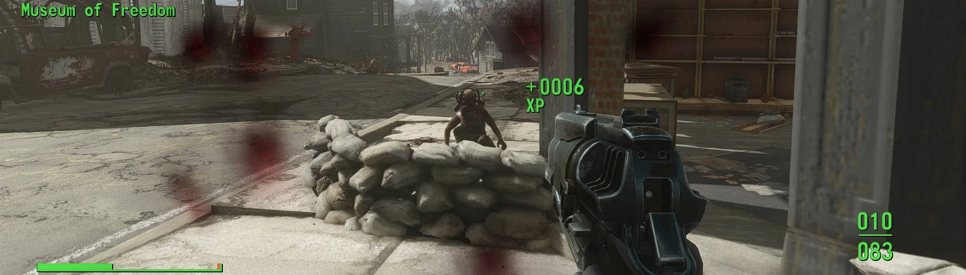
The Health Bar, AP Bar, Decetion Meter, and Enemy Health Bar have all been moved to the lower left-hand corner. This is in the interest of condensing your most essential status indicators into one place--there's little practical reason why you would need your eyes flitting all over the screen looking for these. The HP, AP, and RADS text have been removed, as the brackets now reflect which status bar is which, and the RAD and Fatigue icons should be enough to let you know that you're taking damage to these attributes.
The enemy health bar found its way here, too. This was a cue taken from The Elder Scrolls III: Morrowind, of all games. I've always found that placing the enemy health bar above yours does a couple of things. First of all, it keeps your eyes on the action, instead of a health bar. The lower-left hand corner is typically not where fighting is taking place, and so you get a better sense of the combat. Second, when you do need to check enemy health, you also get to check your own status as well. I also removed the skull and the legendary icons. If an enemy is a higher level than you, that should be communicated by their combat abilities. Removing the Legendary indicator keeps things interesting, as you don't know when an enemy might be prone to mutation.
AMMO COUNTER, BUFFS/DEBUFFS, AND CRIT METER
The ammo counter is on the right-hand side of the screen because that's where your gun is. Simple enough.Putting a grenade counter right under that the next logical step. The buffs/debuffs go here, too, to simple have a consisent sort of "look" with the left-hand side of the screen; while categorically, this has more in common with your health than your ammo, it fits in visually here, as these indicators are smaller and more compact.
I flipped the crit meter to be vertical instead of horizontal and removed the stars and text. I wasn't sure about this at first, but I found that I actually paid more attention to the crit meter with this, whereas before I barely ever noticed it. This is probably a confluence of it being part of a less cluttered space of the screen now, but its vertical positioning also draws attention to itself. It now looks like a meter filling up, instead of another flat bar with a bunch of text and icons pasted over it in the middle of the screen.
CENTER HUD
Removed hit markers. Removed the blooming crosshair. Removed damage indicators. I've never liked these elements in games, as they feel like they're not trusting you to be able to recognize things that are happening to you on screen. The XP meter has had its bar removed--we have enough of those--and placed next to the crosshair. Mostly, this just look satisfying, but it also has the added benefits of making your completed objectives more apparent.
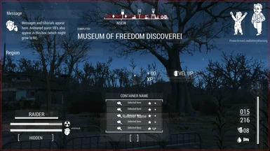
The compass is at the top now. Cue from The Elder Scrolls V: Skyrim. When it's at the bottom, it just clutters up the screen when you're in combat--especially since Fallout 4's compass communicates so much. Given how dense it is, regulating it to the top and largely by itself makes sense. Quest status updates now get pasted to the top, right under the compass, because they're important and only appear there for a few seconds.
The quick-loot pop-up is now at the bottom. I never liked how it used to take up a huge chunk of the center of the screen. Now, it feels like its easier to see--as its regulated to a screen area where there's generally less going on--and doesn't get in your way as much.
MESSAGES/PERK ICONS/CRIPPLED LIMBS
Not a lot to say here. Messages and location didn't need to be tweaked that much. The little animated pip-boy guy got moved to the top-right, because he's kind of annoying and gets in the way, even if he does tell you useful information. Now, he's in an area where his flailing limbs aren't going to distract from trying to observe other UI elements.
DEMONSTRATION (BECAUSE IT'S EASIER TO SEE IT IN-ACTION AS OPPOSED TO STATIC IMAGES)
Note that both the font and the item tags are from different mods.
INSTALLATION (IT'S EASY!)
DEF_UI is a hard requirement.
Other than that, use a mod manager, or drag and drop. That easy.
PERMISSIONS (AND CONTACT)
mod compilation, uploading it to different site for
maintenance/accessibility reasons, patching, go for it. There's no need
to ask me, and I only ask that you credit me. A link to this mod page
would be neat, too, but isn't necessary. If, for whatever reason, you
need to contact me about permissions, and I do not reply after three
months: do whatever you need to do. Just credit me if you can.
· Nexus is the best way to contact me. Don't do it on Youtube. High chance I will miss it.
· Please, please, for the love of God do not ever call me "bro." I'm serious. I don't care what you are asking me - I will ignore you.
DESCRIPTION (WHAT TO EXPECT/WHY ANOTHER DEF_UI PRESET)
This mod uses DEF_UI to re-organize the HUD. There's dozens of presets out there for DEF_UI, of course, and FallUI is the hot new kid on the block, but I thought that a simple, plug 'n' play approach would be appreciated by some. I'm at a spot with modding where I don't like spending a ton of time fiddling around in MCMs. Thus, I made this UI.
The primary goal here is to clean up the screen space and just generally make better use of it. There's plenty of presets that do this, of course, but they tend to veer into the extreme and condense everything to one corner of the screen and/or will shrink UI elements down and strain your poor eyes. I tend to play games laying in my bed with a gamepad these days, so while I like some of the layout choices these mods make, it's just not an option. The primary goal becomes, then, to present you with something that more-or-less looks like it could have come from a professional game studio (even though I am strictly an amateur). This also means while the UI is primarily designed for "couch-gamers" (Fallout 4 is a great couch game, after all), it should still work perfectly fine and be unobtrusive for those who play in front of their PC.
Finally, I hope to clean up a lot of the visual clutter baked into the UI. In addition to slapping information all over the screen, Fallout 4 has a tendency to over-communicate with a variety of superfluous icons and/or text, depending on the UI element. See the section below for more info on this.
THE LAYOUT (AND THE JUSTIFICATION FOR IT)
Spoiler:
Show
PLAYER AND ENEMY STATUS
The Health Bar, AP Bar, Decetion Meter, and Enemy Health Bar have all been moved to the lower left-hand corner. This is in the interest of condensing your most essential status indicators into one place--there's little practical reason why you would need your eyes flitting all over the screen looking for these. The HP, AP, and RADS text have been removed, as the brackets now reflect which status bar is which, and the RAD and Fatigue icons should be enough to let you know that you're taking damage to these attributes.
The enemy health bar found its way here, too. This was a cue taken from The Elder Scrolls III: Morrowind, of all games. I've always found that placing the enemy health bar above yours does a couple of things. First of all, it keeps your eyes on the action, instead of a health bar. The lower-left hand corner is typically not where fighting is taking place, and so you get a better sense of the combat. Second, when you do need to check enemy health, you also get to check your own status as well. I also removed the skull and the legendary icons. If an enemy is a higher level than you, that should be communicated by their combat abilities. Removing the Legendary indicator keeps things interesting, as you don't know when an enemy might be prone to mutation.
AMMO COUNTER, BUFFS/DEBUFFS, AND CRIT METER
The ammo counter is on the right-hand side of the screen because that's where your gun is. Simple enough.Putting a grenade counter right under that the next logical step. The buffs/debuffs go here, too, to simple have a consisent sort of "look" with the left-hand side of the screen; while categorically, this has more in common with your health than your ammo, it fits in visually here, as these indicators are smaller and more compact.
I flipped the crit meter to be vertical instead of horizontal and removed the stars and text. I wasn't sure about this at first, but I found that I actually paid more attention to the crit meter with this, whereas before I barely ever noticed it. This is probably a confluence of it being part of a less cluttered space of the screen now, but its vertical positioning also draws attention to itself. It now looks like a meter filling up, instead of another flat bar with a bunch of text and icons pasted over it in the middle of the screen.
CENTER HUD
Removed hit markers. Removed the blooming crosshair. Removed damage indicators. I've never liked these elements in games, as they feel like they're not trusting you to be able to recognize things that are happening to you on screen. The XP meter has had its bar removed--we have enough of those--and placed next to the crosshair. Mostly, this just look satisfying, but it also has the added benefits of making your completed objectives more apparent.
The compass is at the top now. Cue from The Elder Scrolls V: Skyrim. When it's at the bottom, it just clutters up the screen when you're in combat--especially since Fallout 4's compass communicates so much. Given how dense it is, regulating it to the top and largely by itself makes sense. Quest status updates now get pasted to the top, right under the compass, because they're important and only appear there for a few seconds.
The quick-loot pop-up is now at the bottom. I never liked how it used to take up a huge chunk of the center of the screen. Now, it feels like its easier to see--as its regulated to a screen area where there's generally less going on--and doesn't get in your way as much.
MESSAGES/PERK ICONS/CRIPPLED LIMBS
Not a lot to say here. Messages and location didn't need to be tweaked that much. The little animated pip-boy guy got moved to the top-right, because he's kind of annoying and gets in the way, even if he does tell you useful information. Now, he's in an area where his flailing limbs aren't going to distract from trying to observe other UI elements.
DEMONSTRATION (BECAUSE IT'S EASIER TO SEE IT IN-ACTION AS OPPOSED TO STATIC IMAGES)
Note that both the font and the item tags are from different mods.
INSTALLATION (IT'S EASY!)
DEF_UI is a hard requirement.
Other than that, use a mod manager, or drag and drop. That easy.
PERMISSIONS (AND CONTACT)
Spoiler:
If you need to use this work for any reason whatsoever - entering it into aShow
·
mod compilation, uploading it to different site for
maintenance/accessibility reasons, patching, go for it. There's no need
to ask me, and I only ask that you credit me. A link to this mod page
would be neat, too, but isn't necessary. If, for whatever reason, you
need to contact me about permissions, and I do not reply after three
months: do whatever you need to do. Just credit me if you can.
· Nexus is the best way to contact me. Don't do it on Youtube. High chance I will miss it.
· Please, please, for the love of God do not ever call me "bro." I'm serious. I don't care what you are asking me - I will ignore you.